)
is an NYC-Based Graphic Designer currently working at &WALSH and previously
Foreign Policy in Singapore. He’s a graduate of the legendary Typography Summer School, in Brooklyn, NY, and founder of the largely unheard of
"N
ormal
B
log"
which he is probably doing a terrible job of keeping up with. After you see his work, go check it out!
)
is an NYC-Based Graphic Designer currently working at &WALSH and previously
Foreign Policy in Singapore. He’s a graduate of the legendary Typography Summer School, in Brooklyn, NY, and founder of the largely unheard of
"N
ormal
B
log"
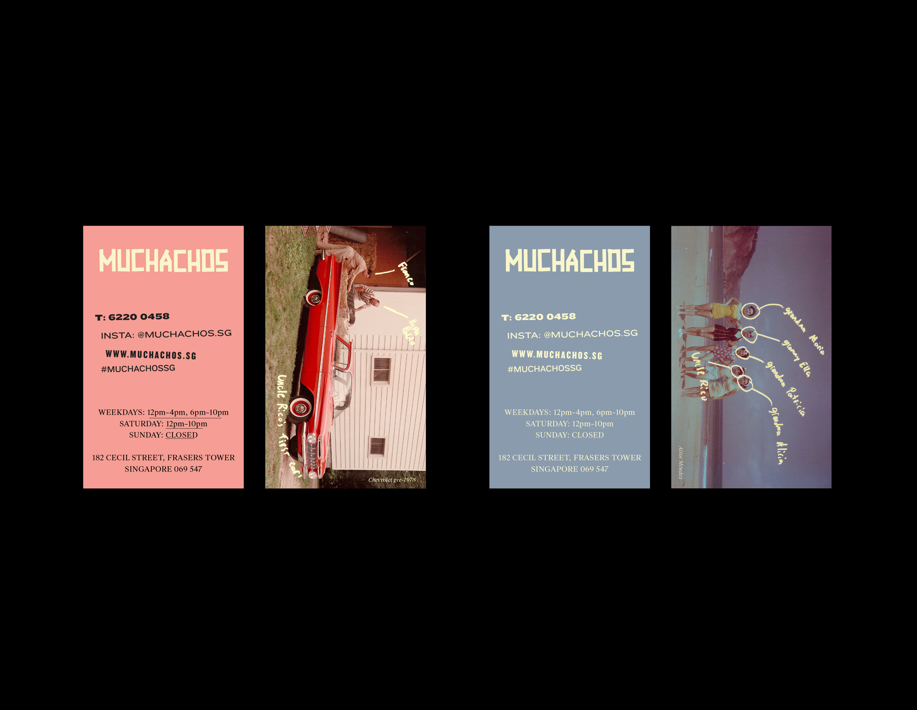
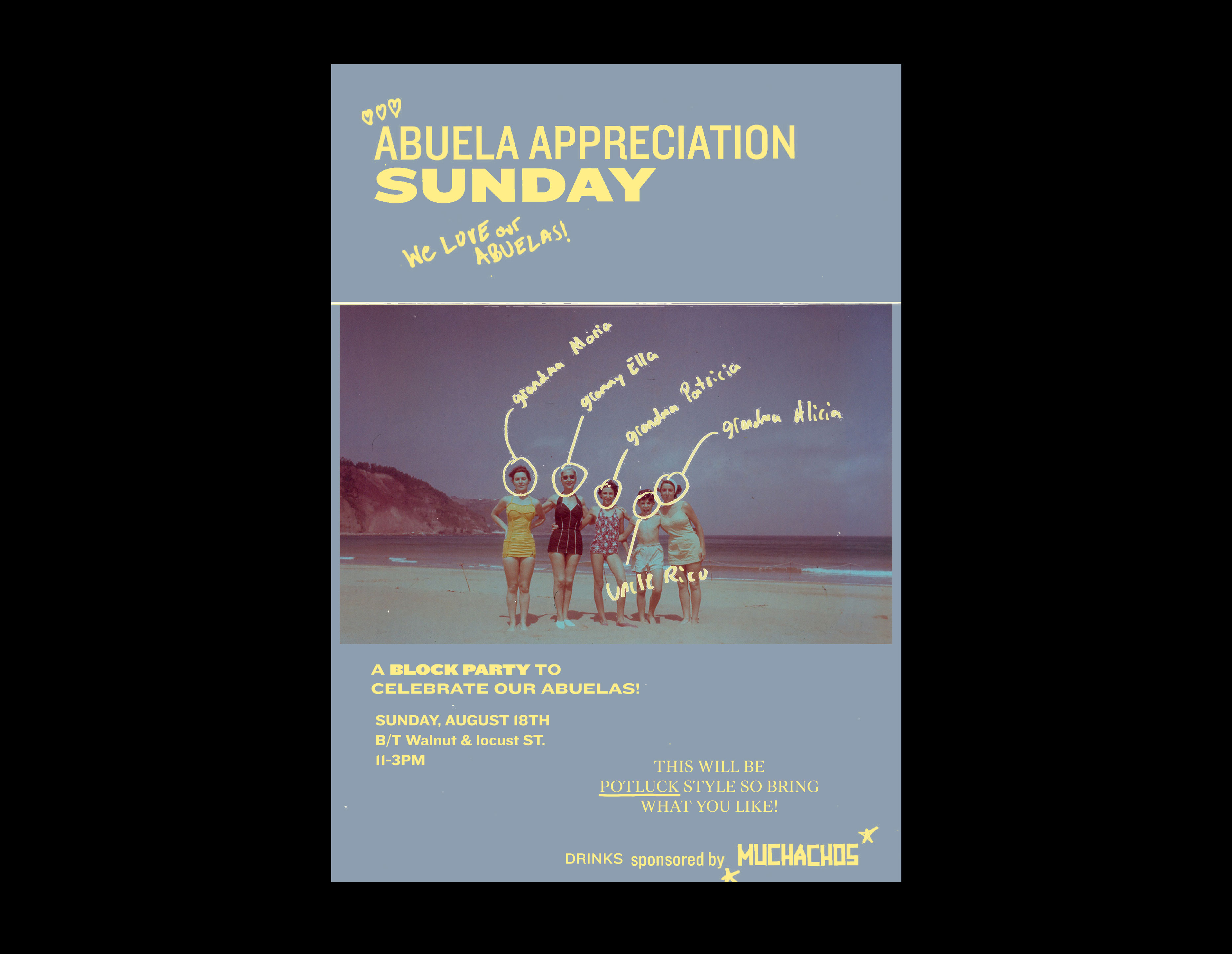
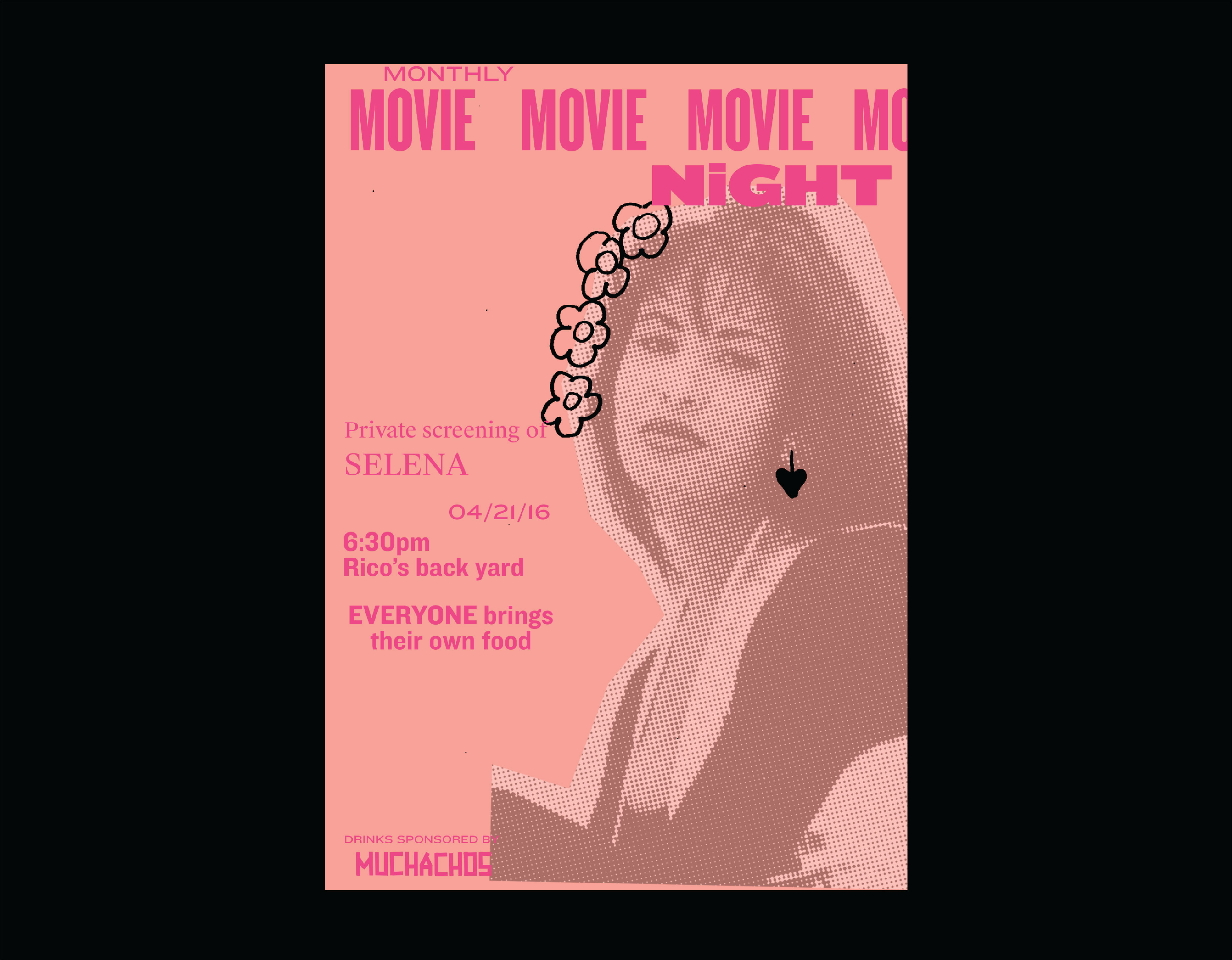
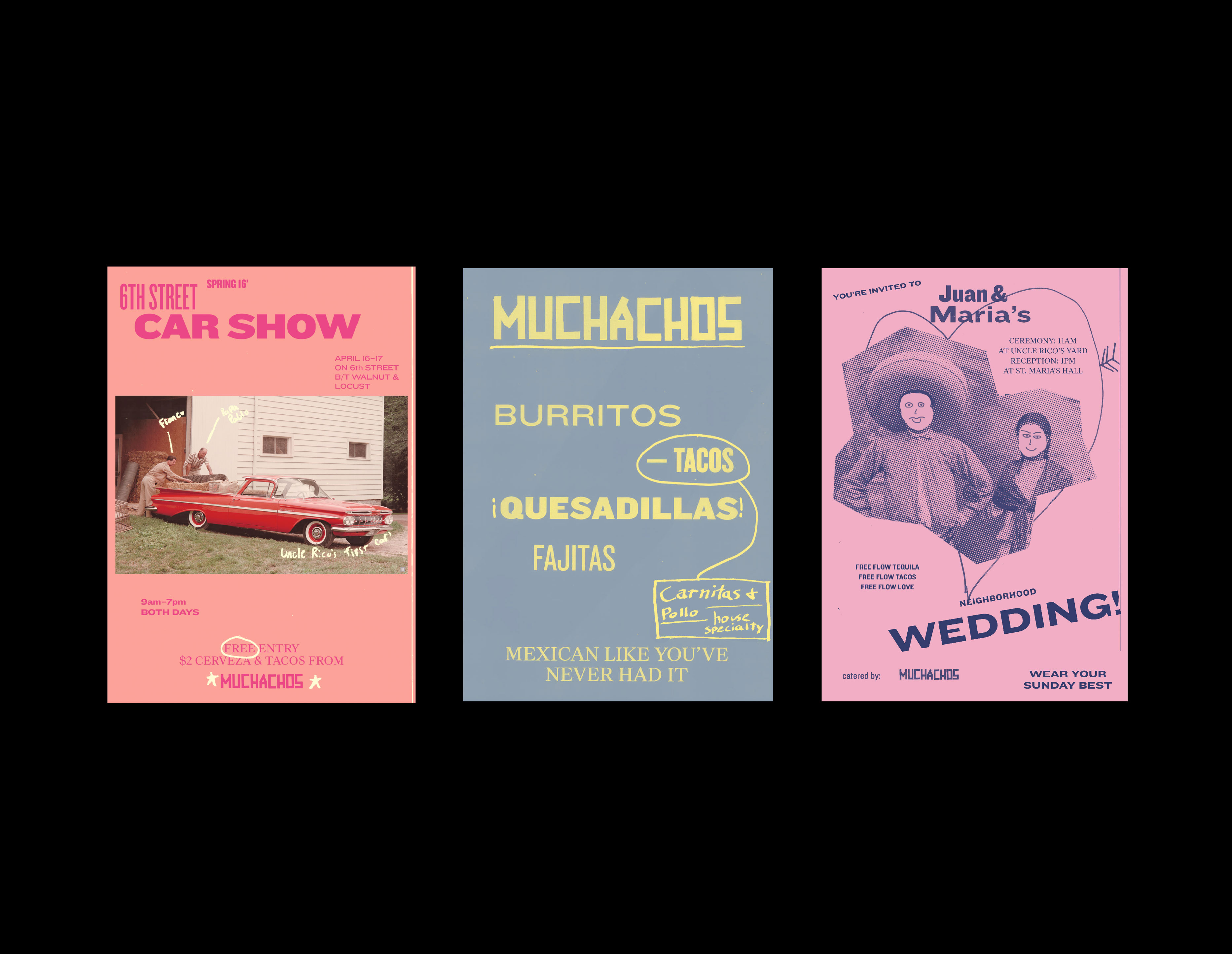
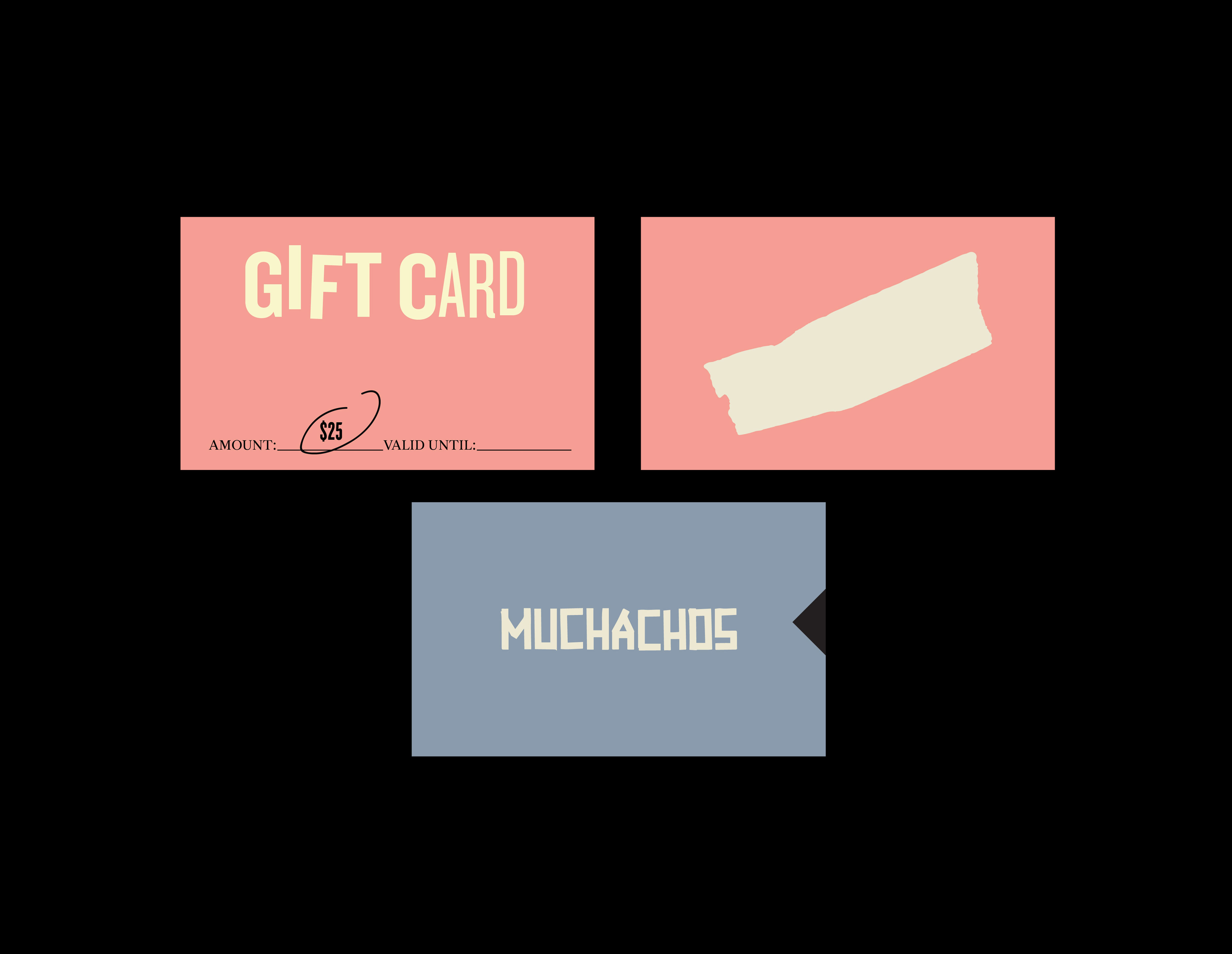
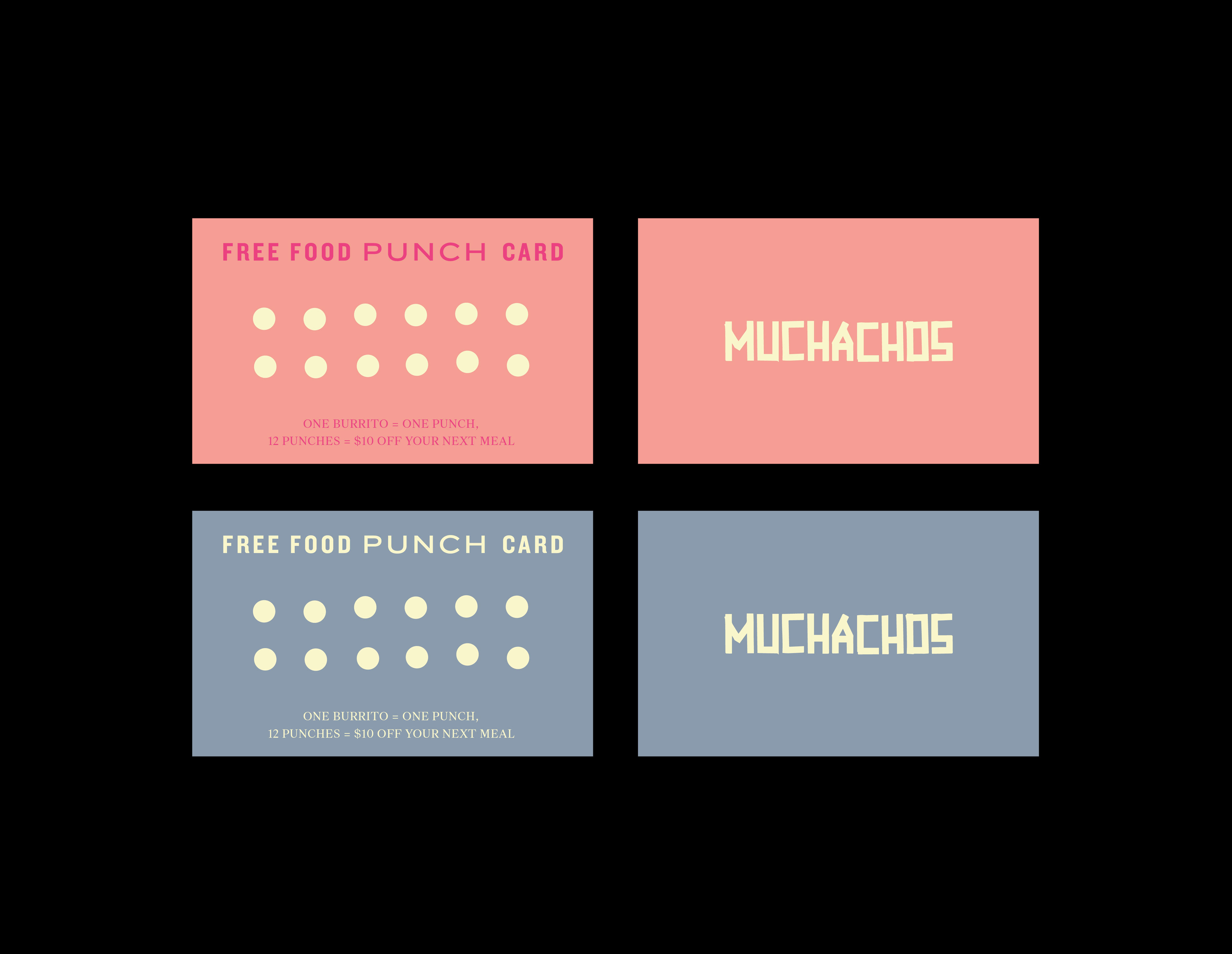
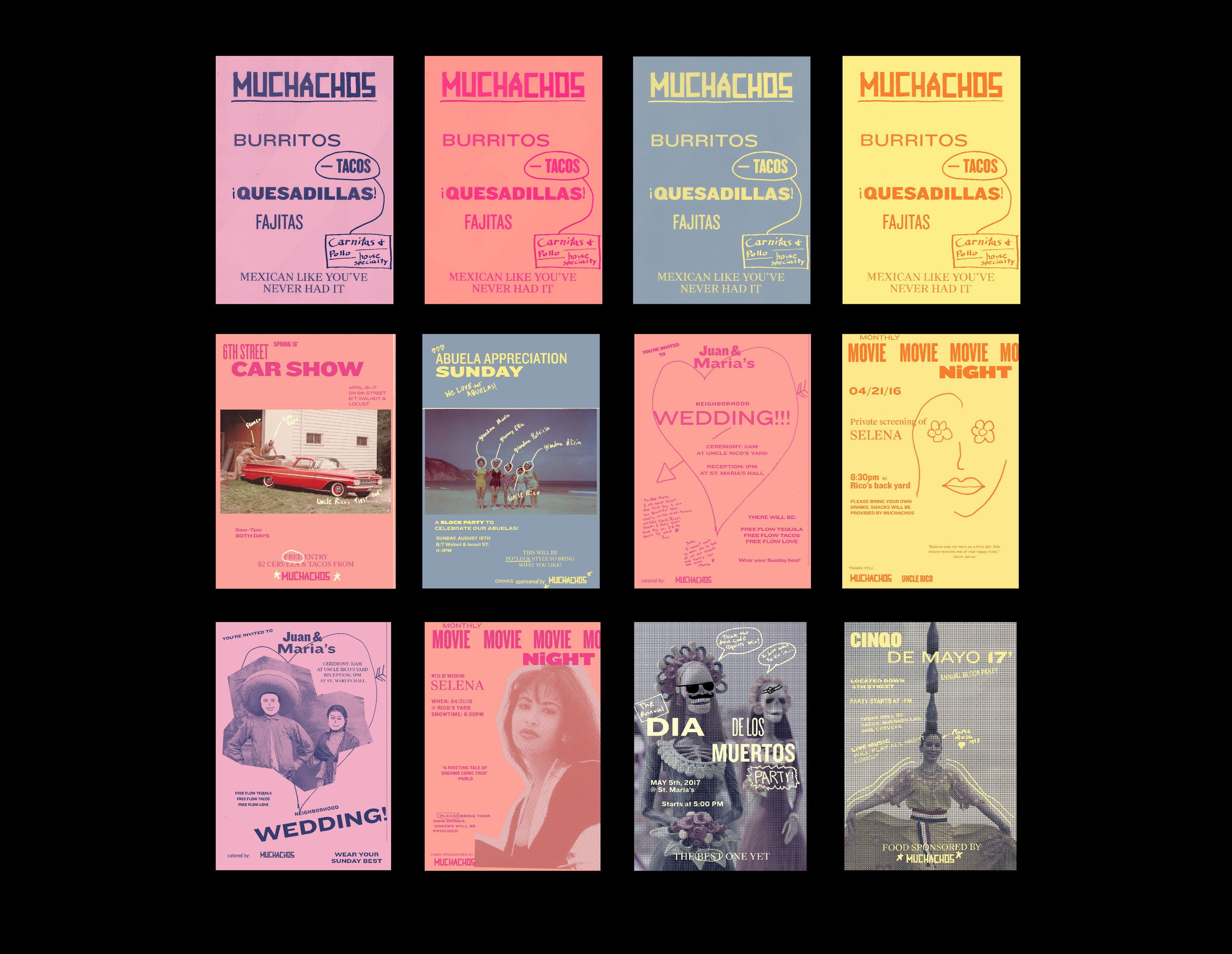
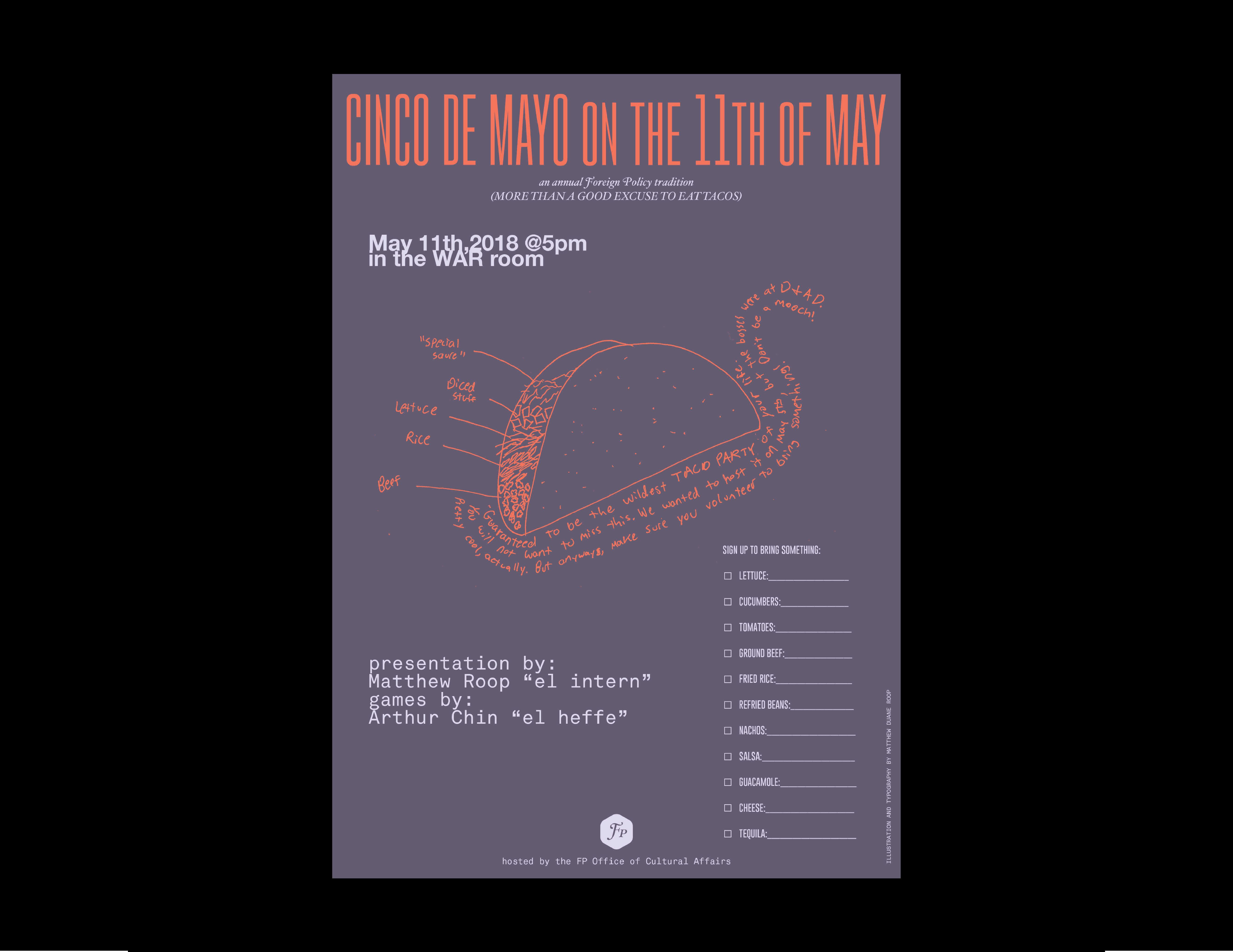
which he is probably doing a terrible job of keeping up with. After you see his work, go check it out! Muchachos is a Singapore-based "Mexican-American" restaurant. While interning at Foreign Policy I created a new look for the brand based on messy hand-set type, sharpie annotations, and a bueno sense of humor.
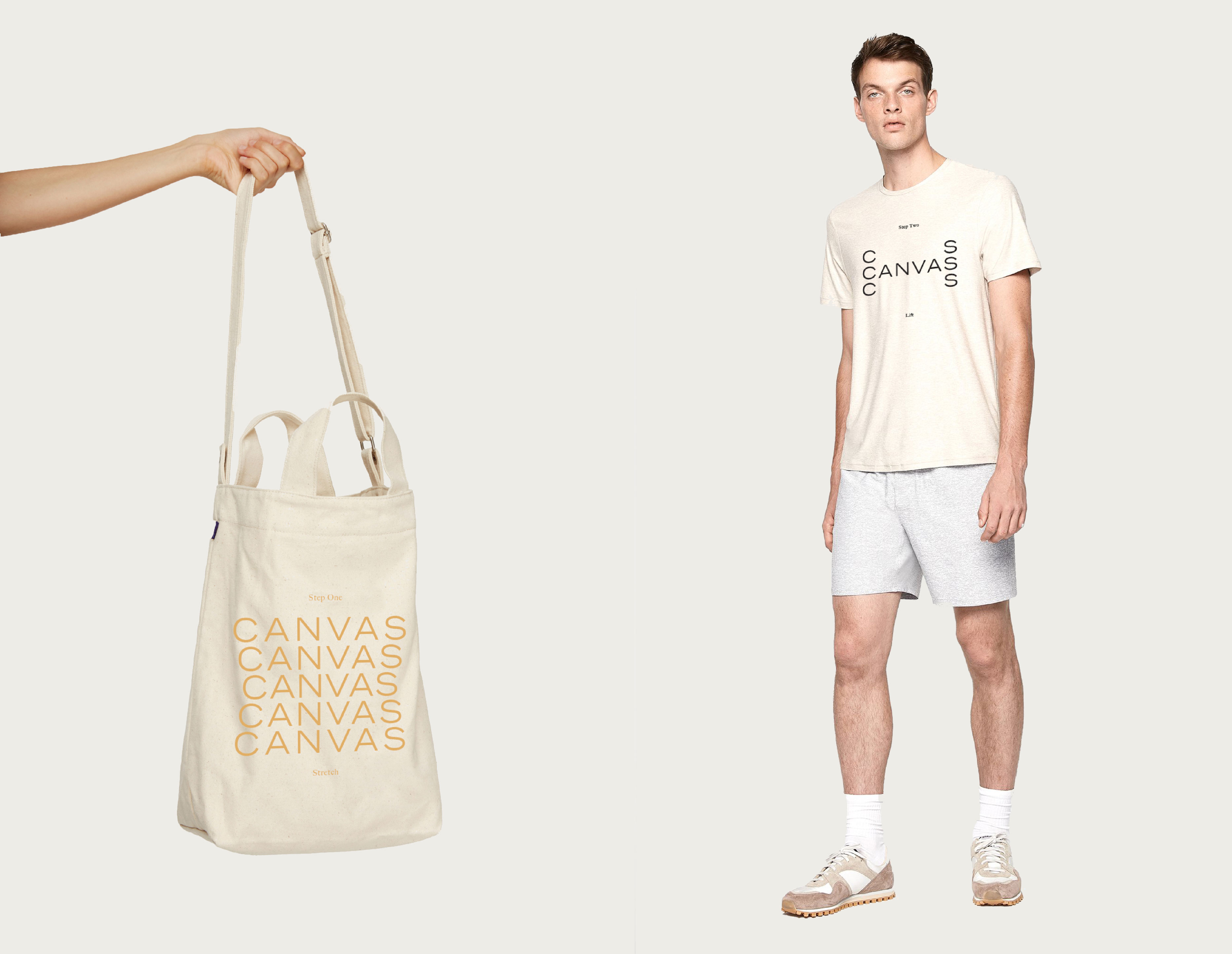
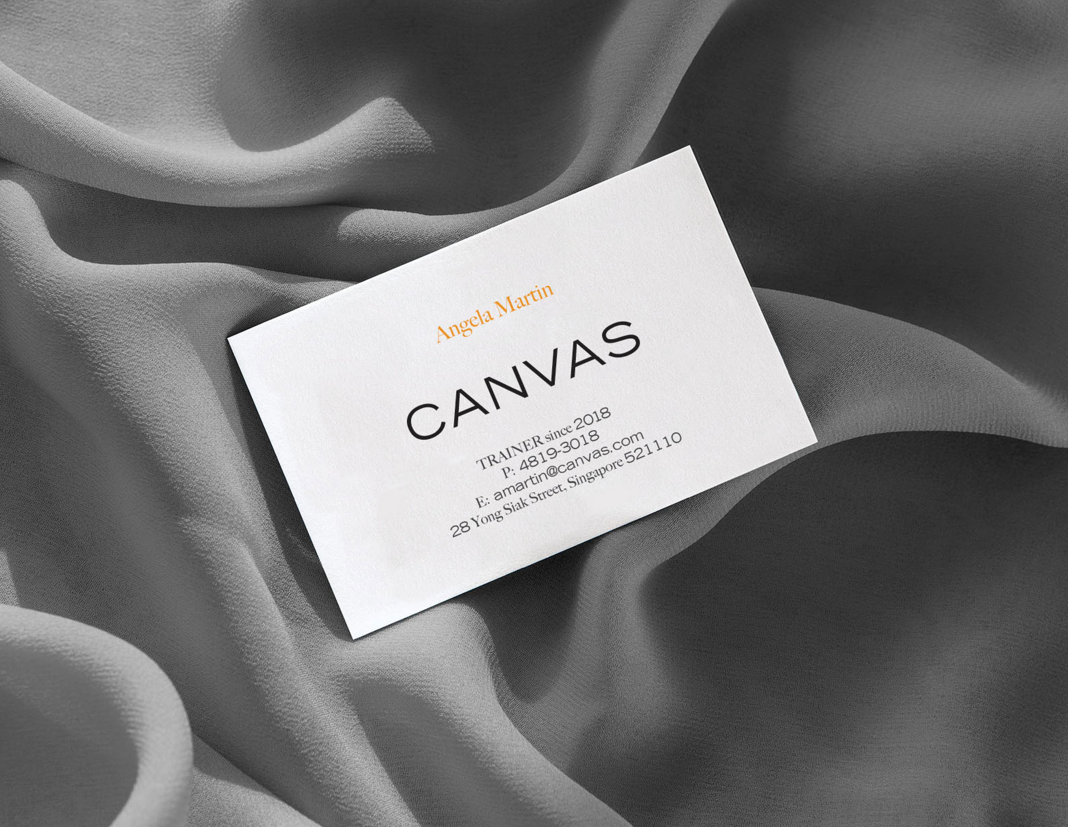
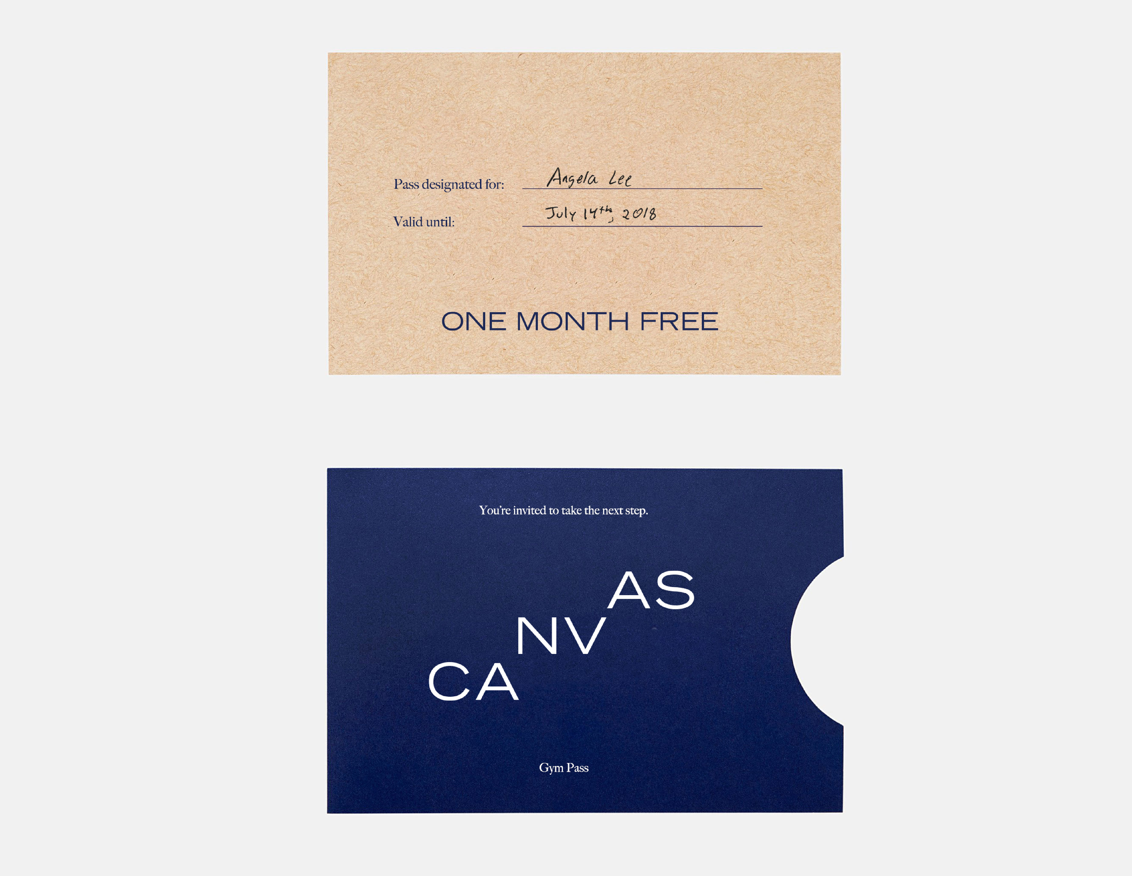
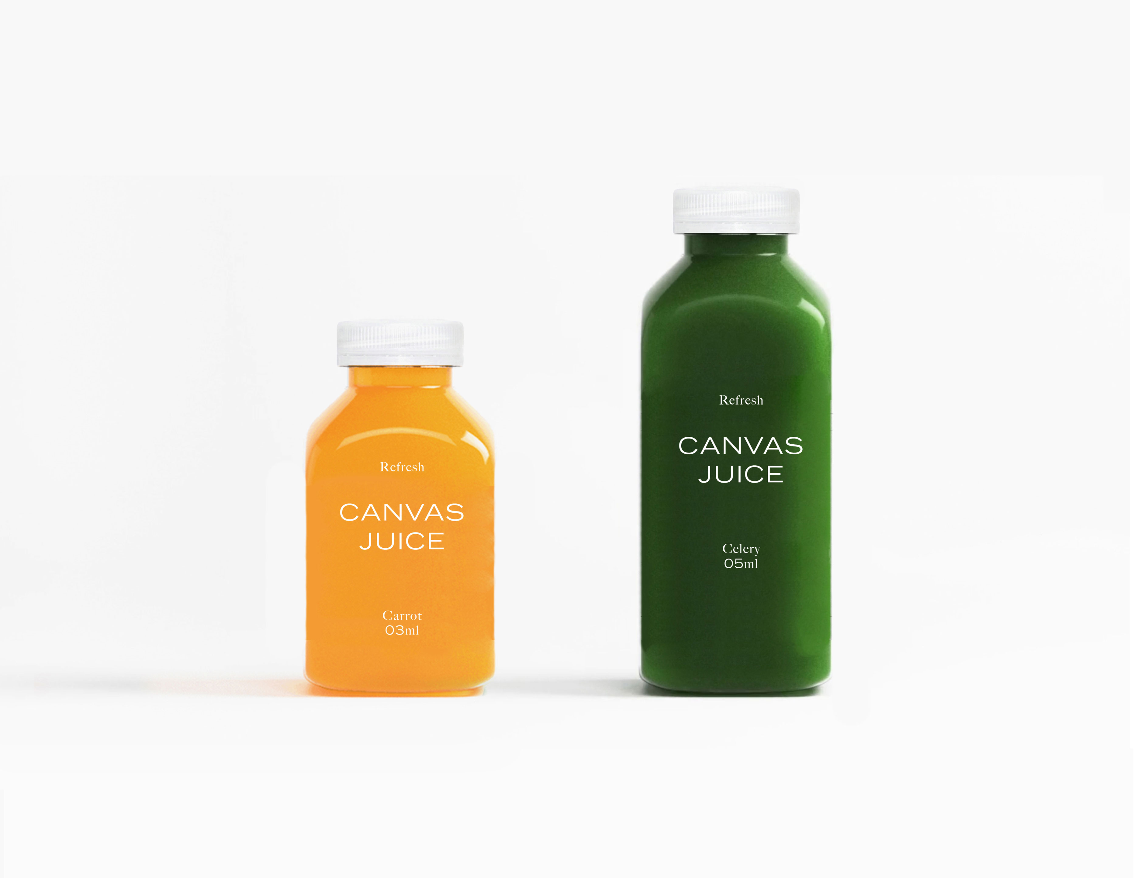
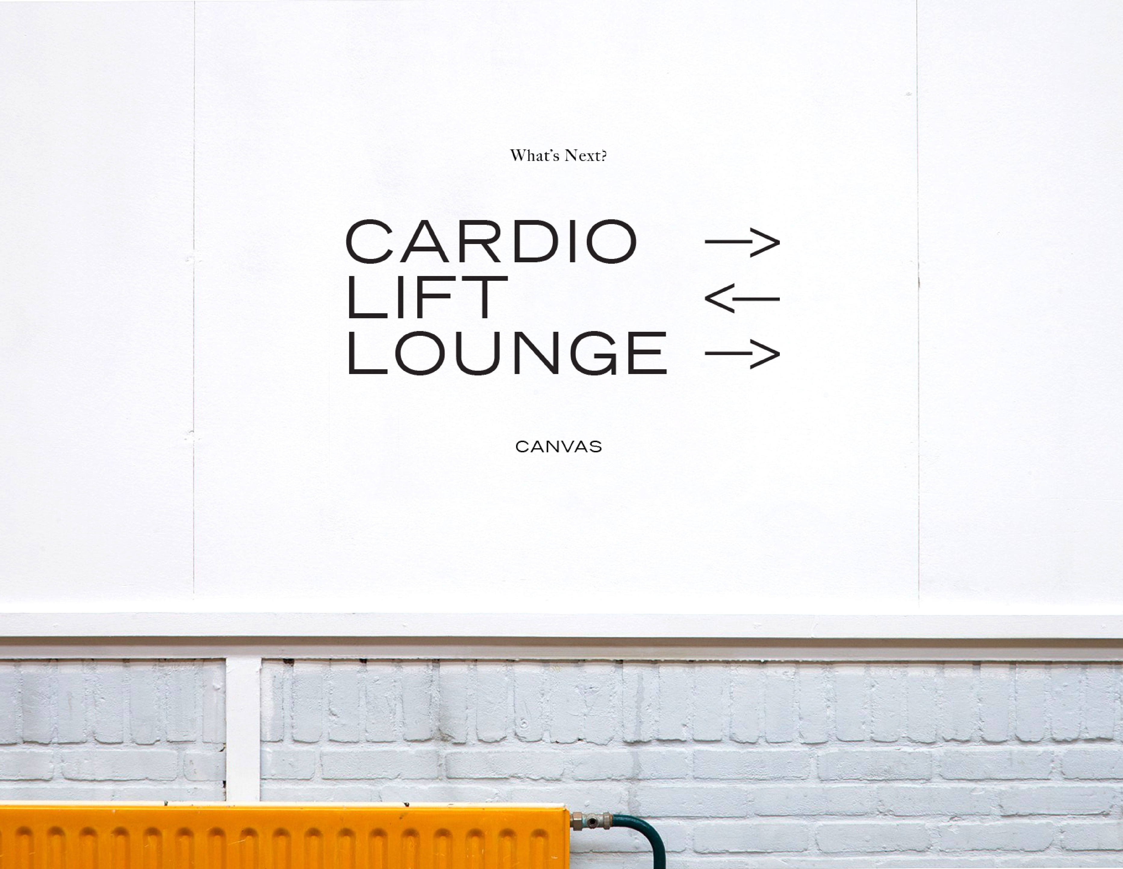
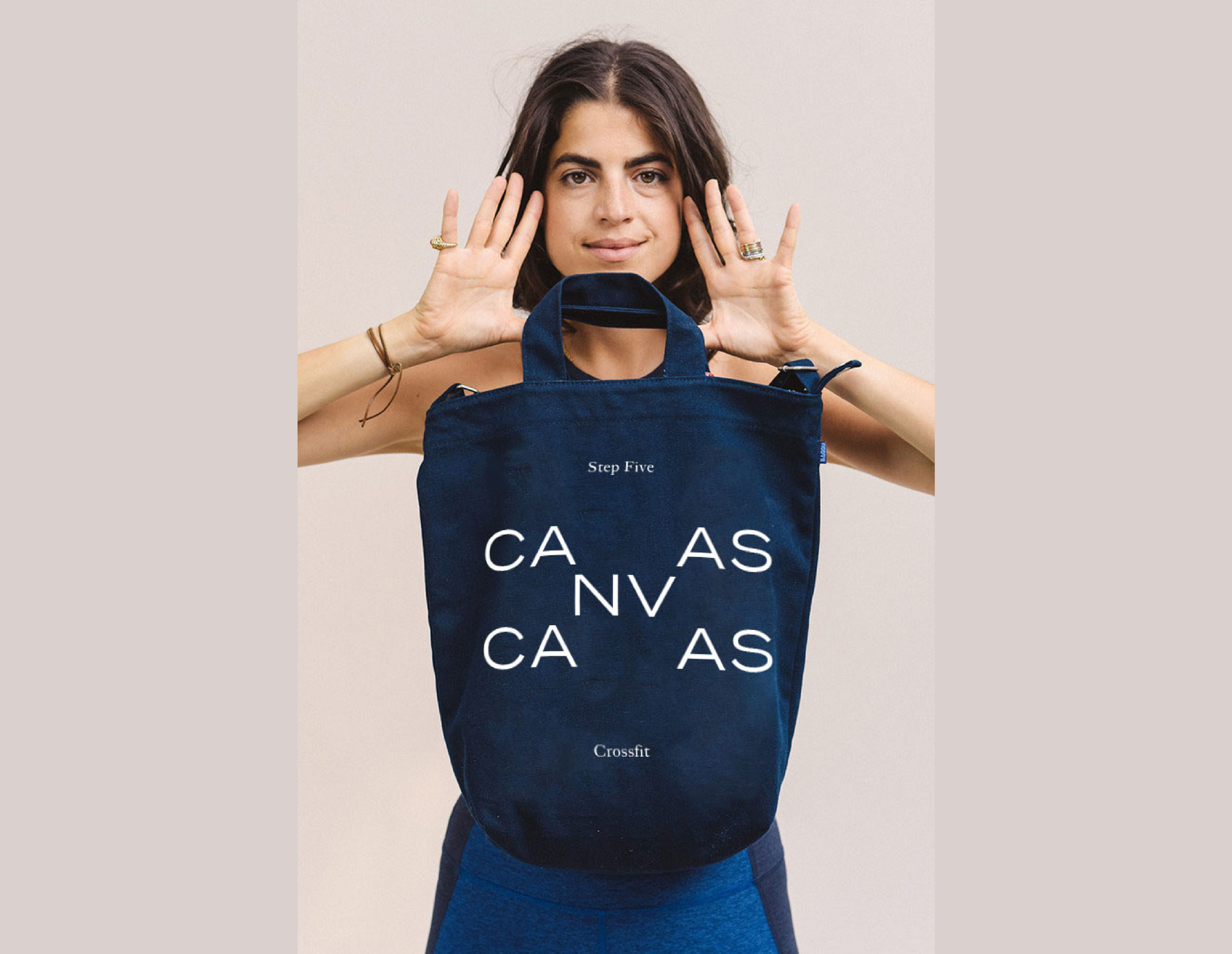
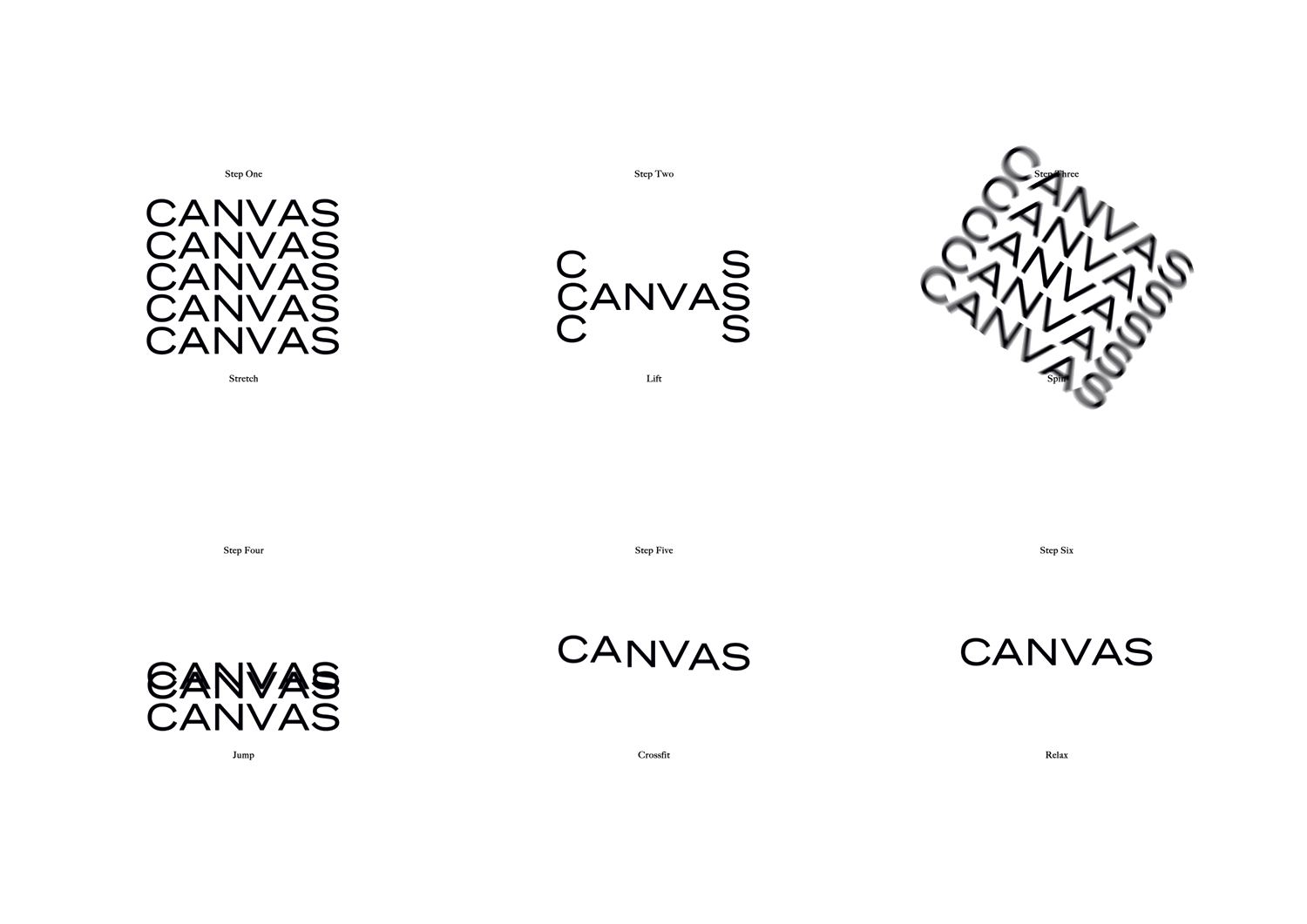
Canvas is a "lifestyle gym" looking to be more than your run of the mill place to work out. While at Foreign Policy, I led this typographic direction that embodies the kinetics of working out while also looking hip and fashionable.
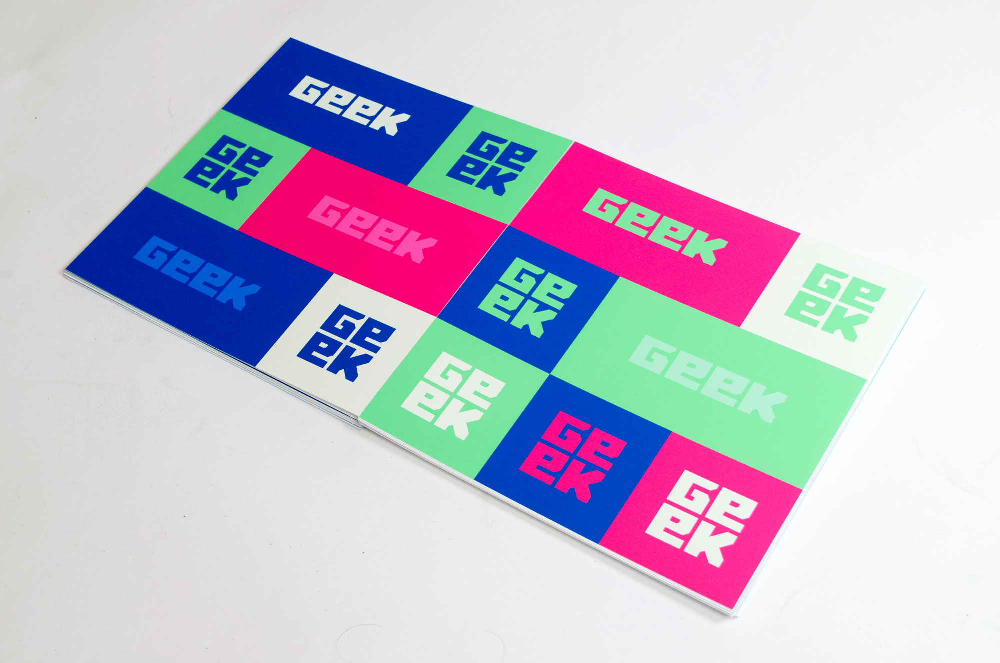
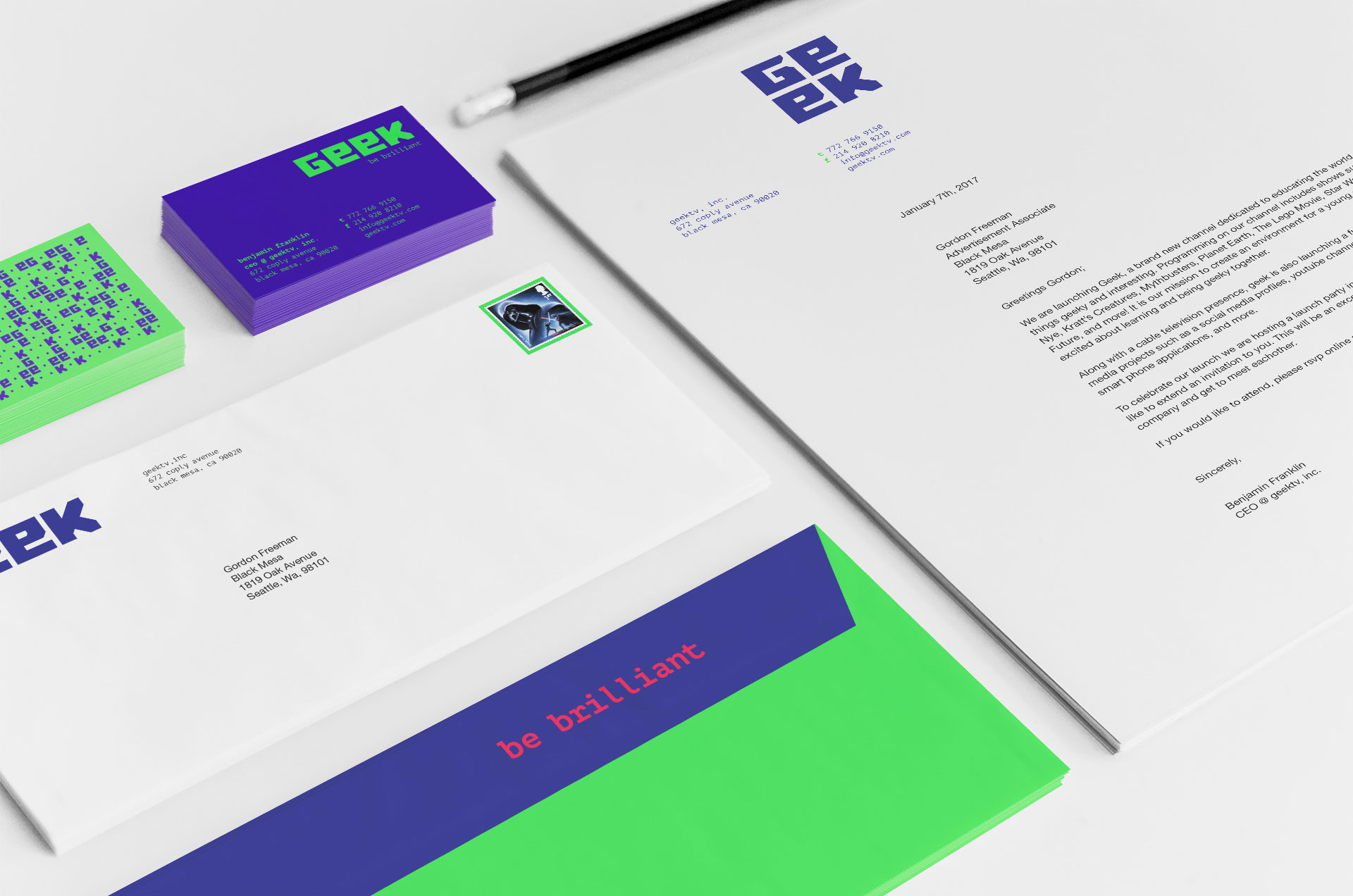
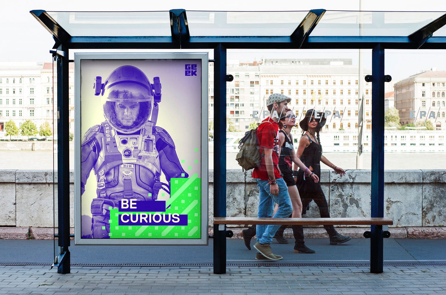
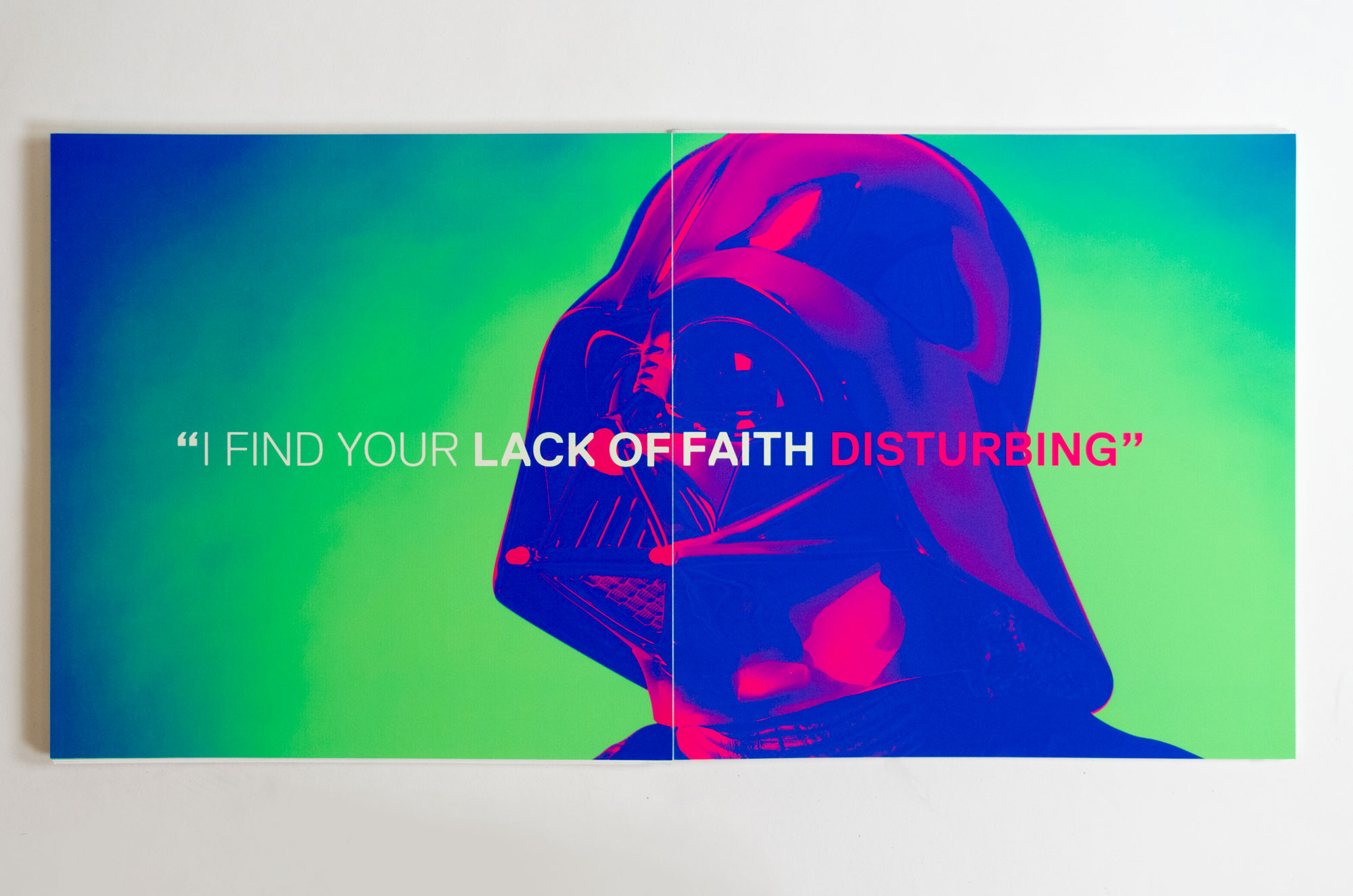
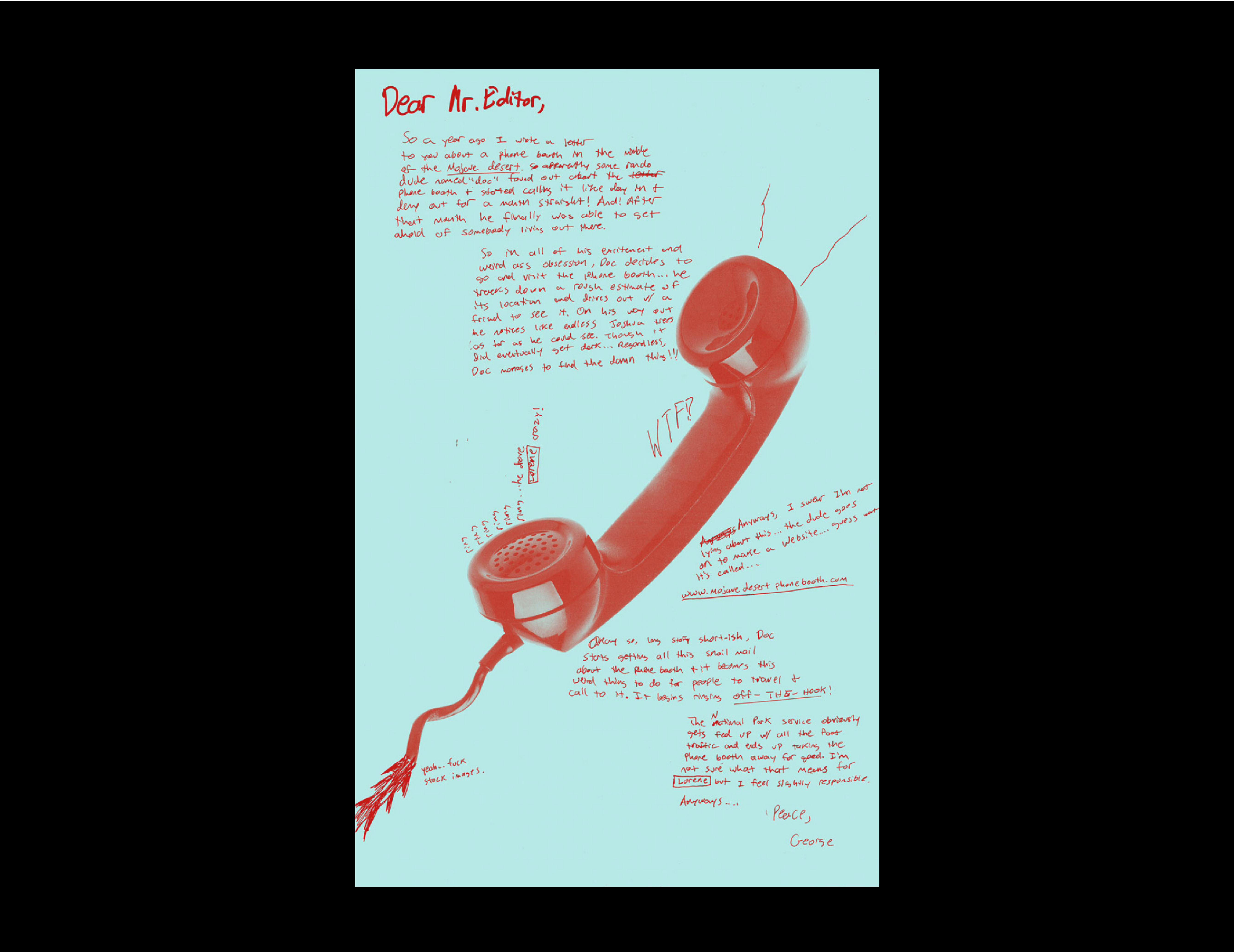
Branding and motion graphics for a faux TV channel with smart, quirky, and educational programming.
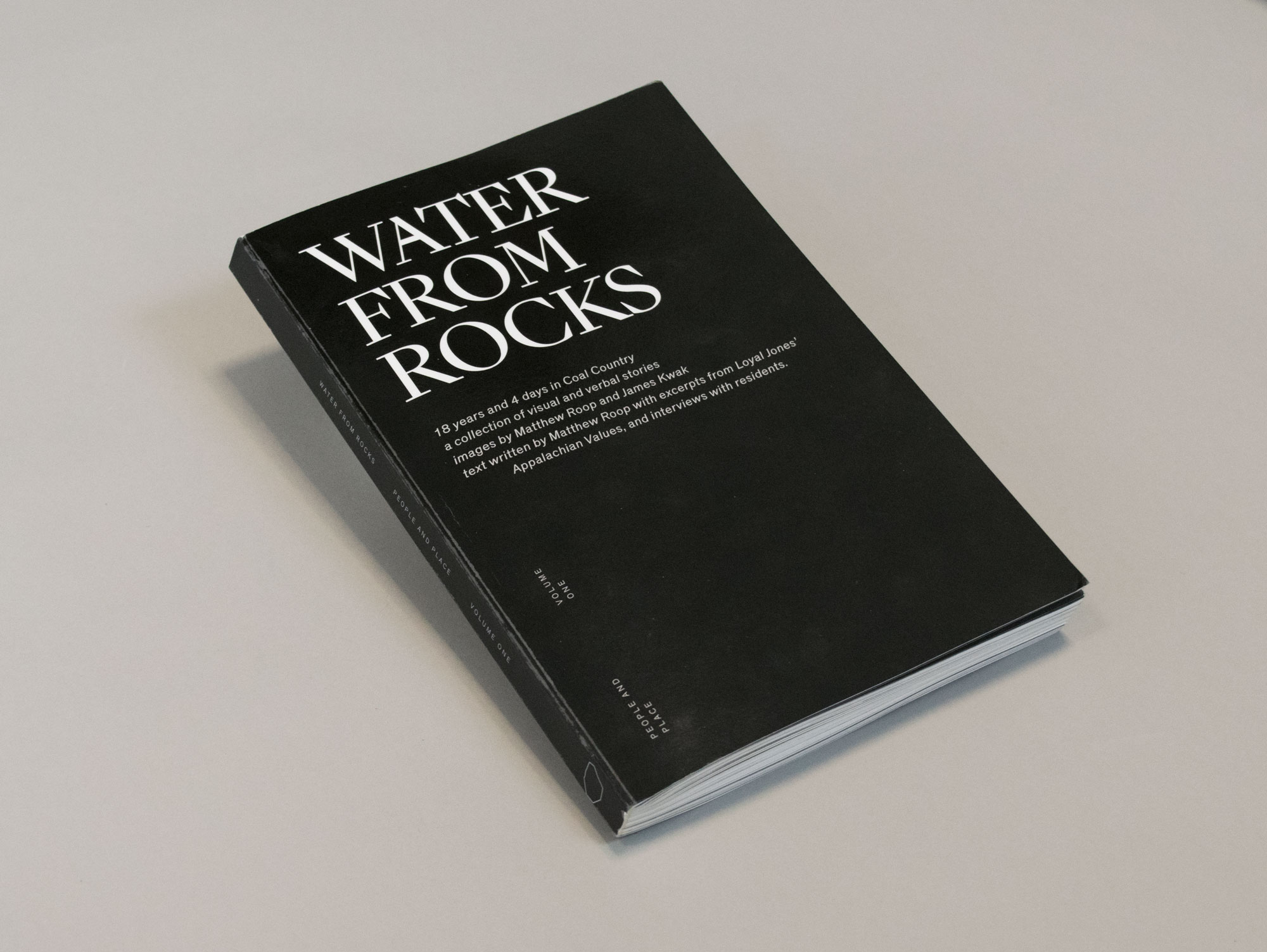
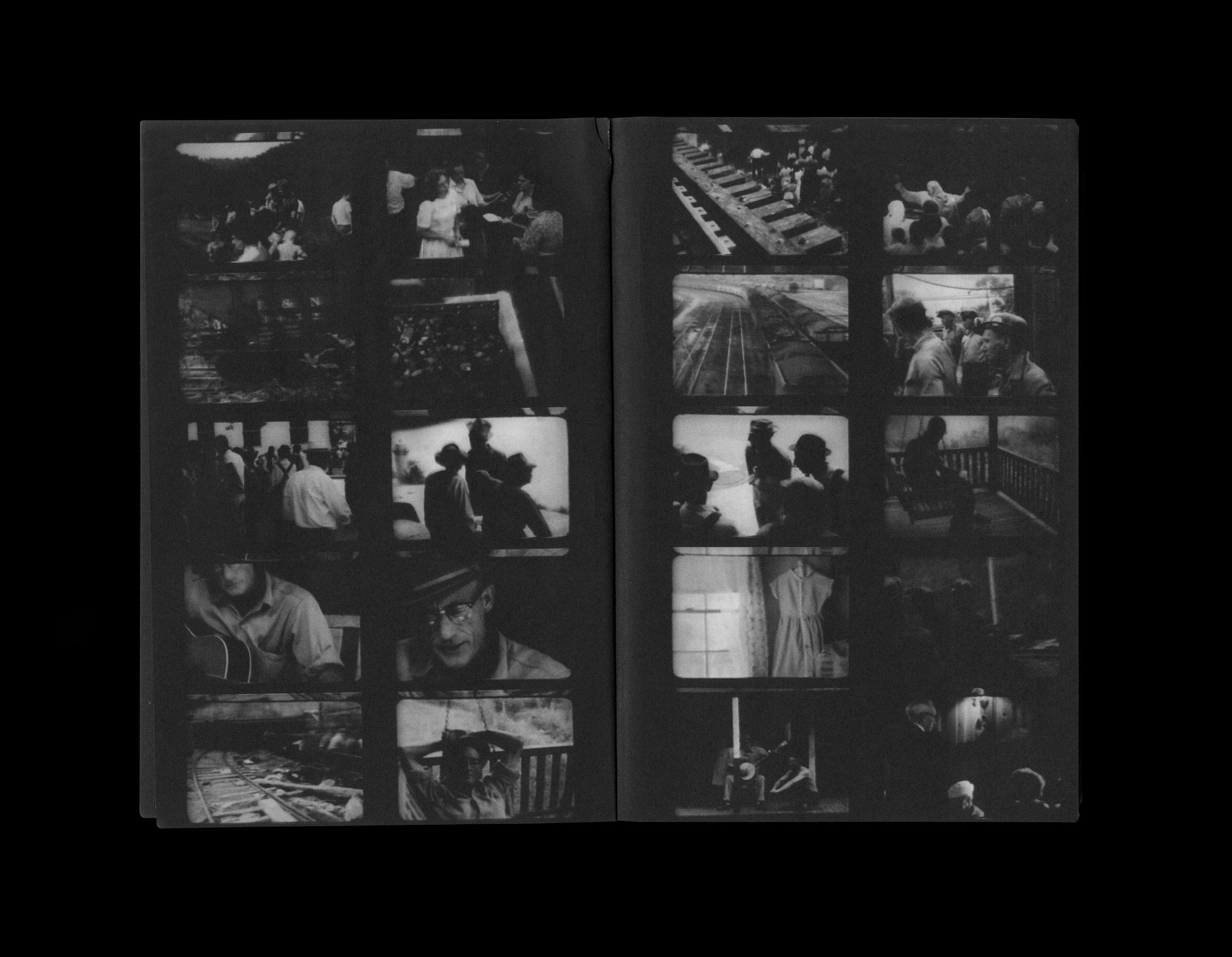
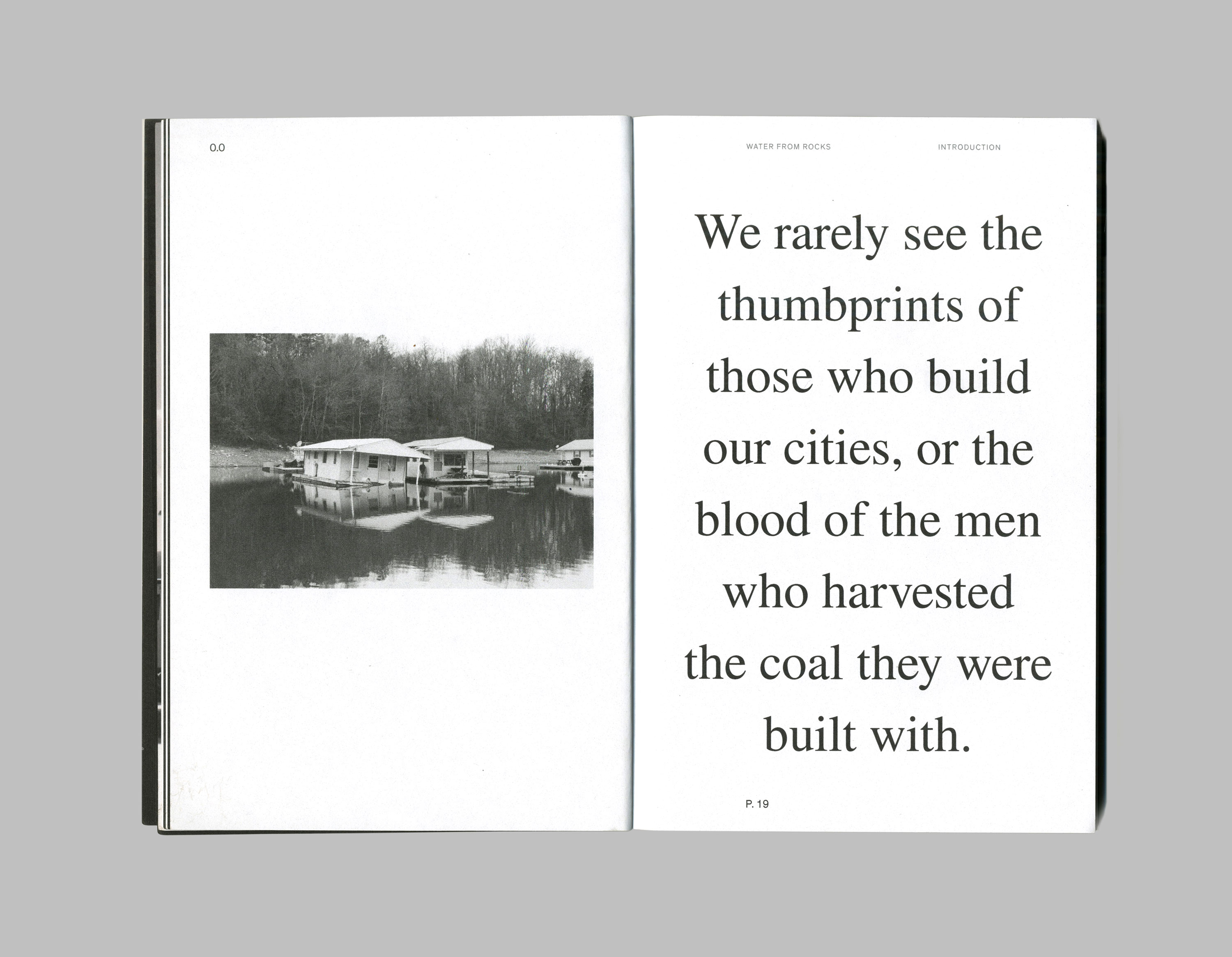
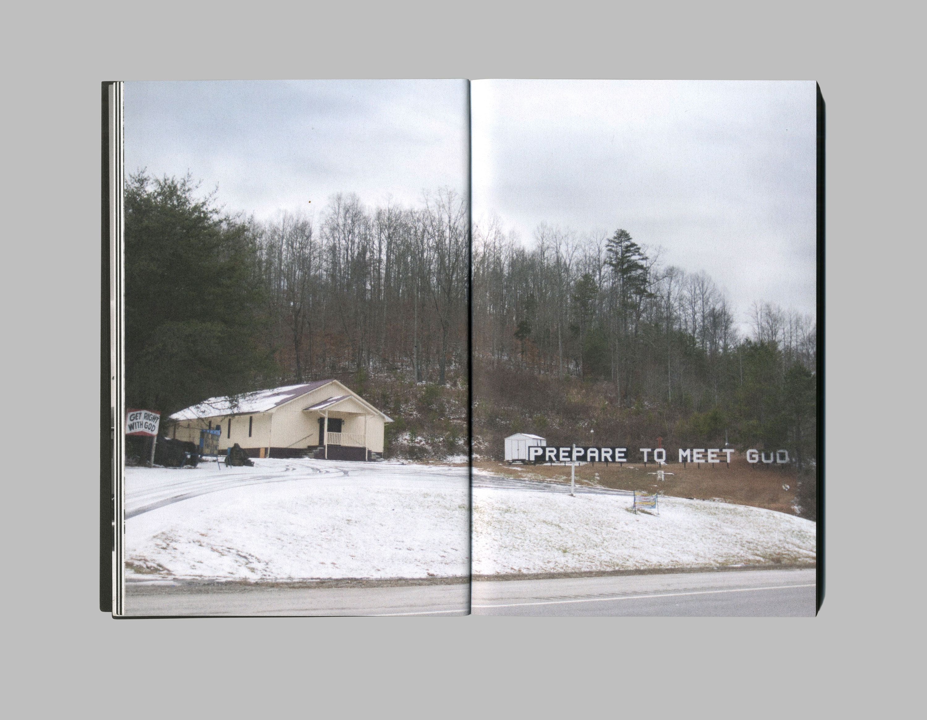
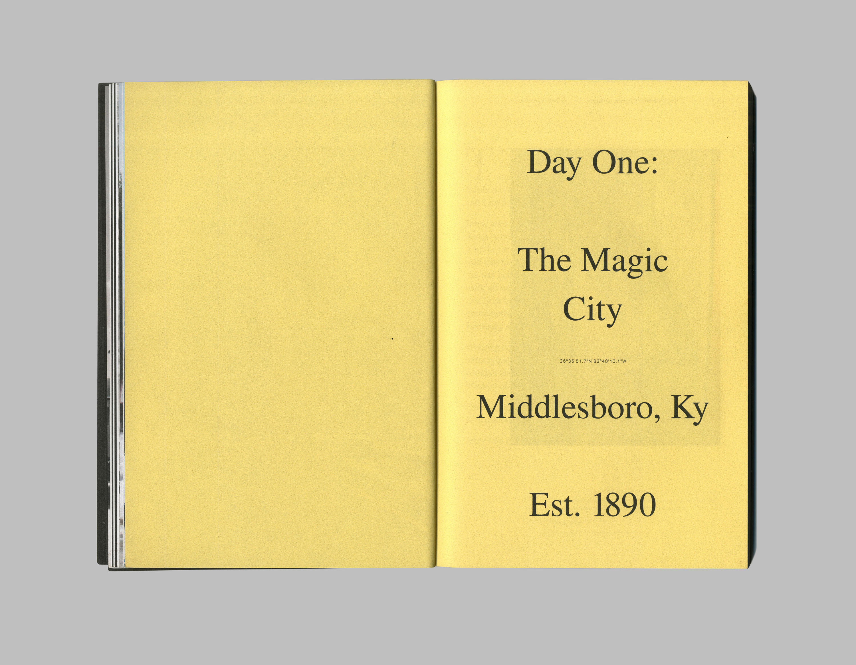
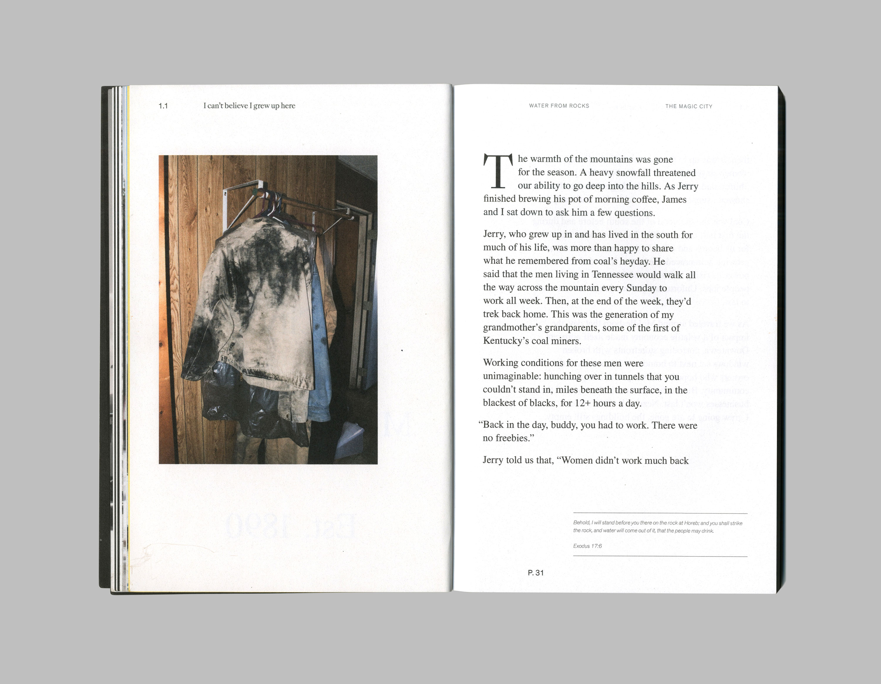
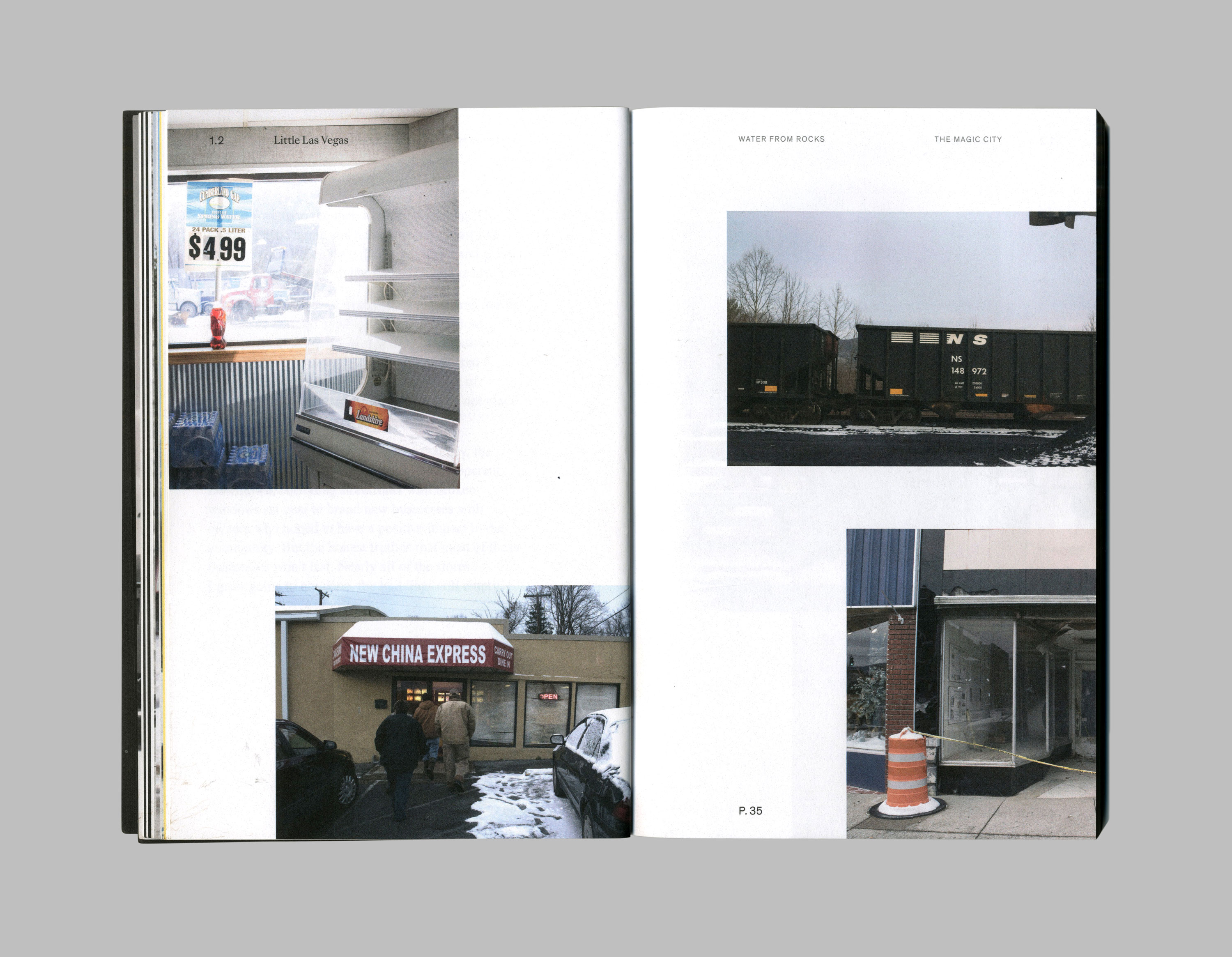
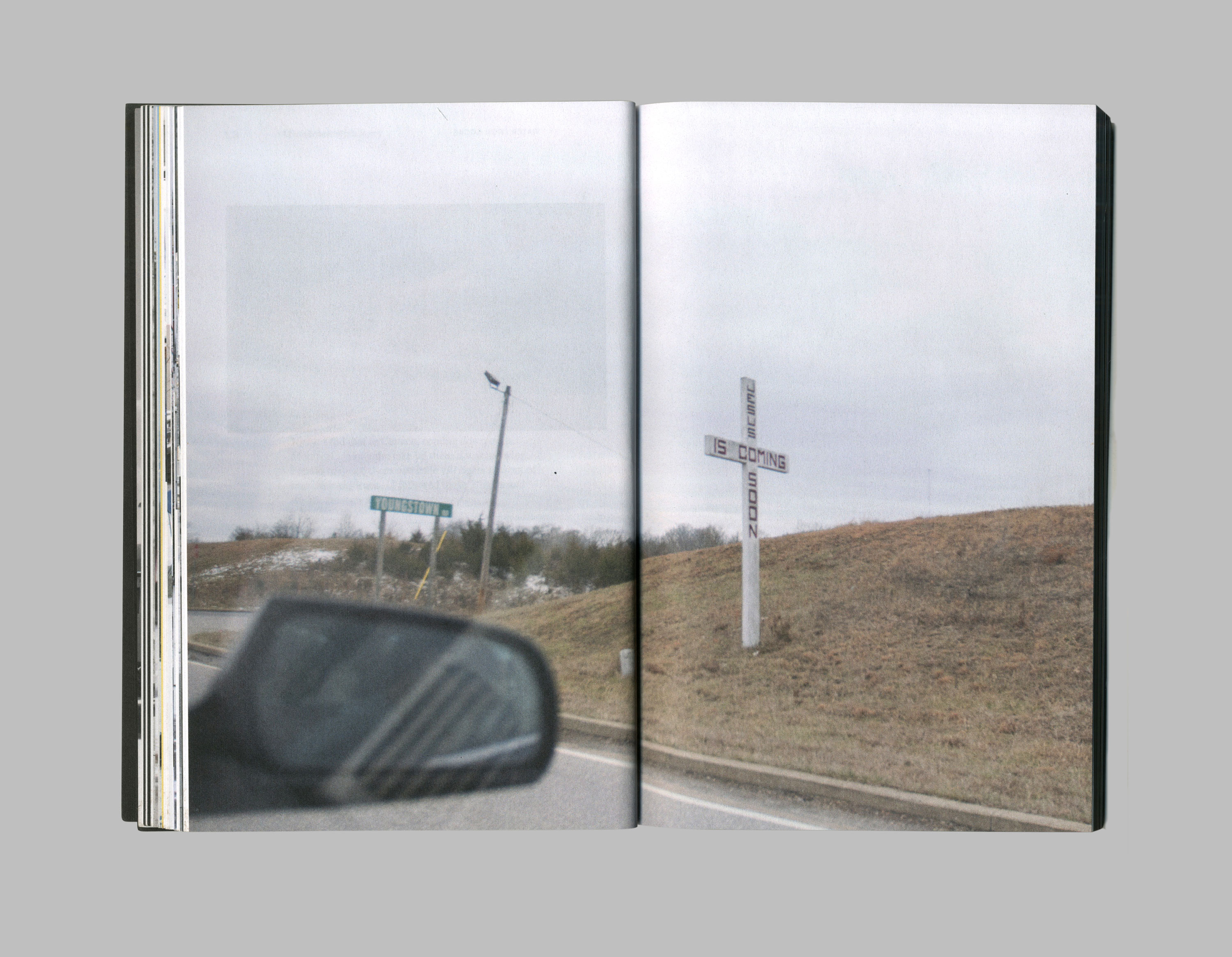
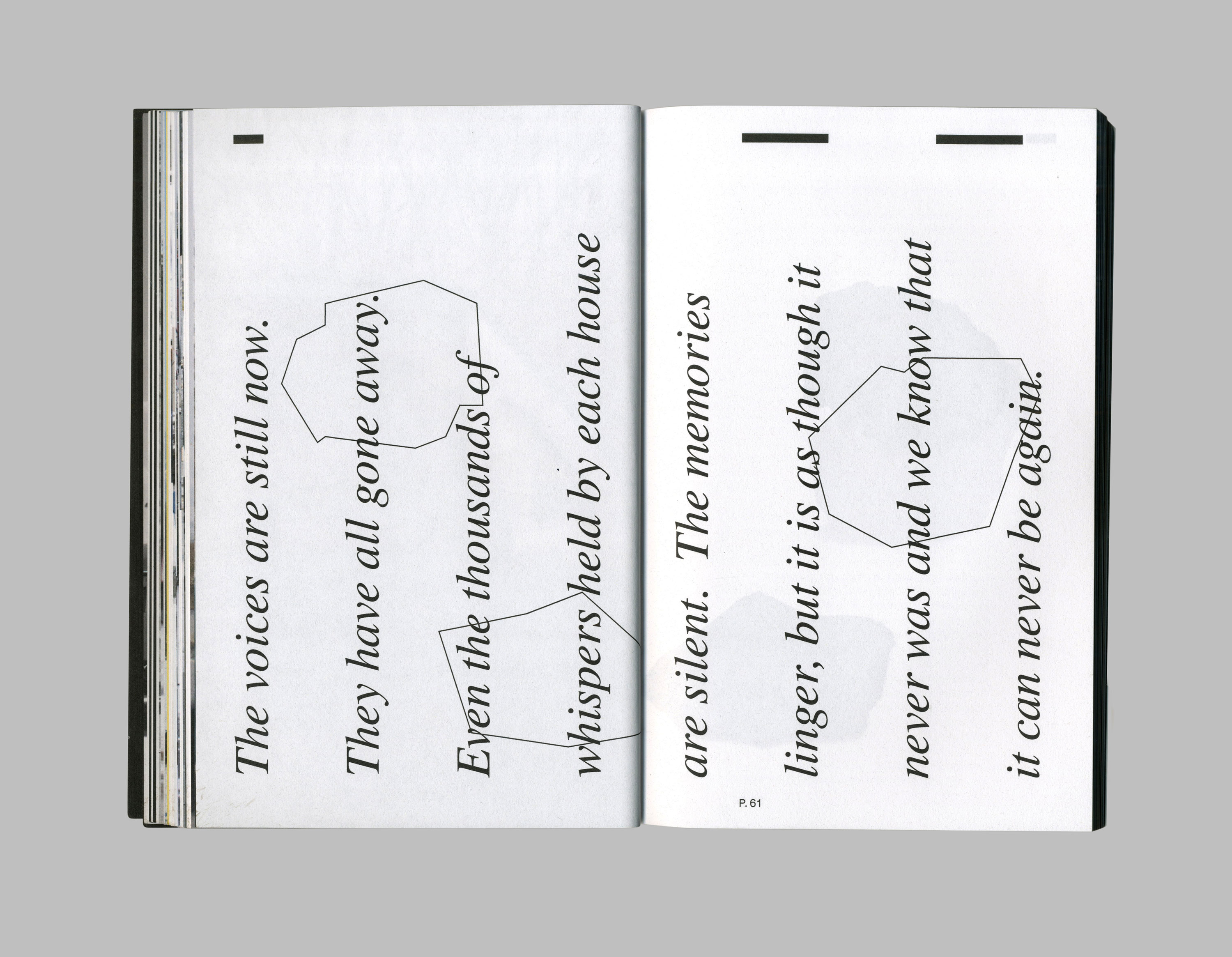
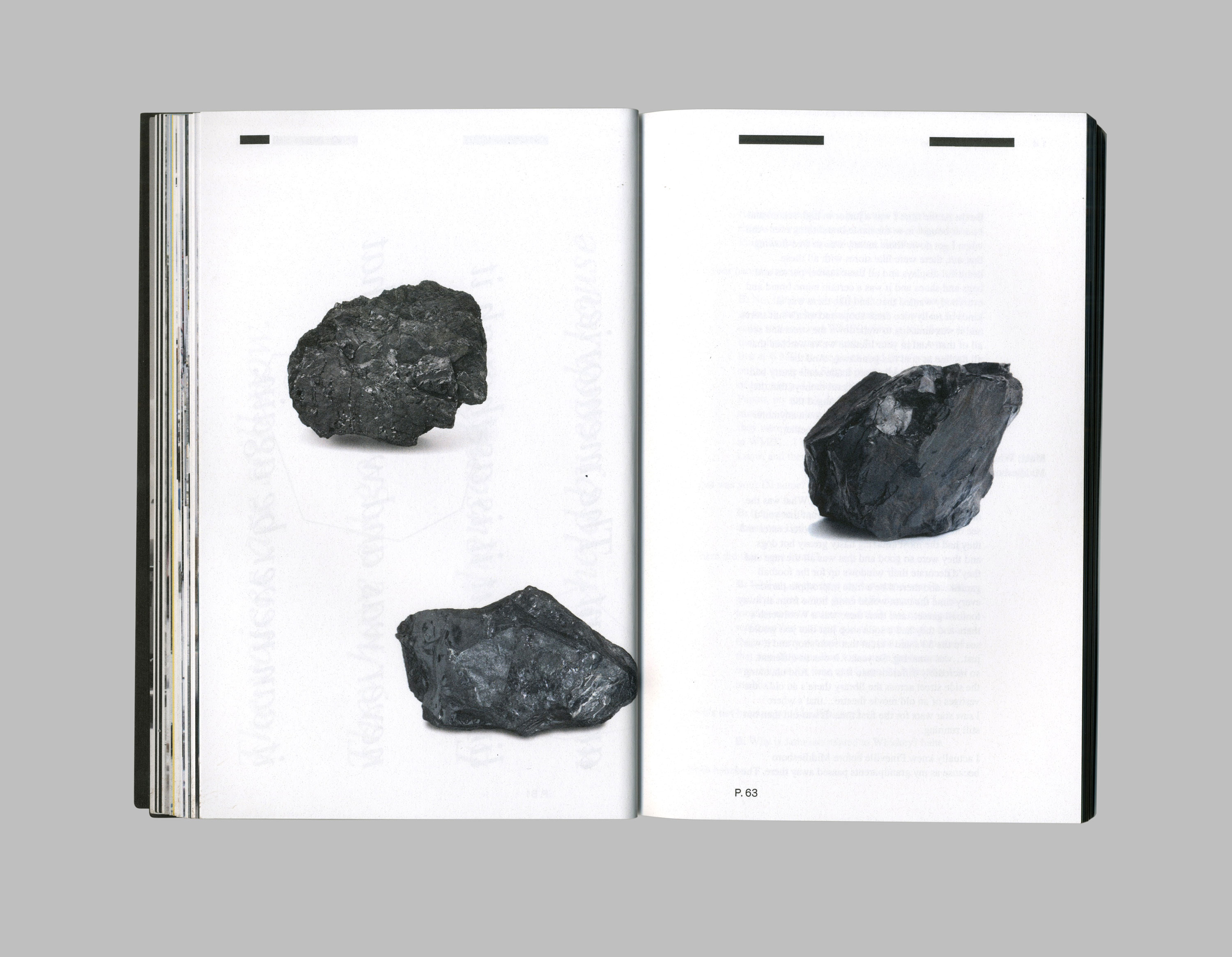
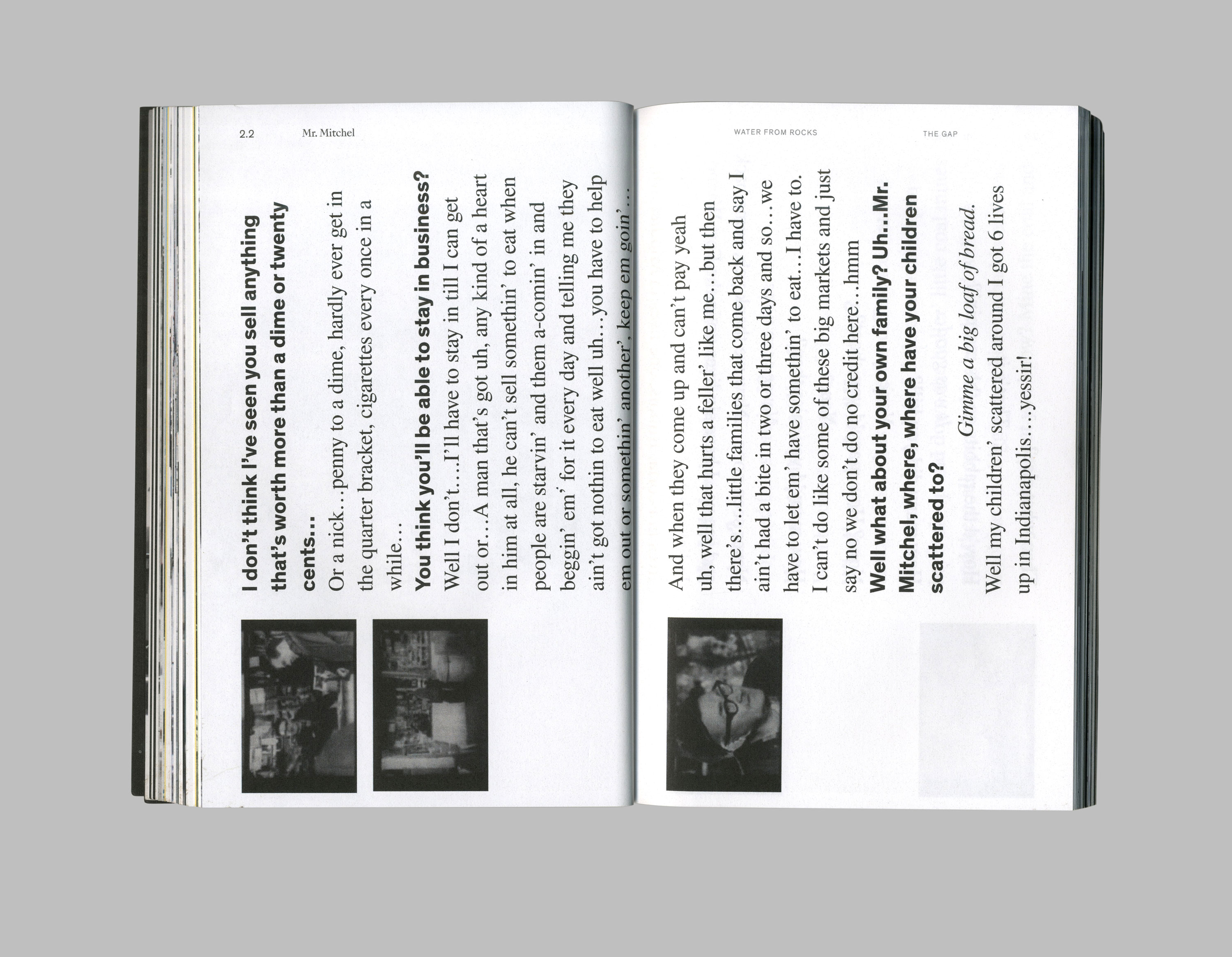
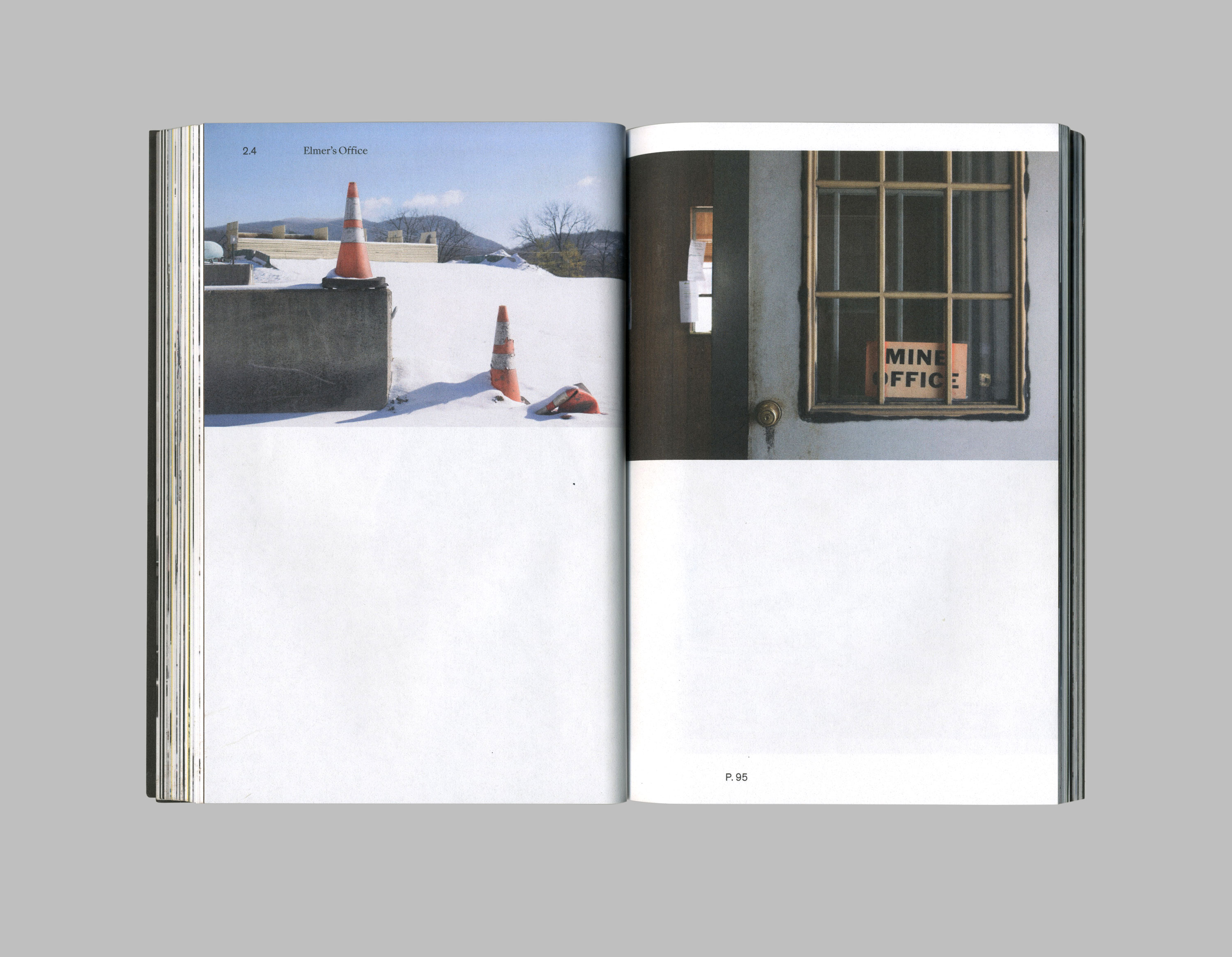
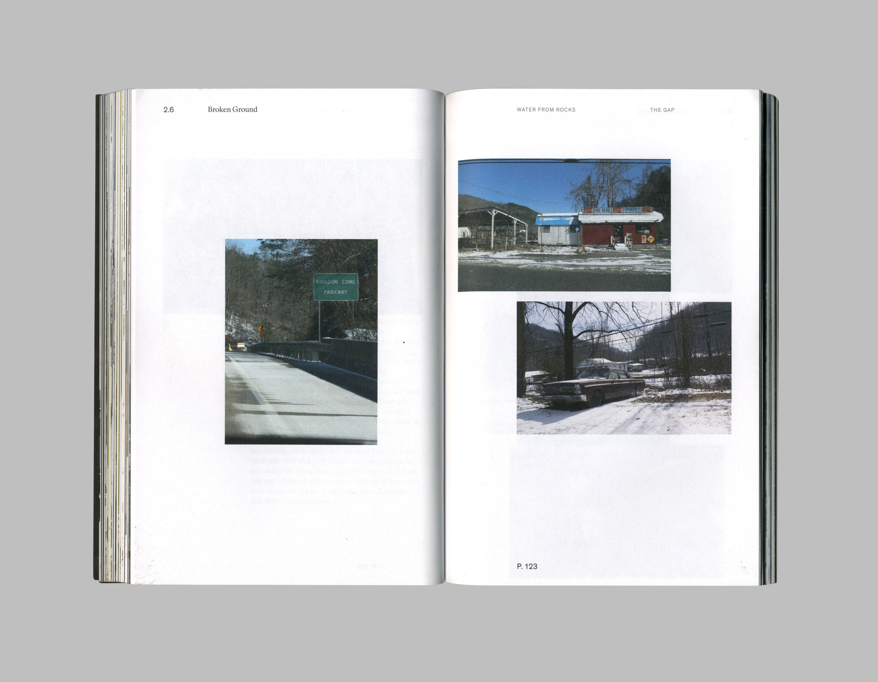
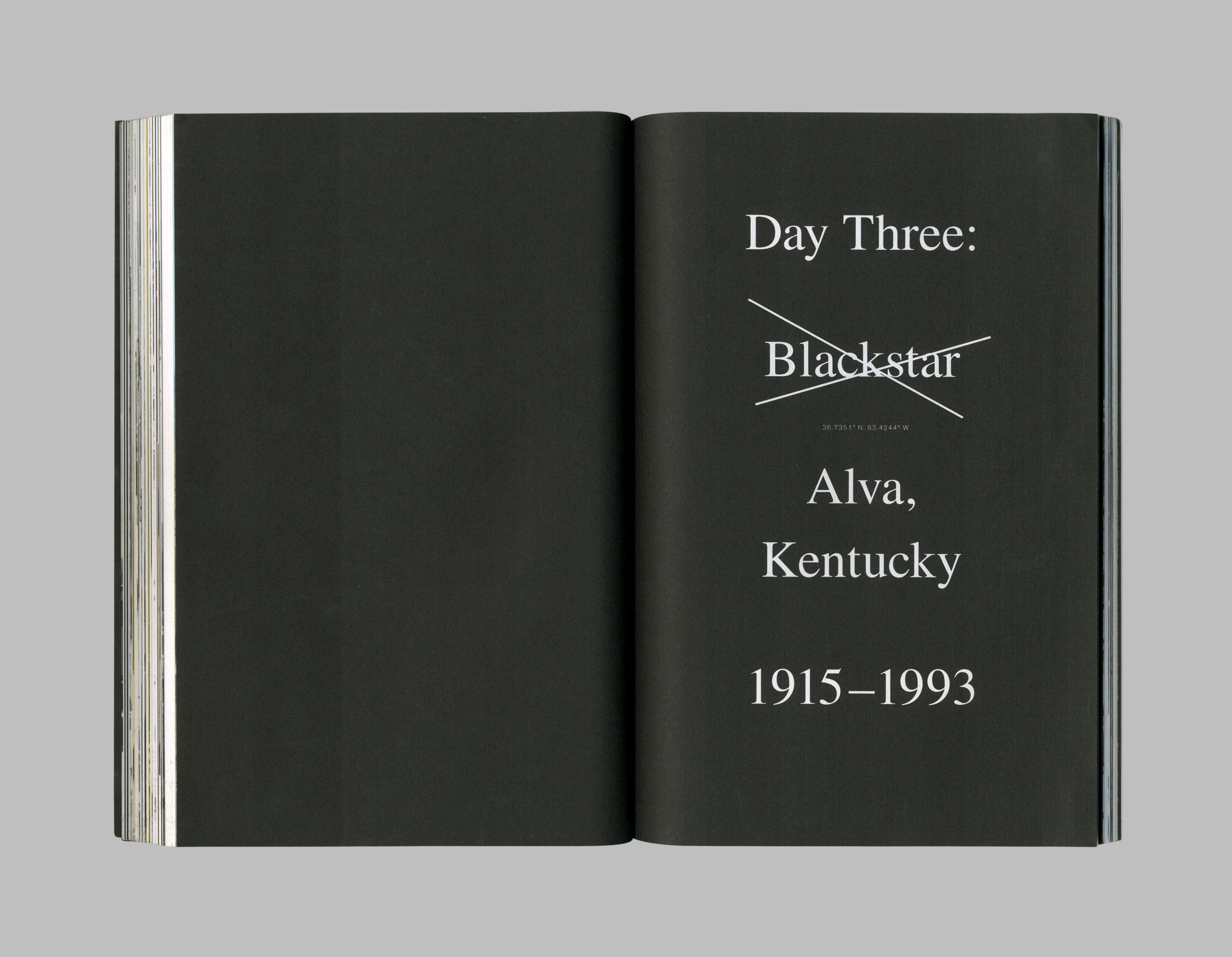
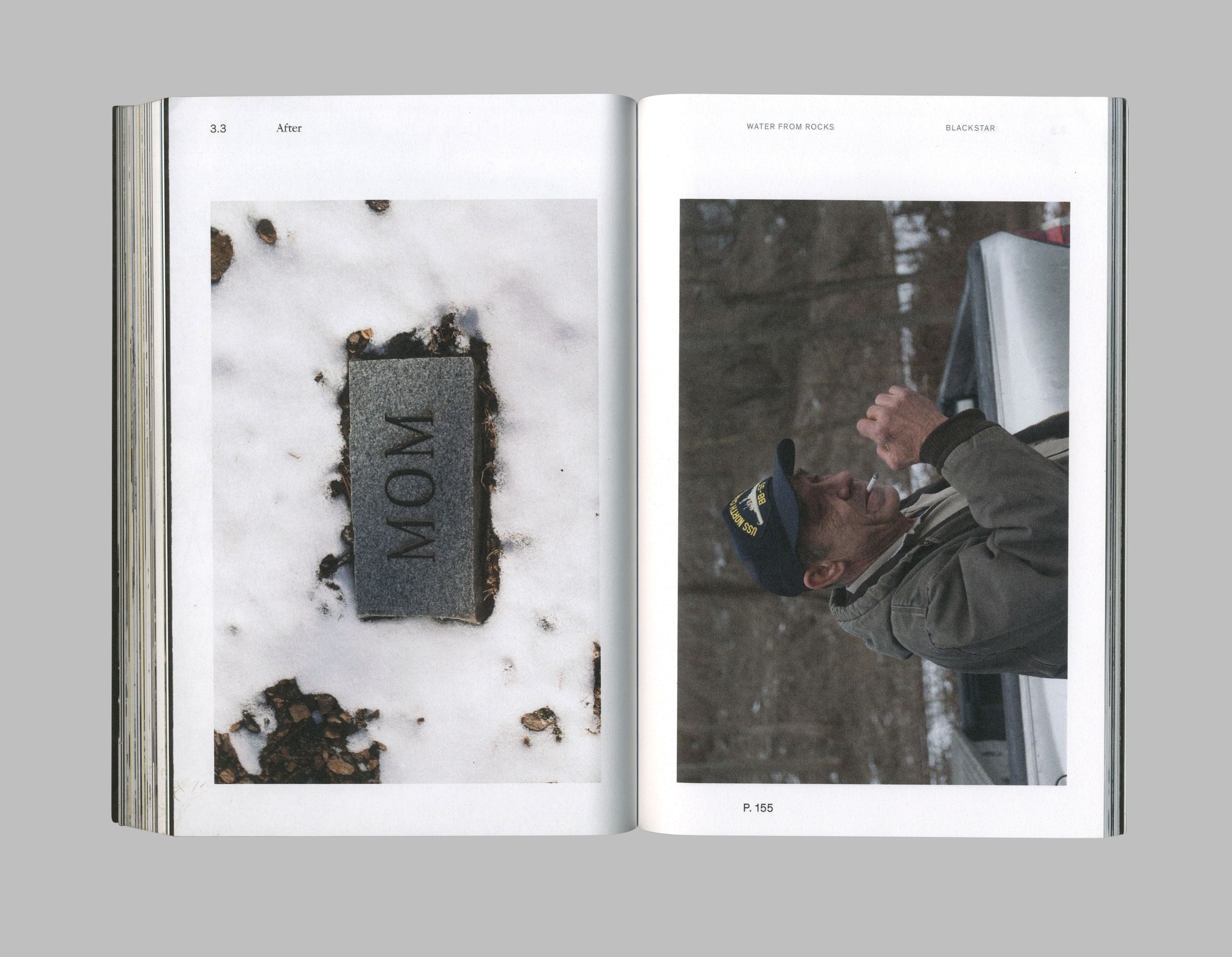
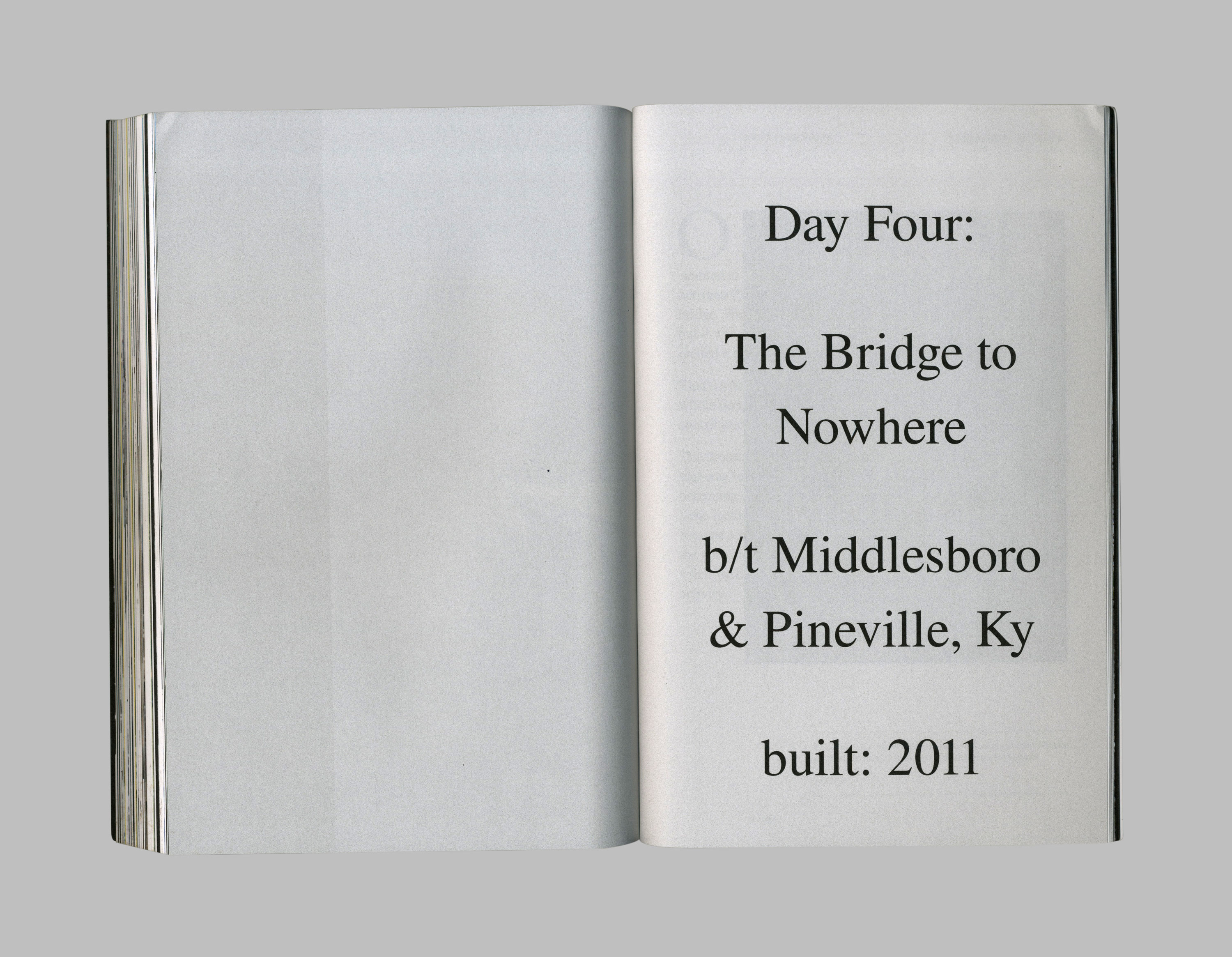
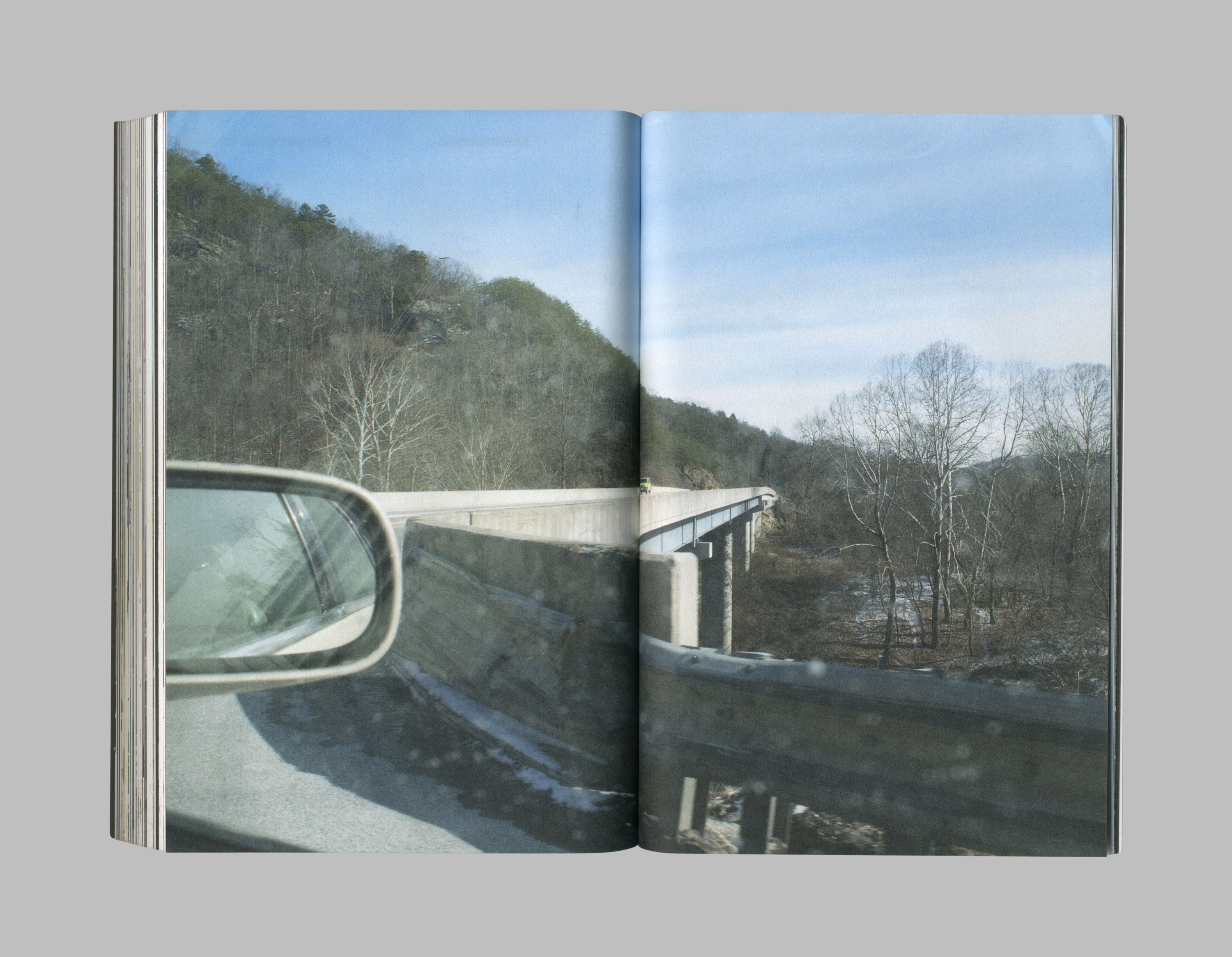
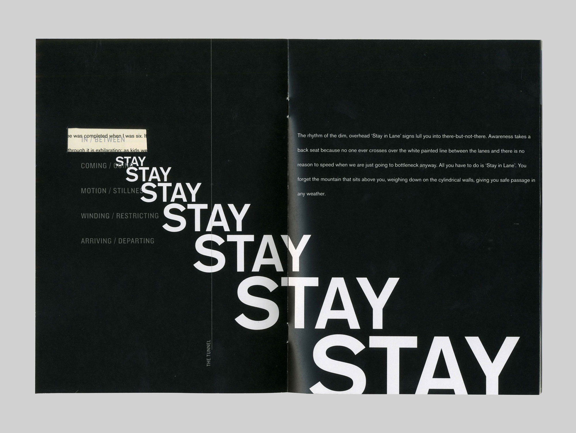
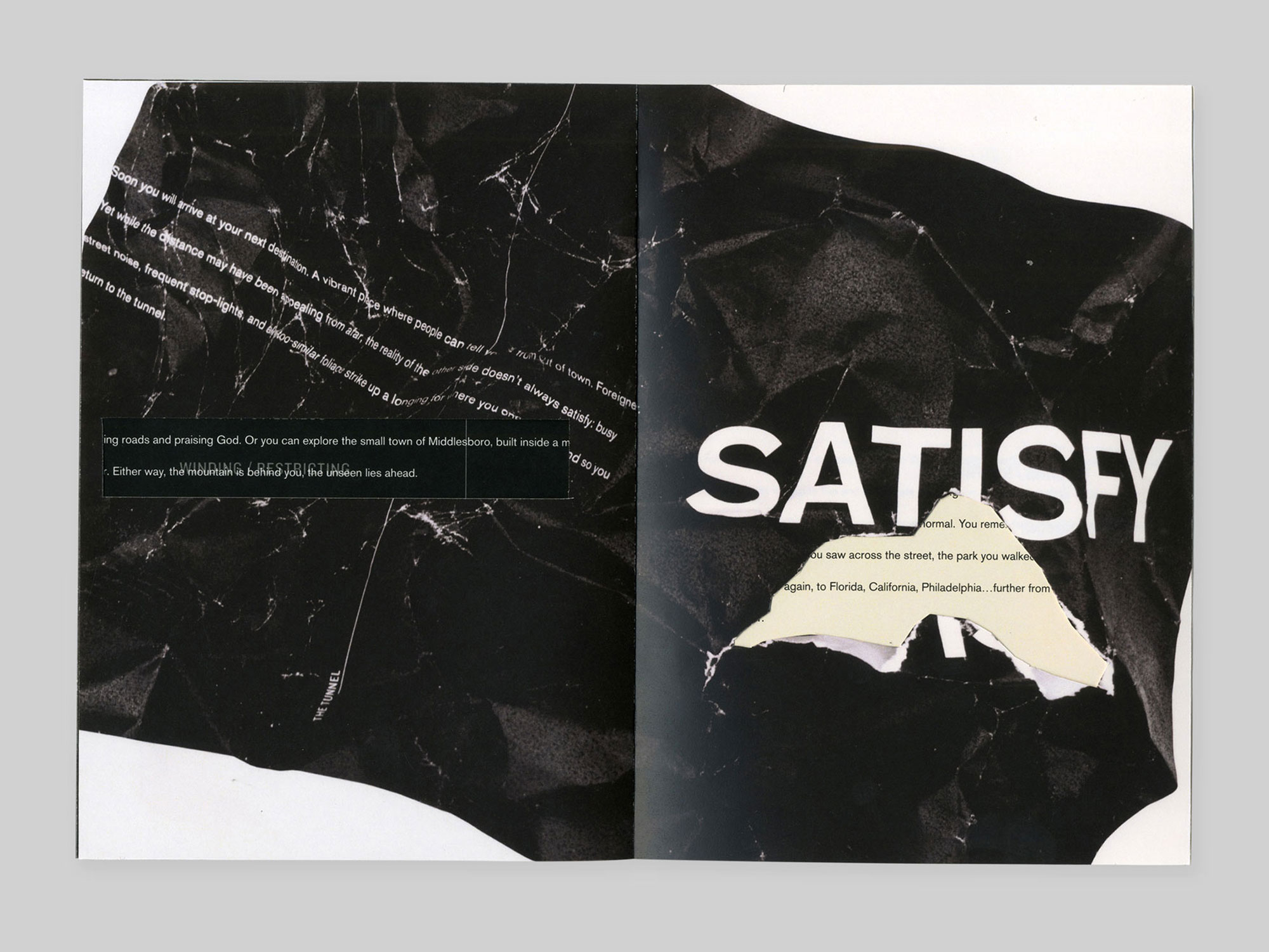
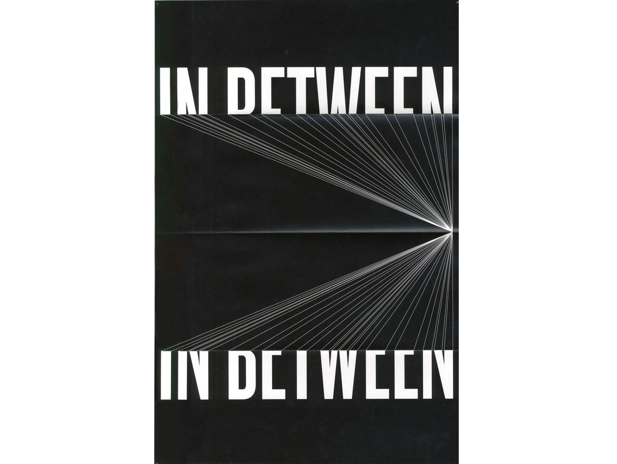
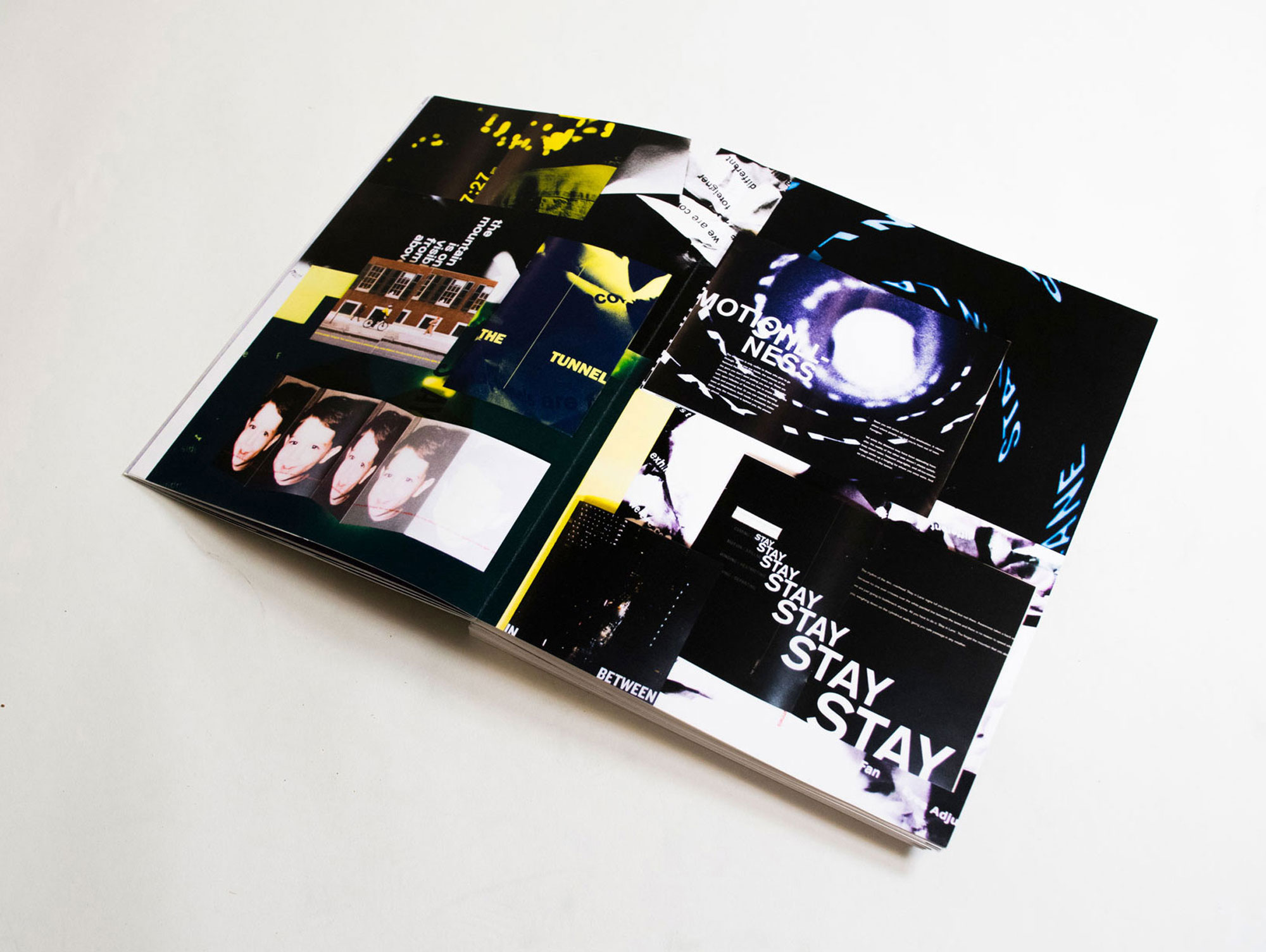
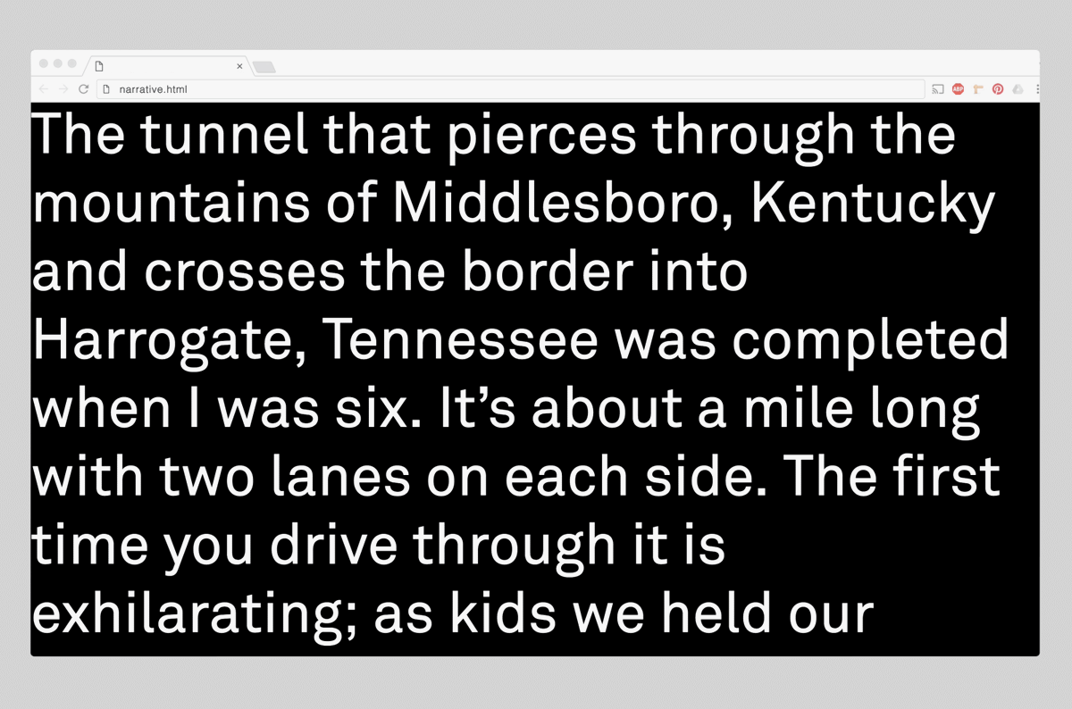
My senior thesis project; Water from Rocks is a 200-page book and photo essay that focuses on the shifts in culture in coal country over the past 50 years. I made a trip back to Kentucky during the winter of 2016 and juxtaposed images from the trip with interviews, a personal narrative, and archival footage to give a sense of the scarred landscape that I left behind. This project was awarded a juried citation by my department.
Assisting the book is an interactive website containing motion graphics and documentaries that I shot and edited.
A website proposal for Jesse Greenberg's nomadic art gallery, JAG. As an exhibition space without a permanent space, I created a list of interactive addresses that references the modern iOS scrolling interface. Created by my partner, the JAG logo is an appropriation of existing logos with the letters "j, a, g" in them as a sort of anti-aesthetic statement.
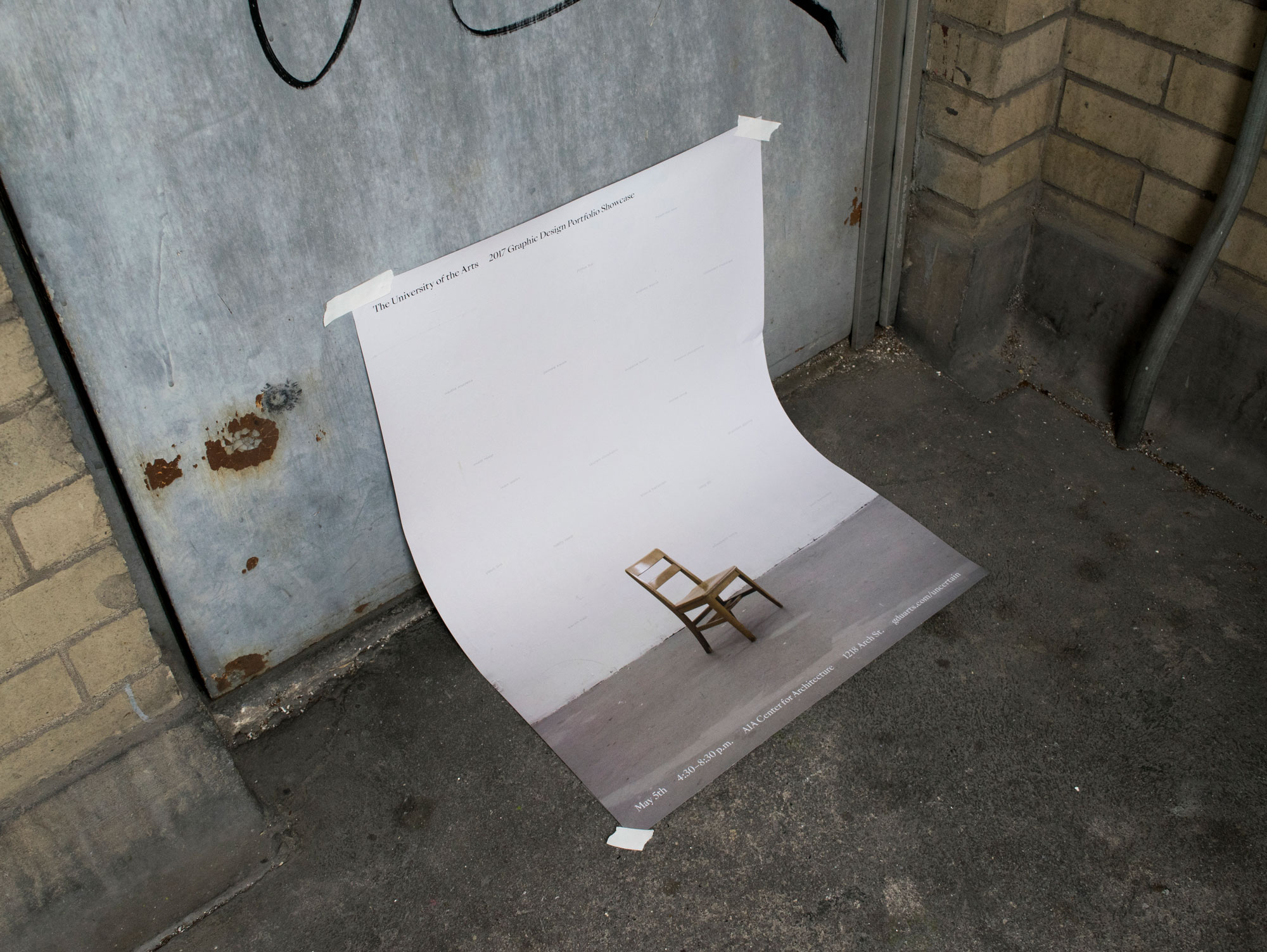
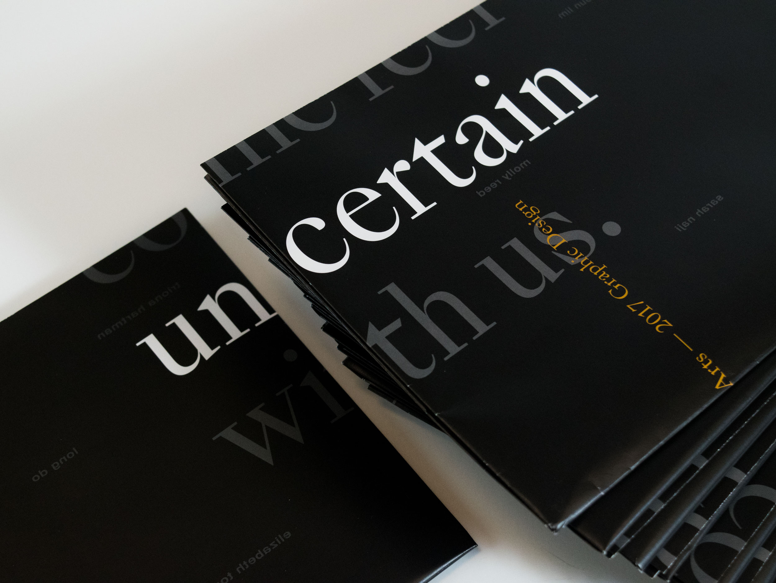
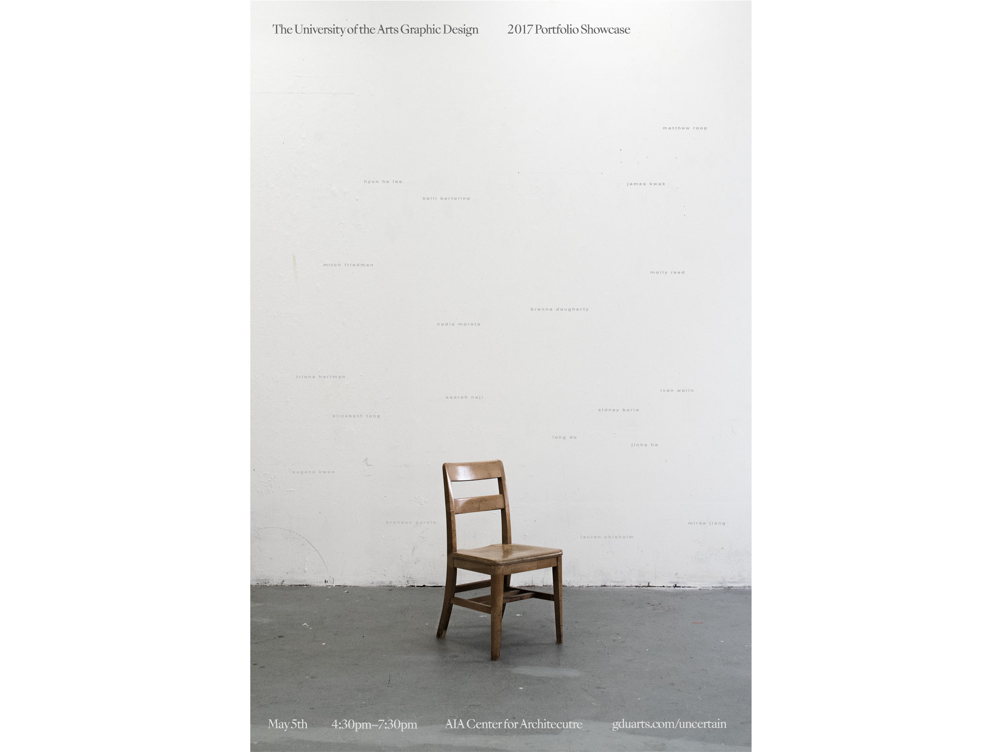
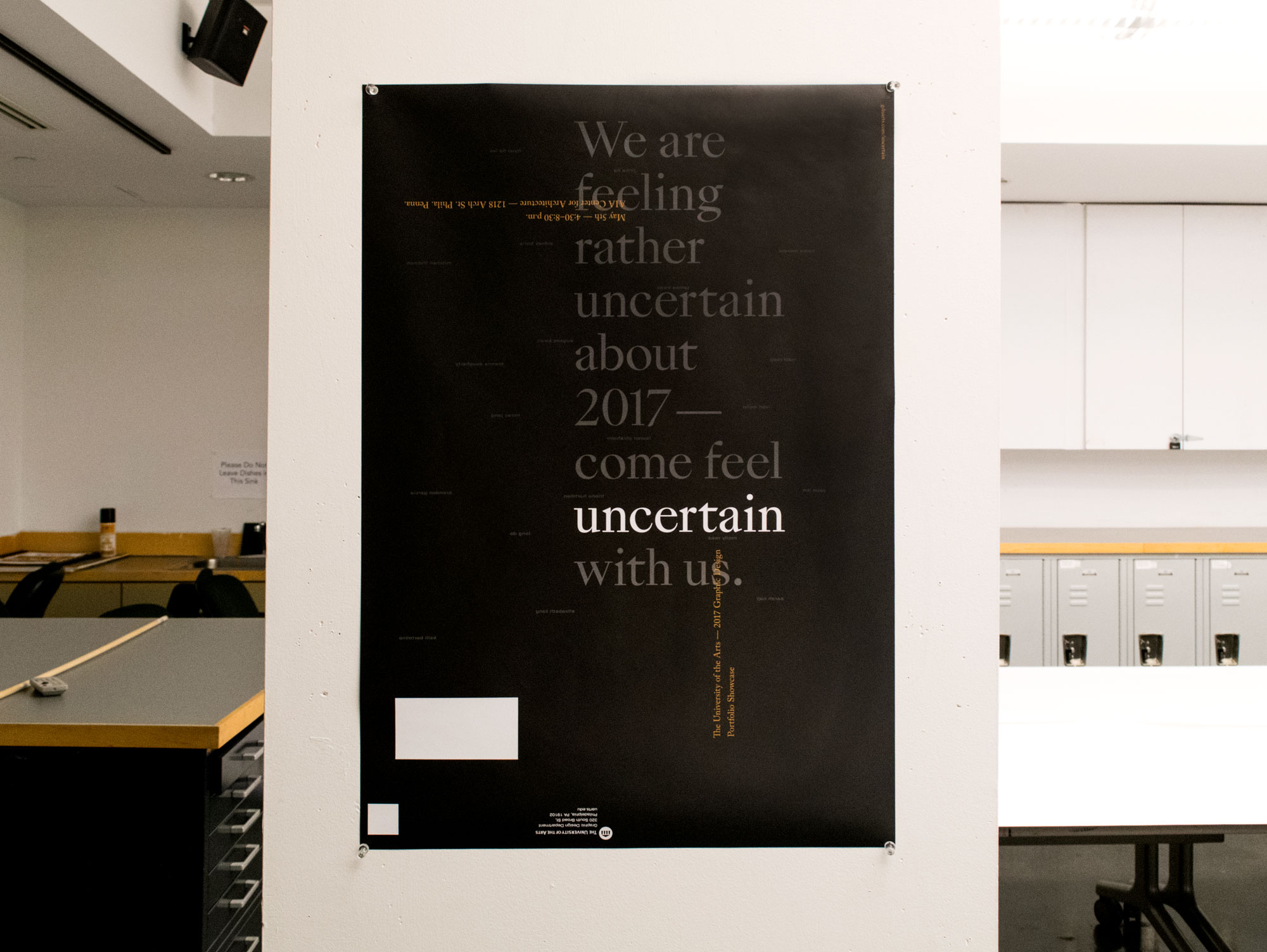
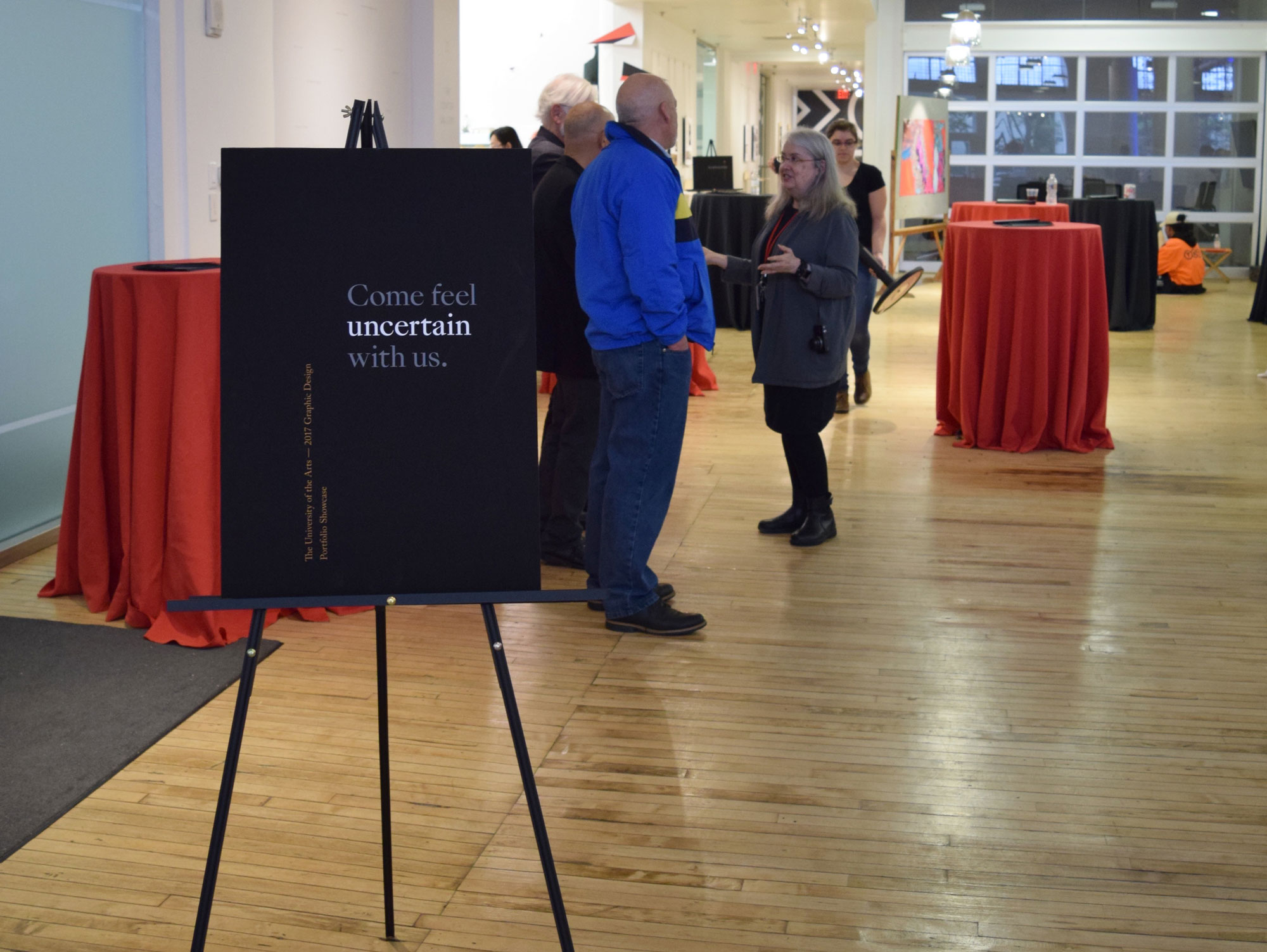
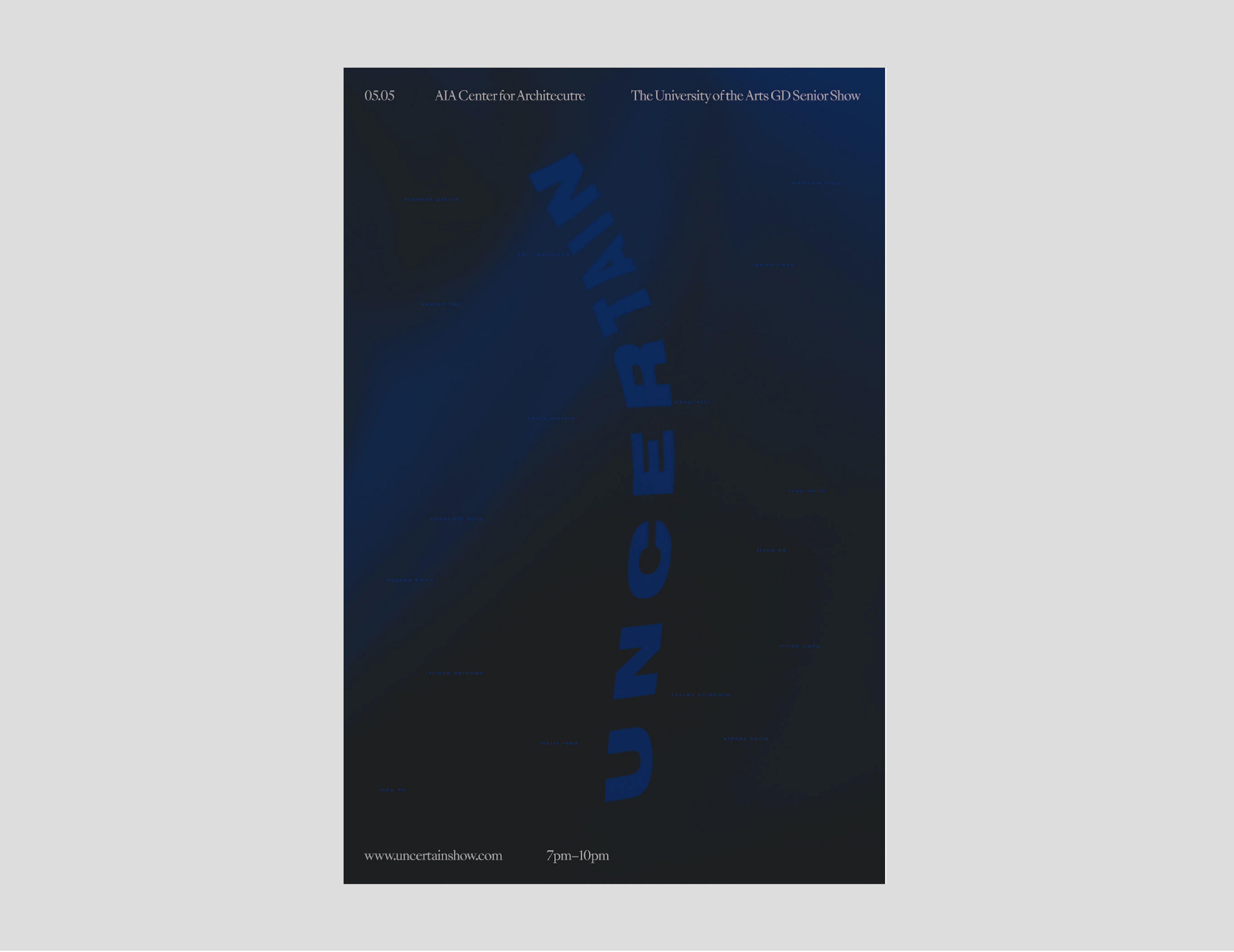
Branding for the UArts Senior Design Show. My team focused on the feeling of Uncertainty which was abundant both for students and for the general public in 2017. By using a plain wooden chair, we created a metaphor with which each of our class members could interact, turning the website into an interactive poster and fun experience for the class.
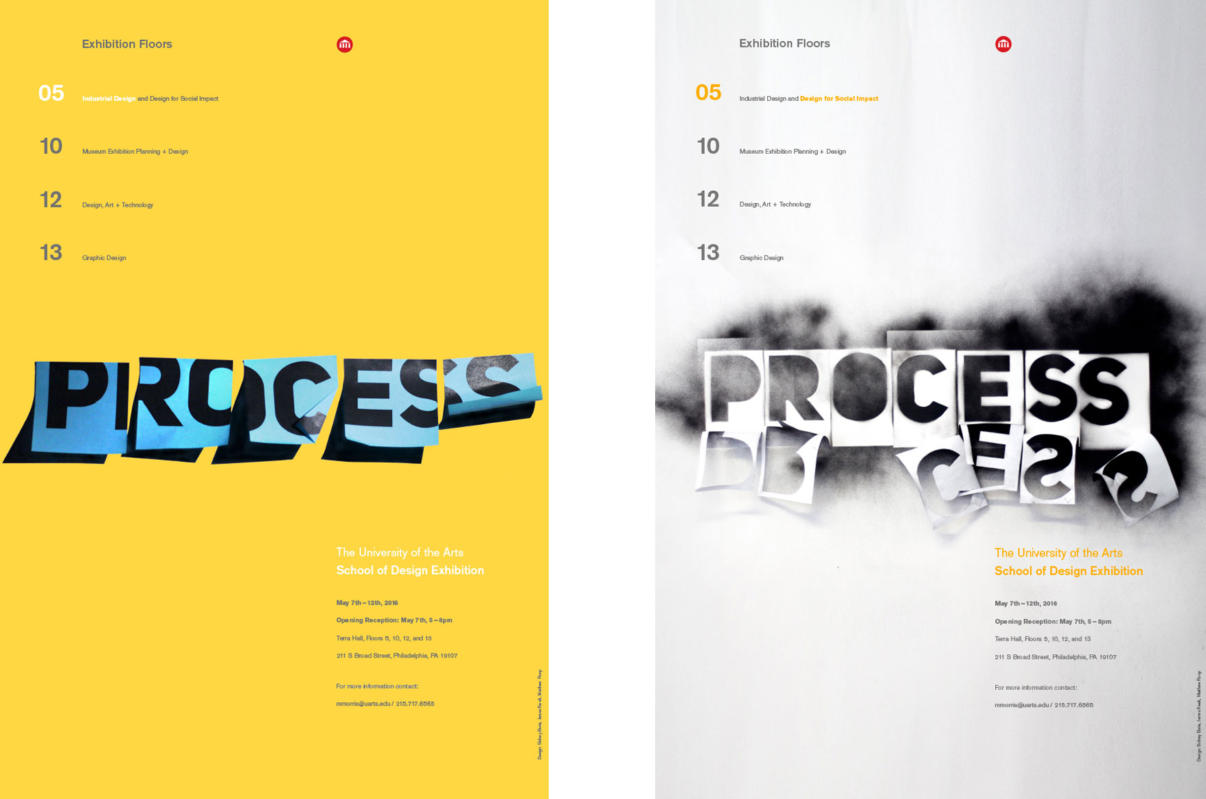
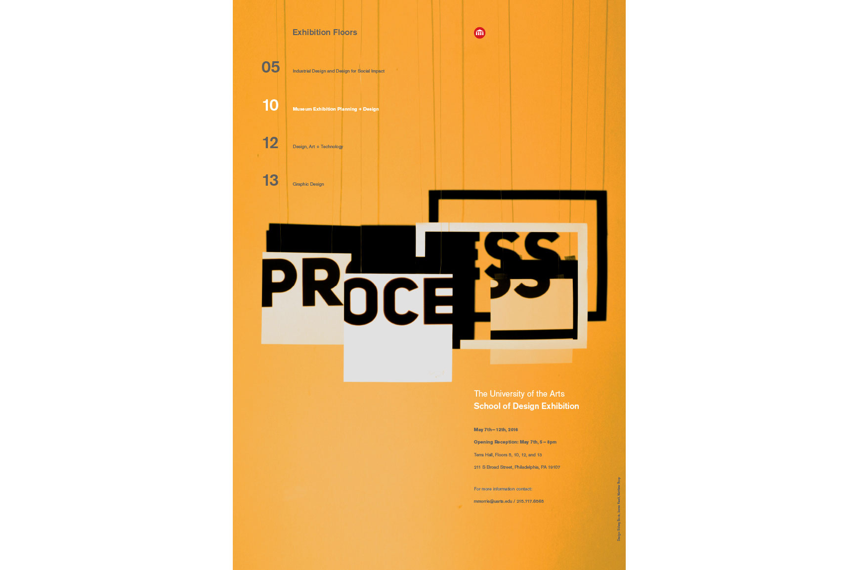
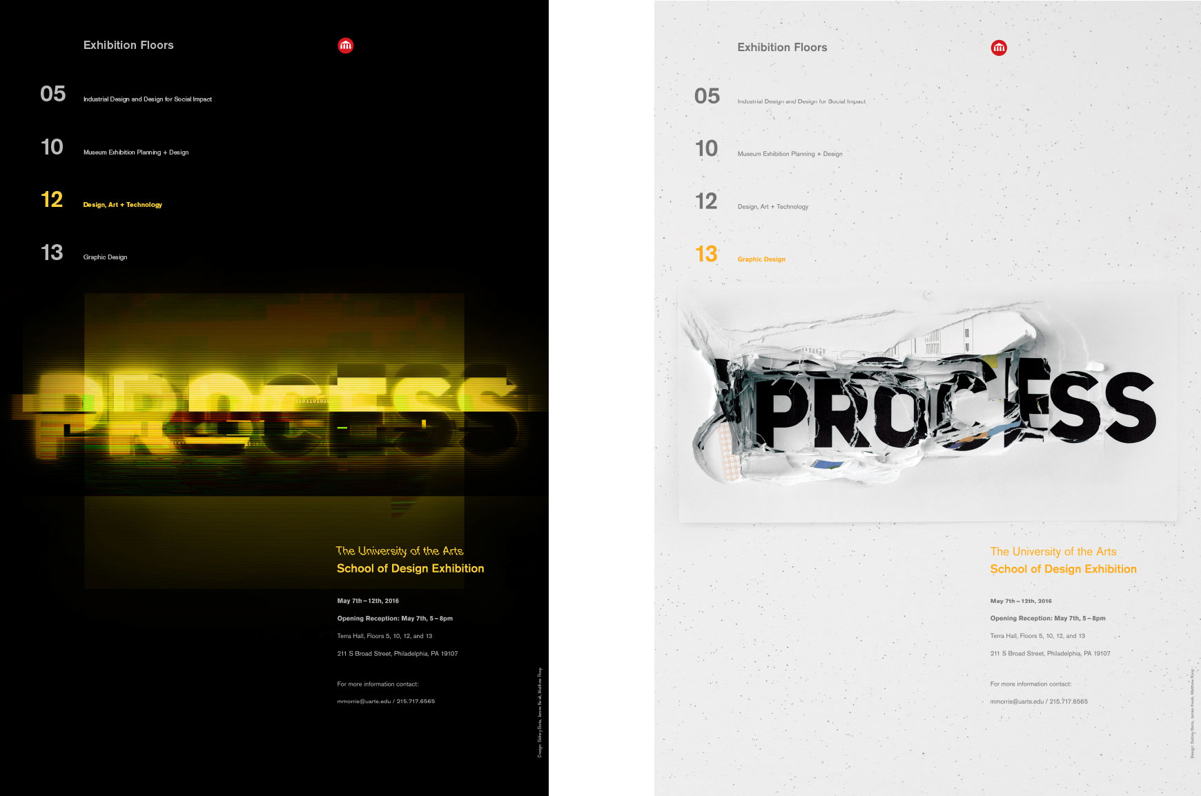
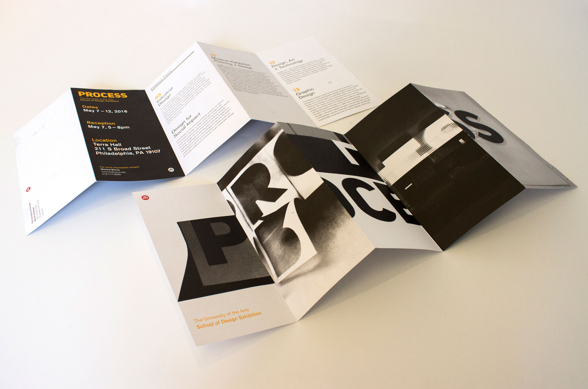
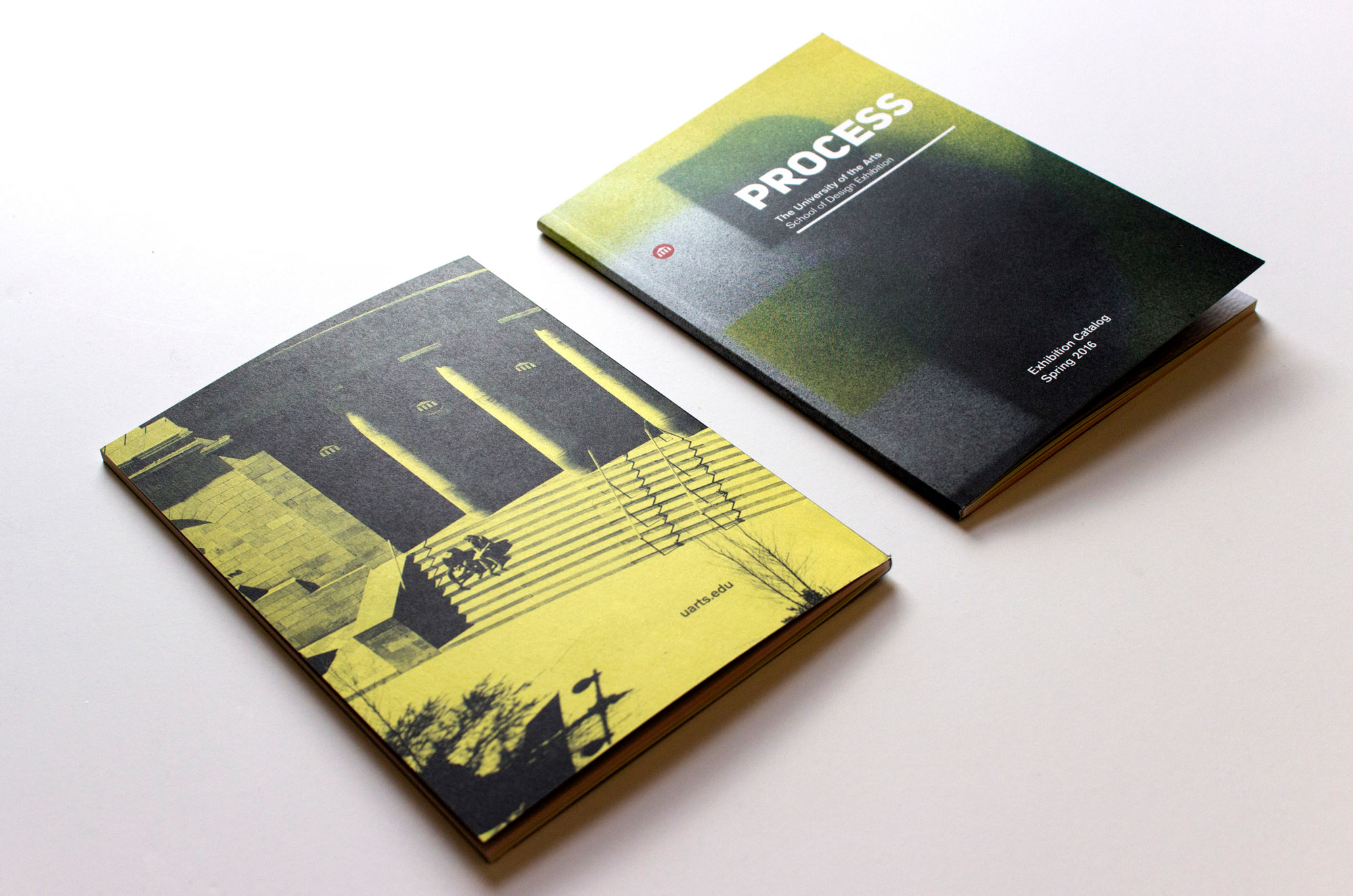
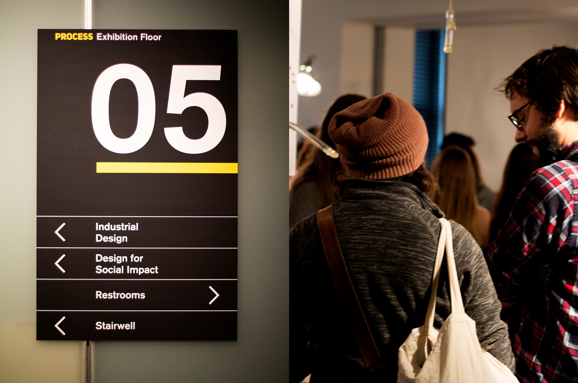
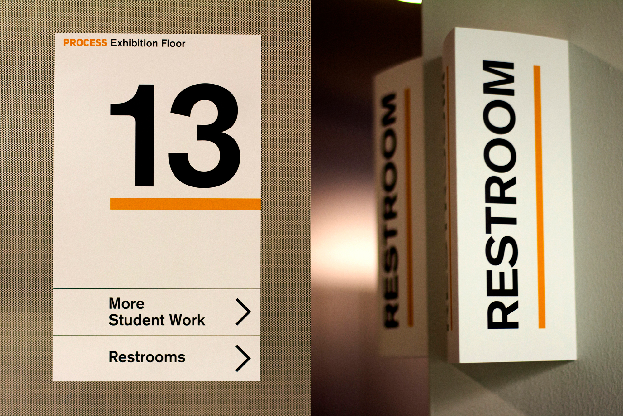
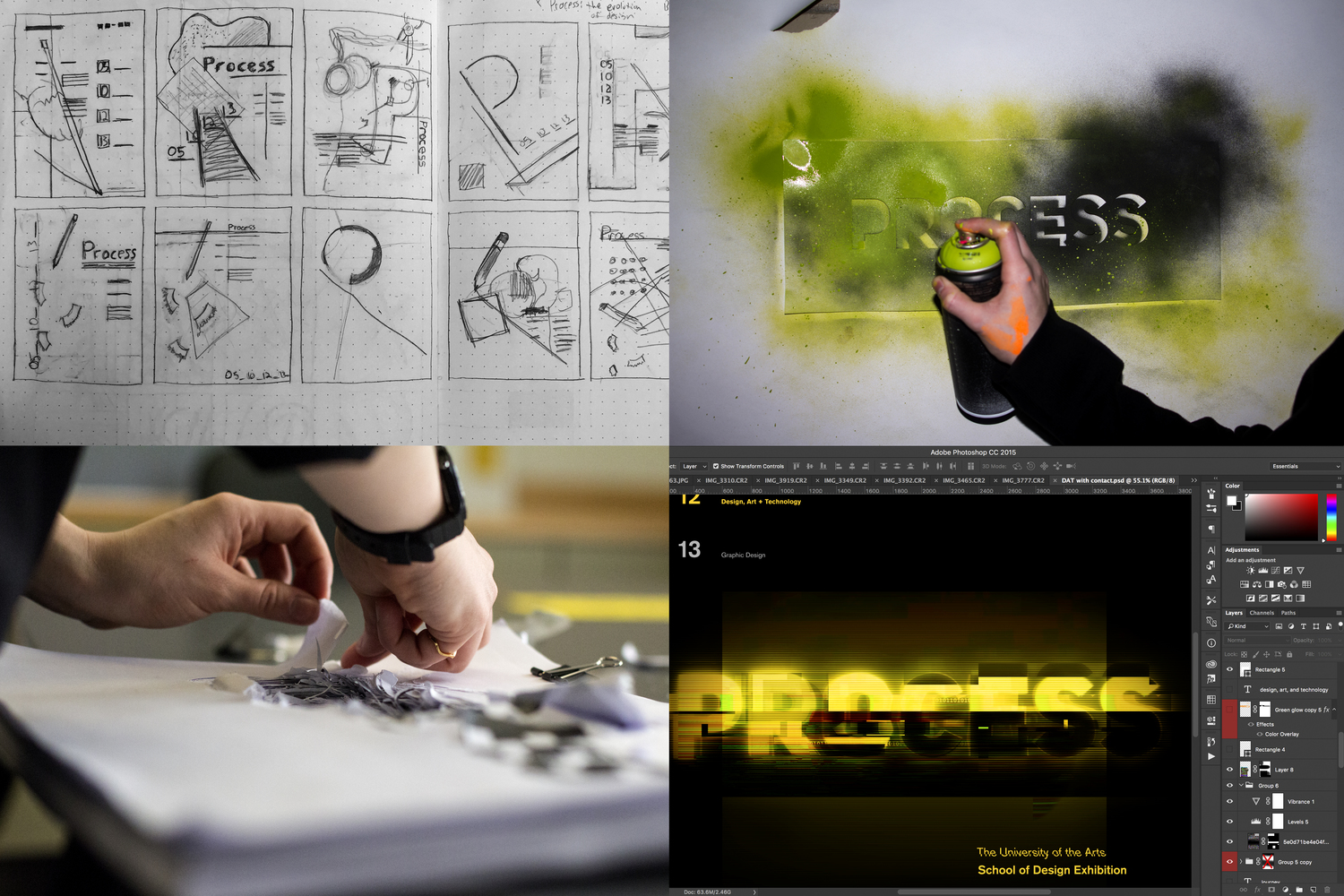
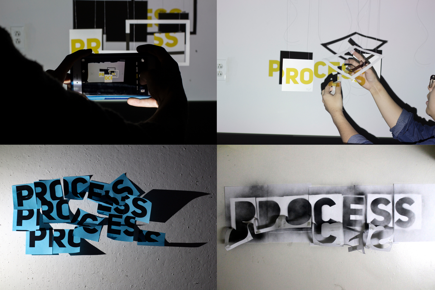
Exhibition branding and design for UArts’ 2016 School of Design show. My team crafted the theme "Process" as the most important aspect and takeaway of design education. We then visualized this concept by creating a series of expressions unique to each of our departments.
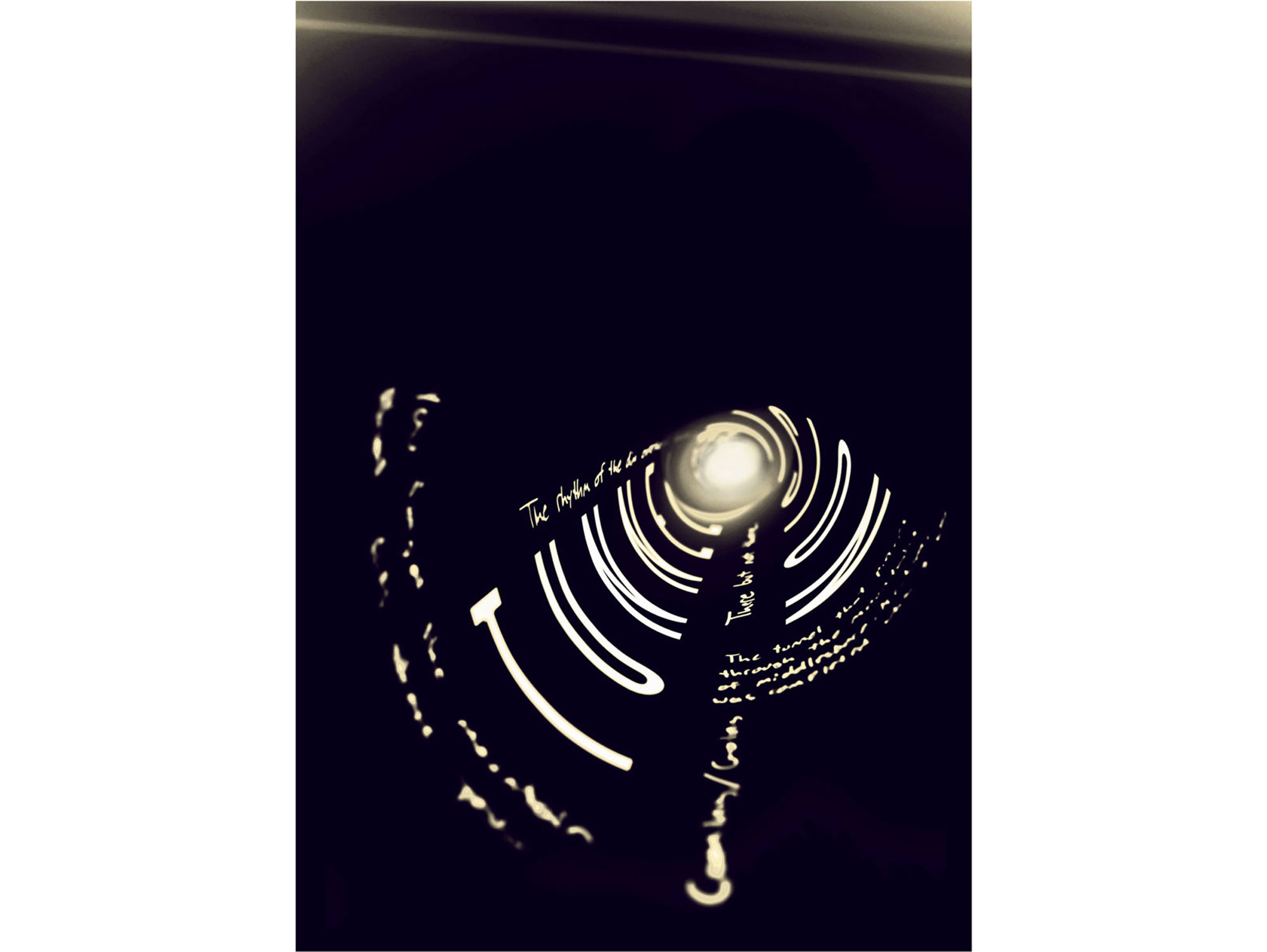
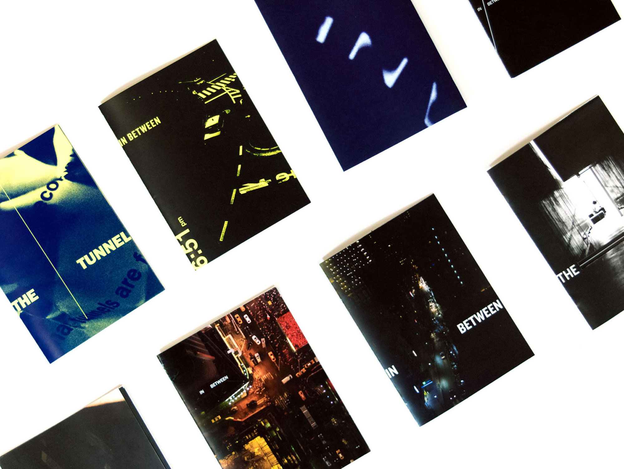
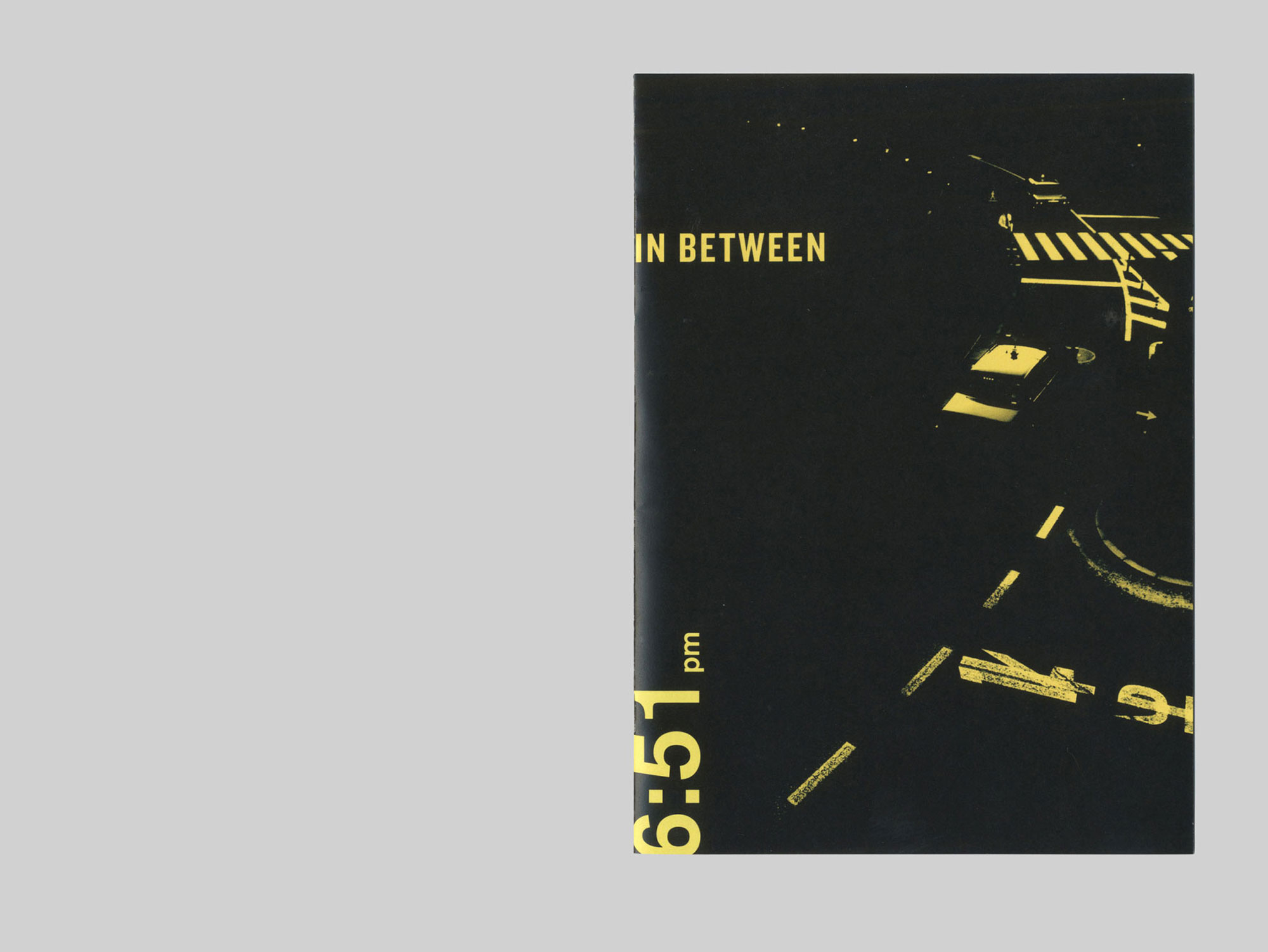
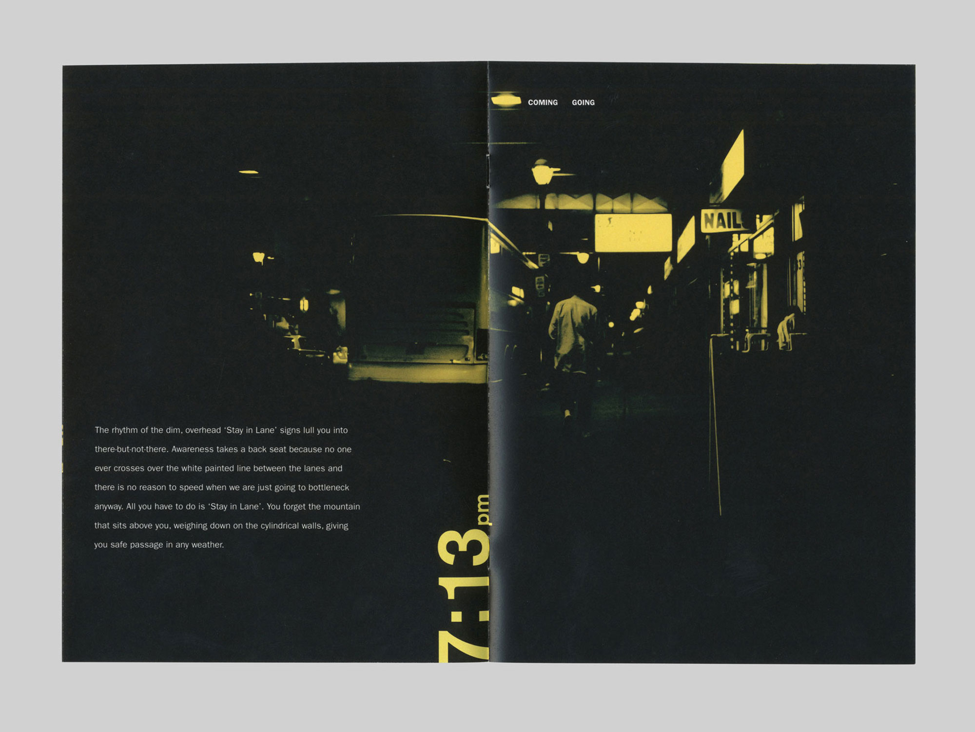
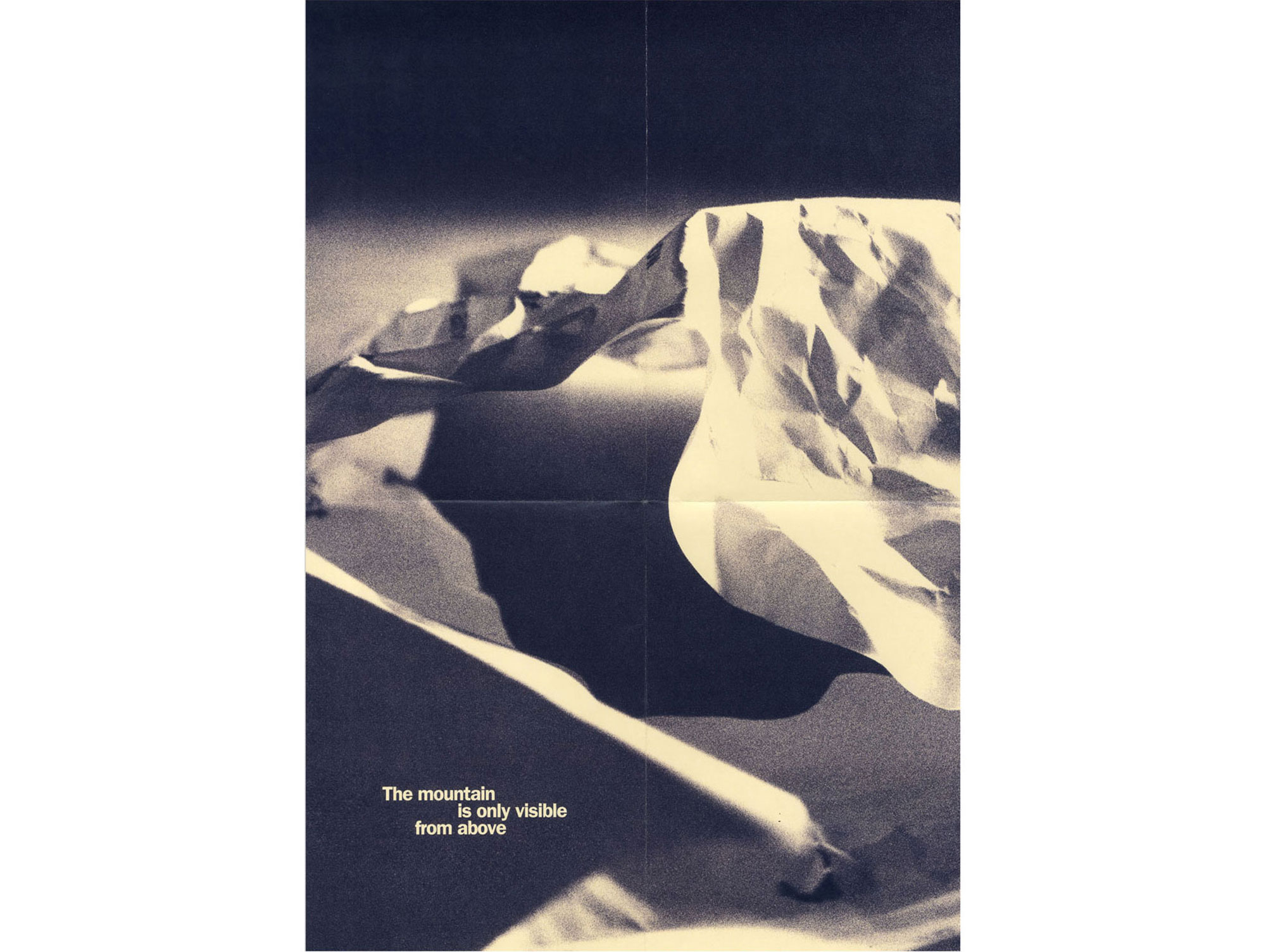
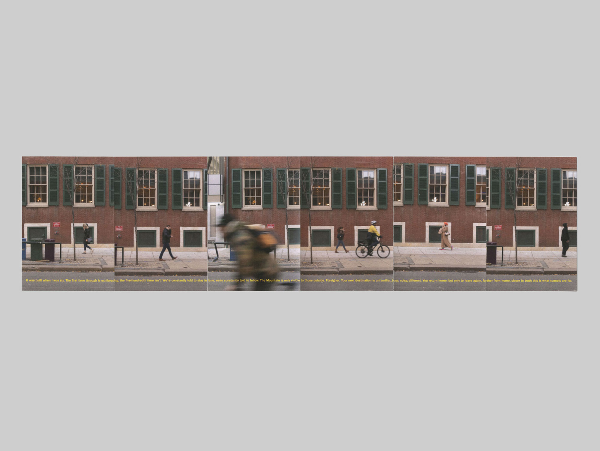
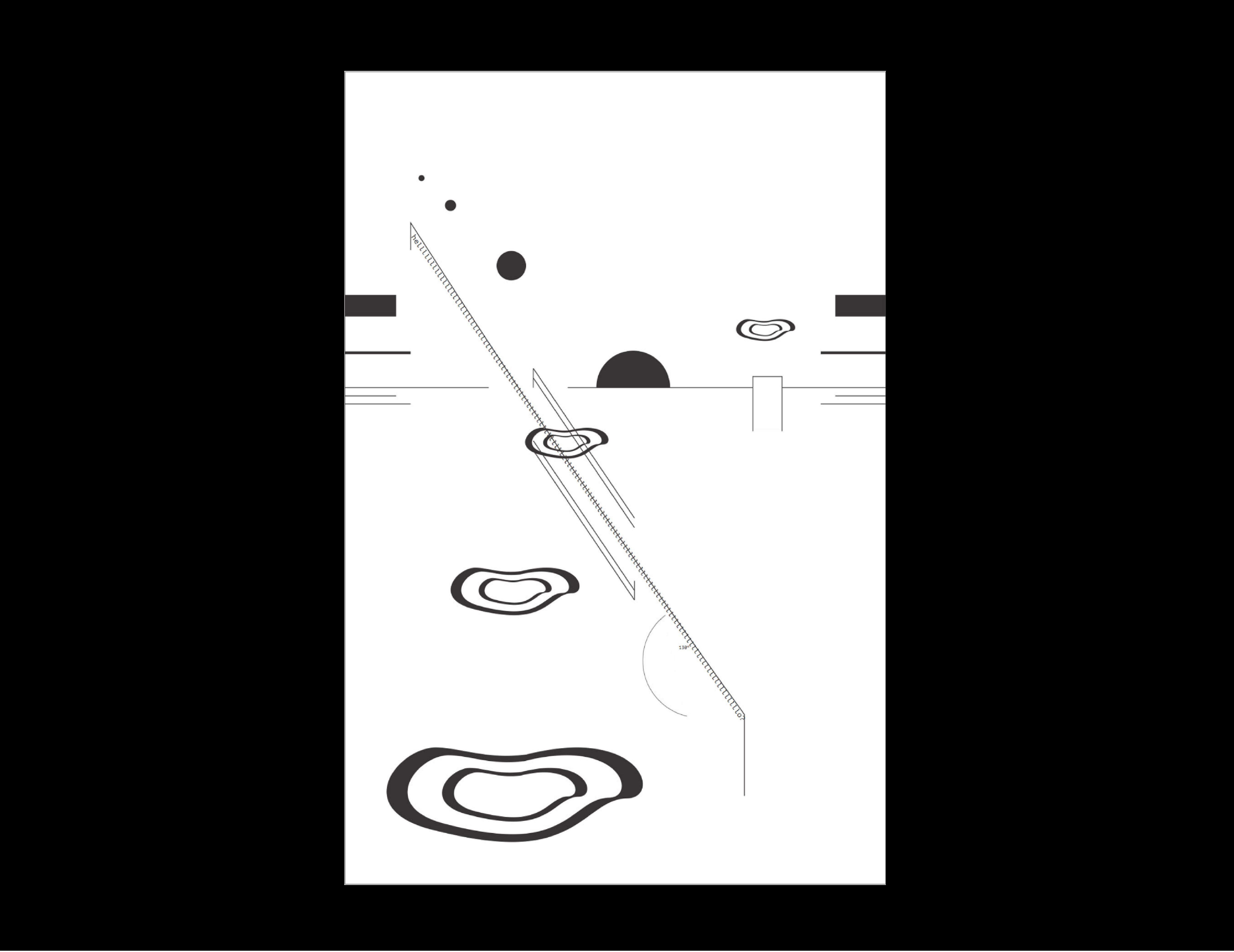
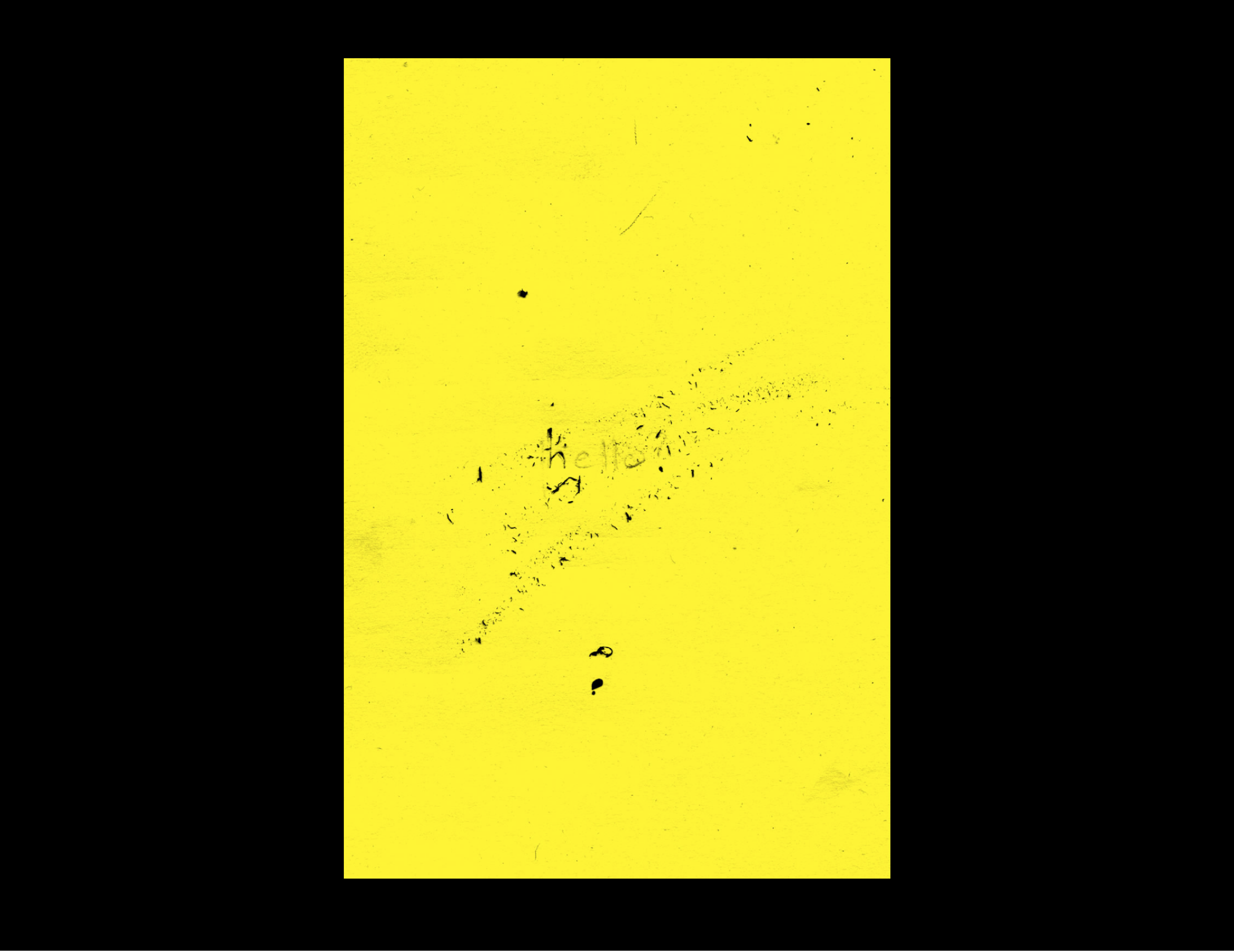
Using a self-written short story as a starting point, this project explores various mediums and visual expressions in an effort to change and emphasize different elements of the story.
Various designs I either created for myself or internally at work.
I was asked to create a motion graphic for our school's very popular art exhibition in the city. I filmed different people crafting a red circle out of multiple materials, which relates back to the red Art Unleashed circle logo.

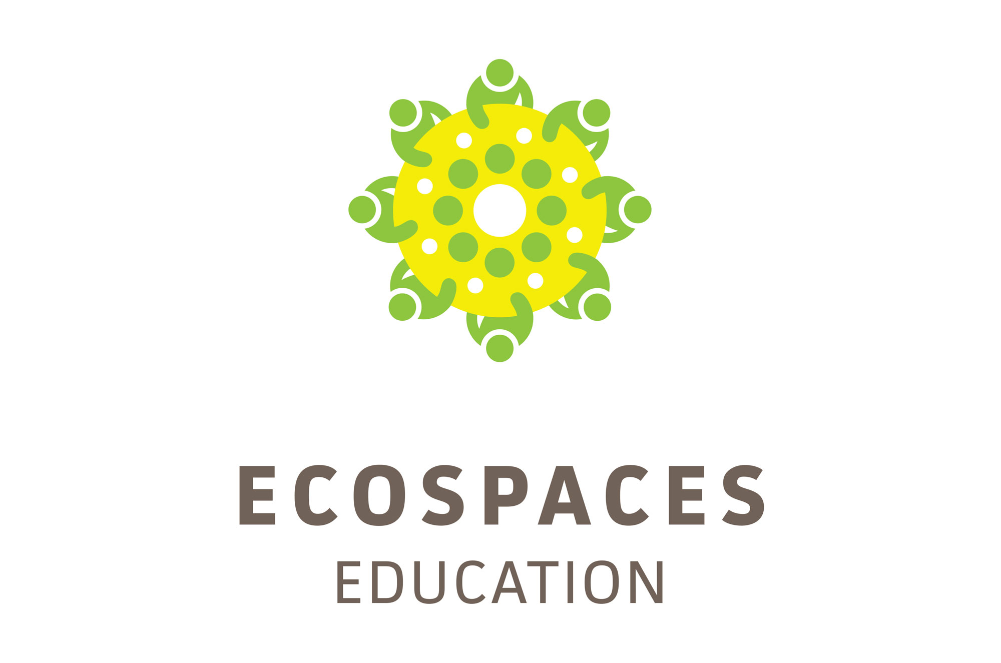
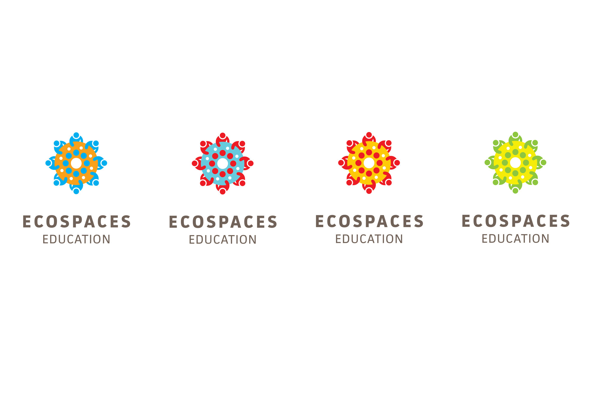
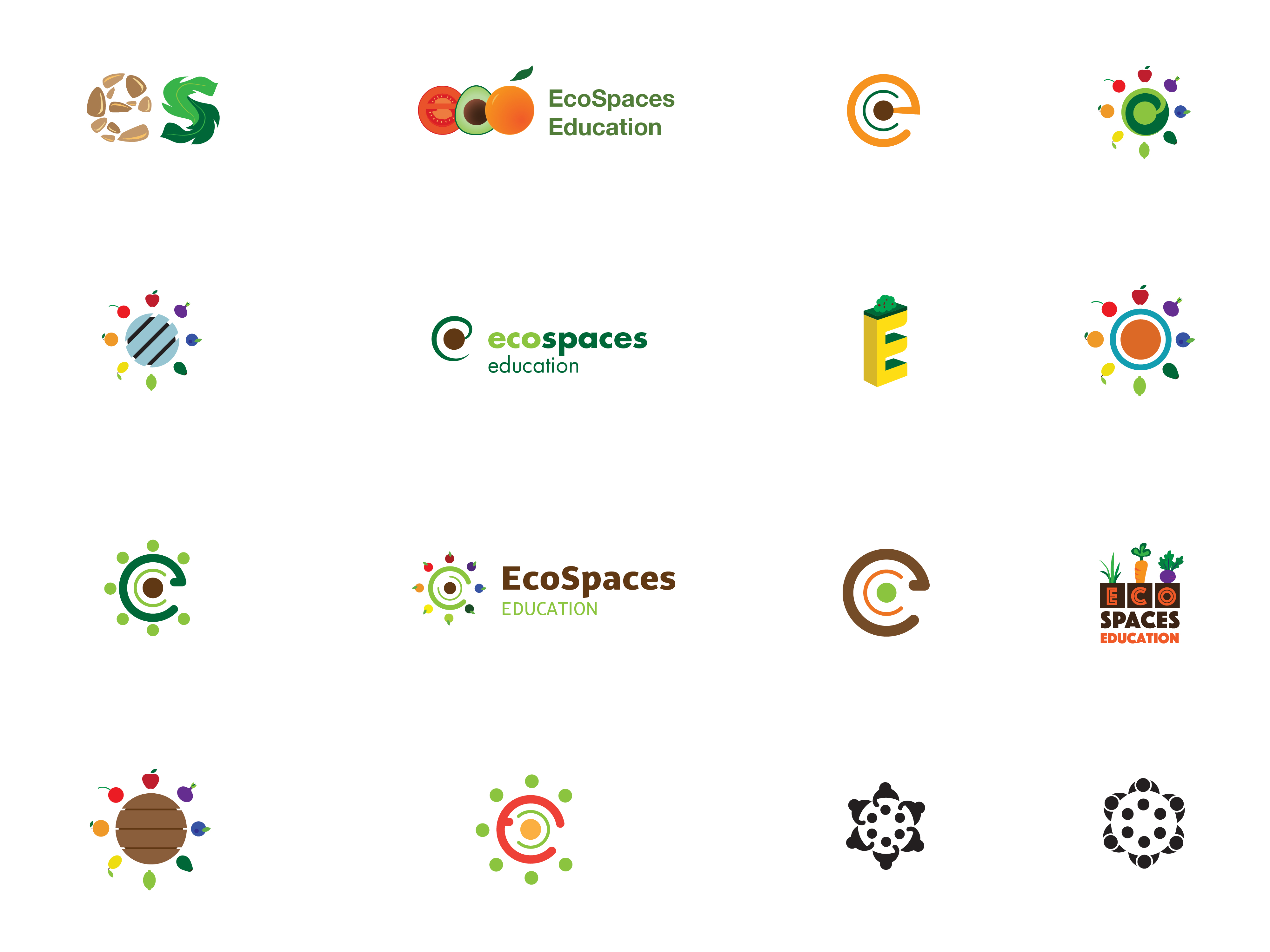
A logo for EcoSpaces, a program which combines farm to table and healthy eating practices into a k–8 curriculum. Designed during my internship with Ideas on Purpose.
A logo for New Jersey Health Initiatives. An organization dedicated to health services in New Jersey.
A visual exploration of a passage from Ernest Hemingway's famous book. The scene focuses on a near-death experience.
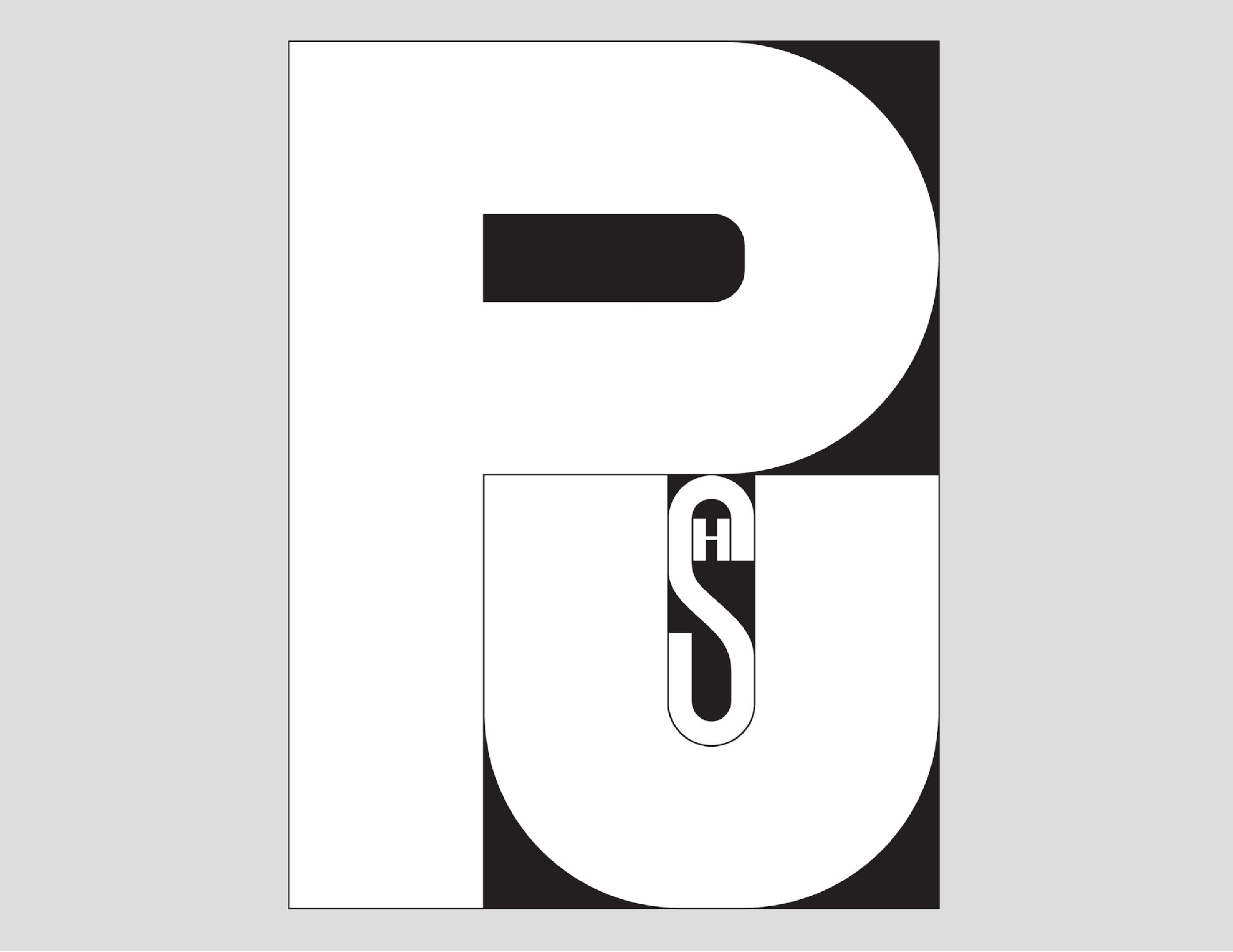
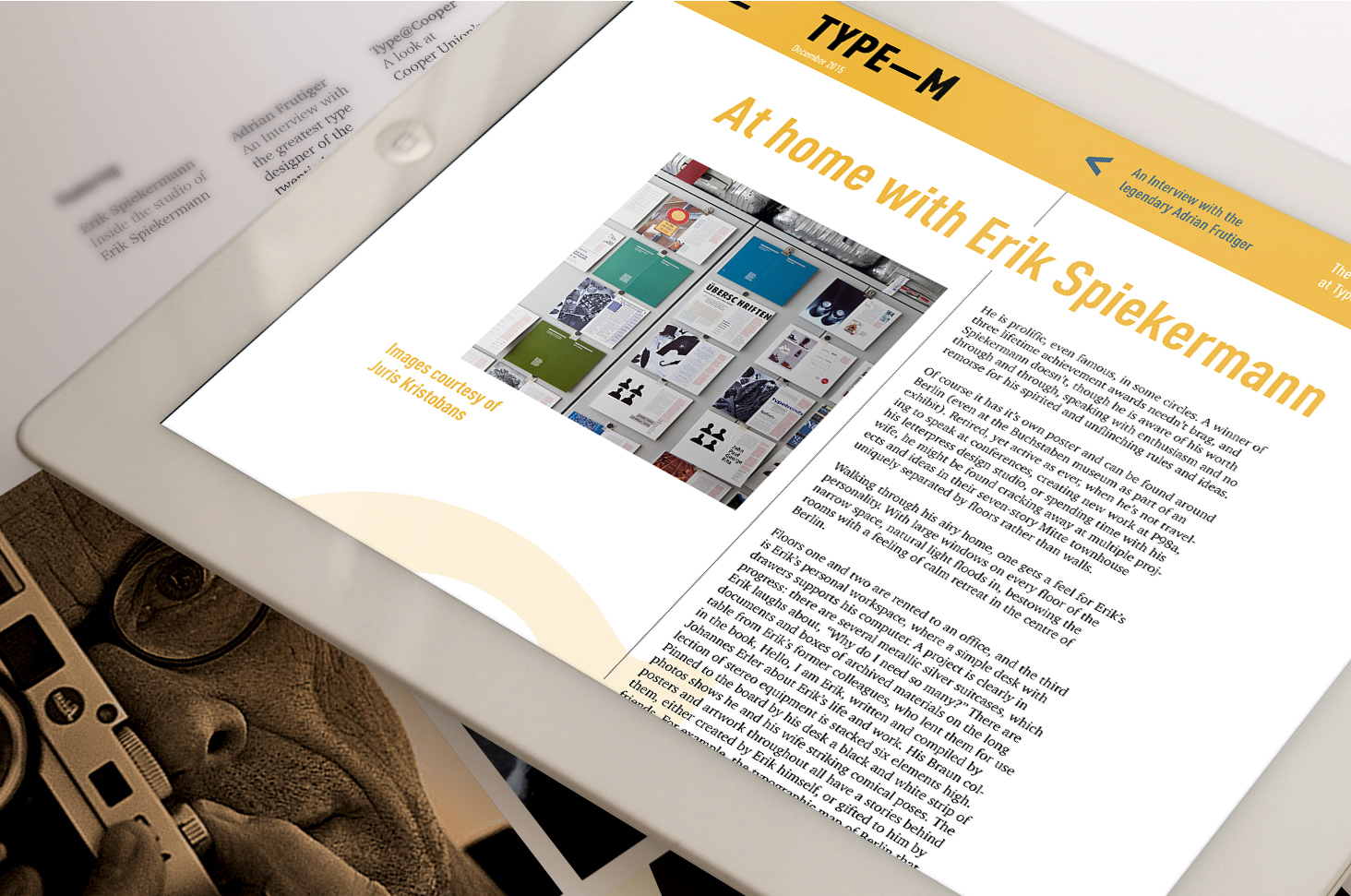
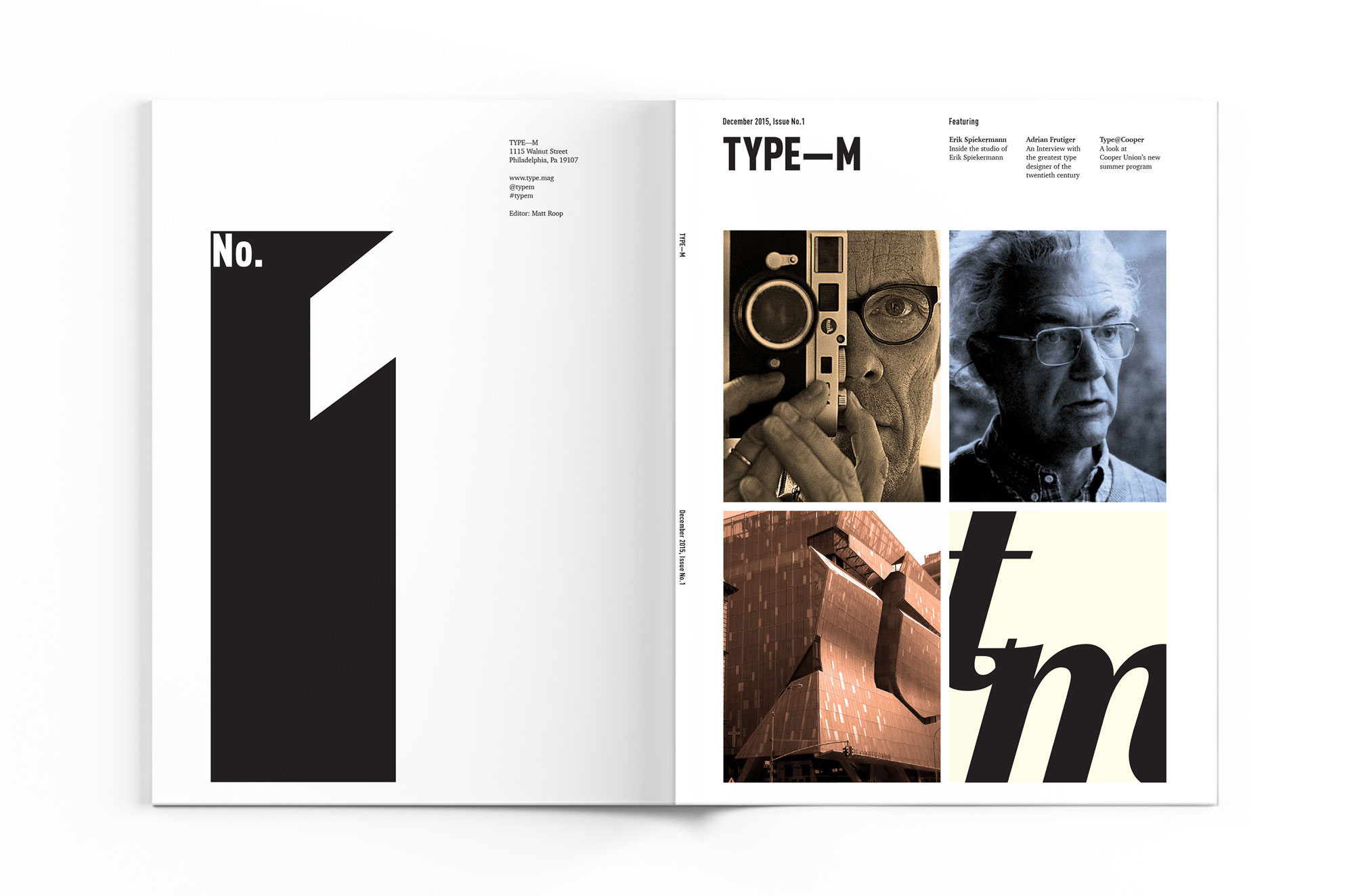
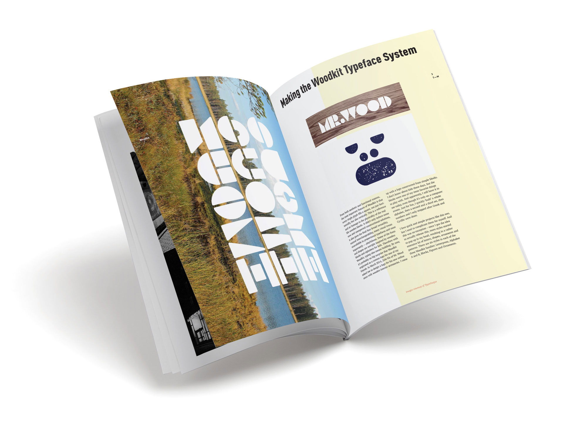
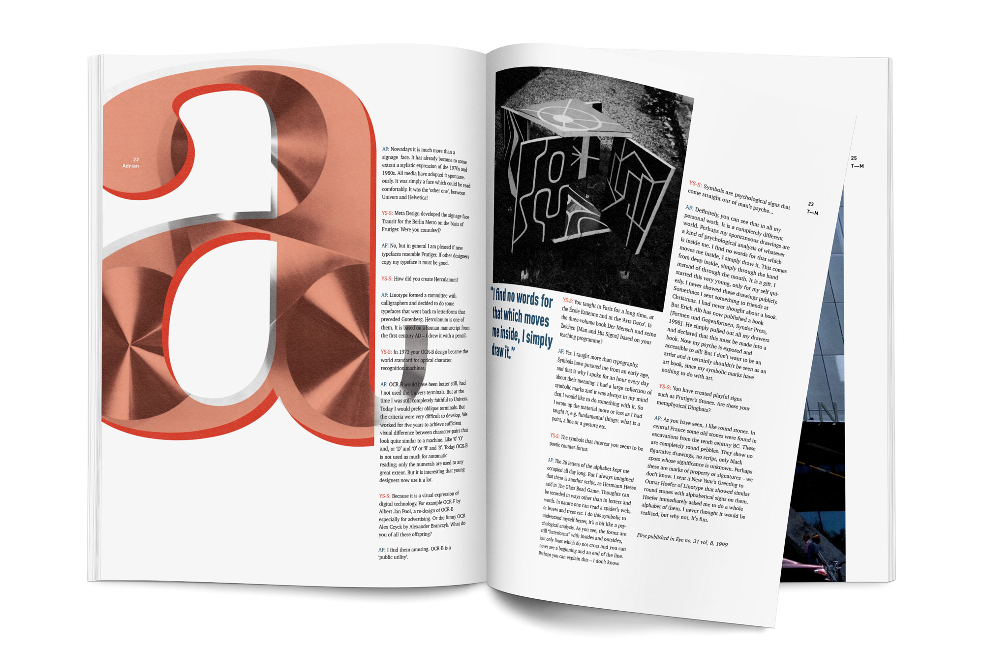
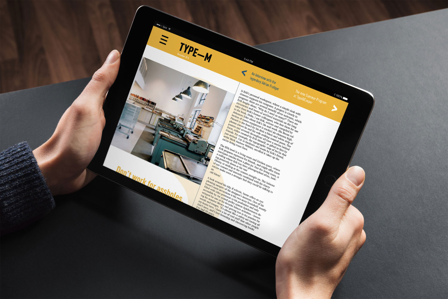
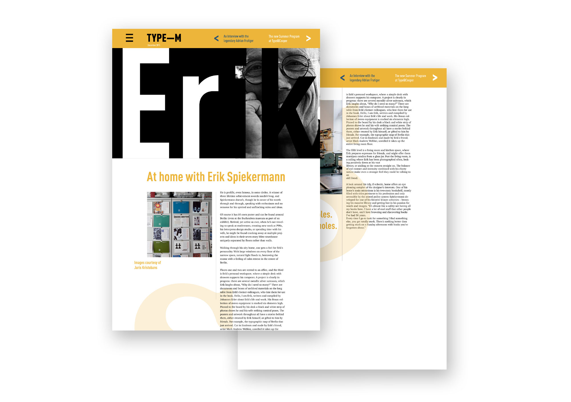
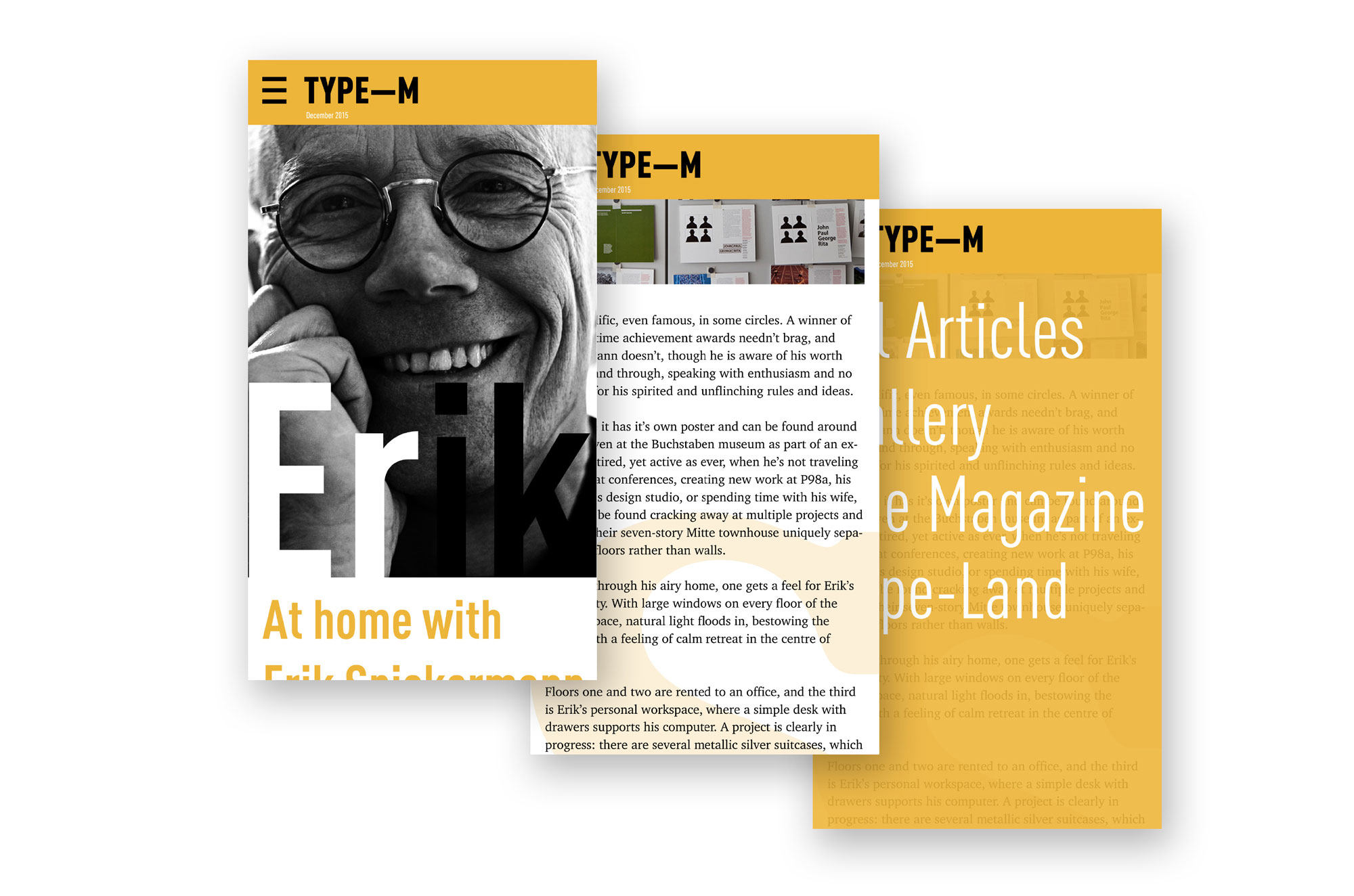
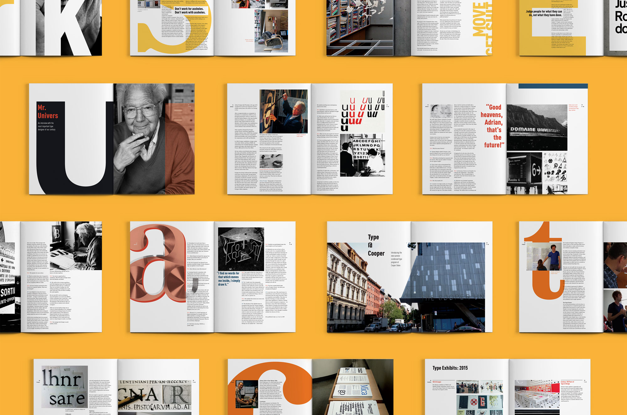
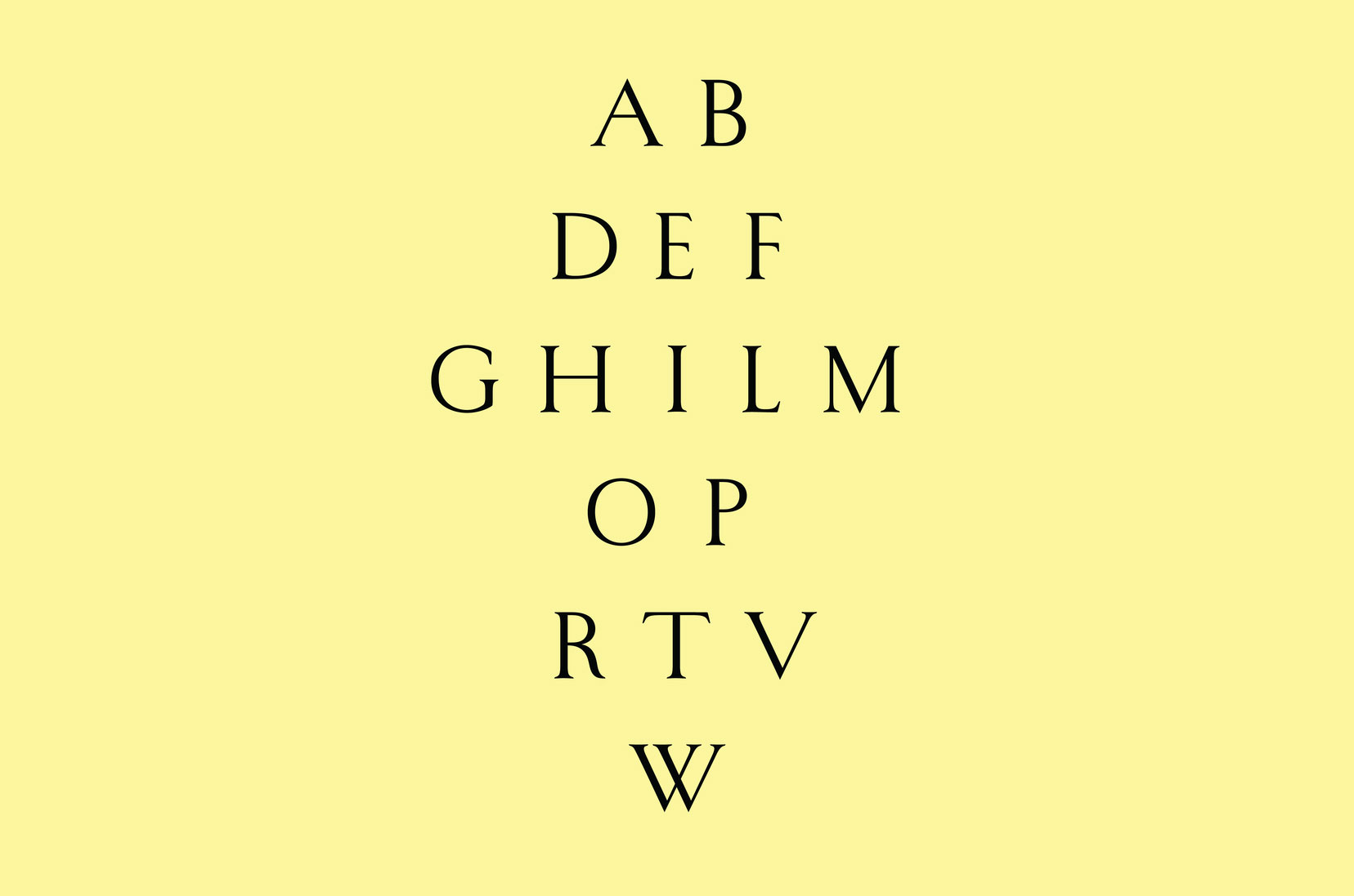
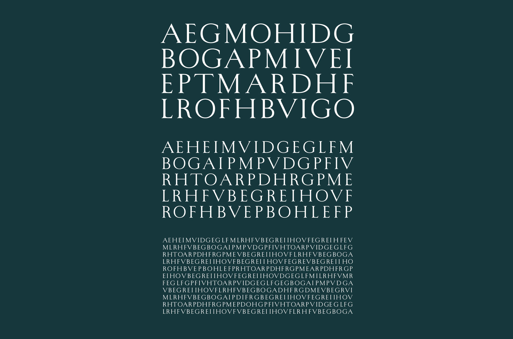
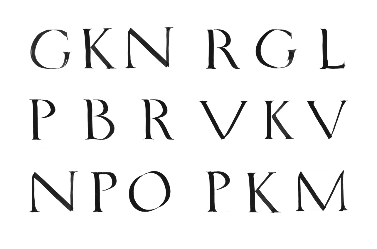
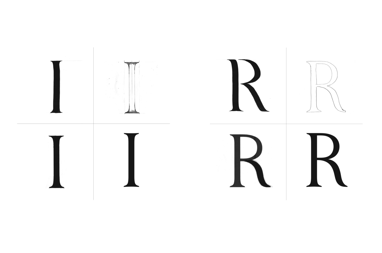
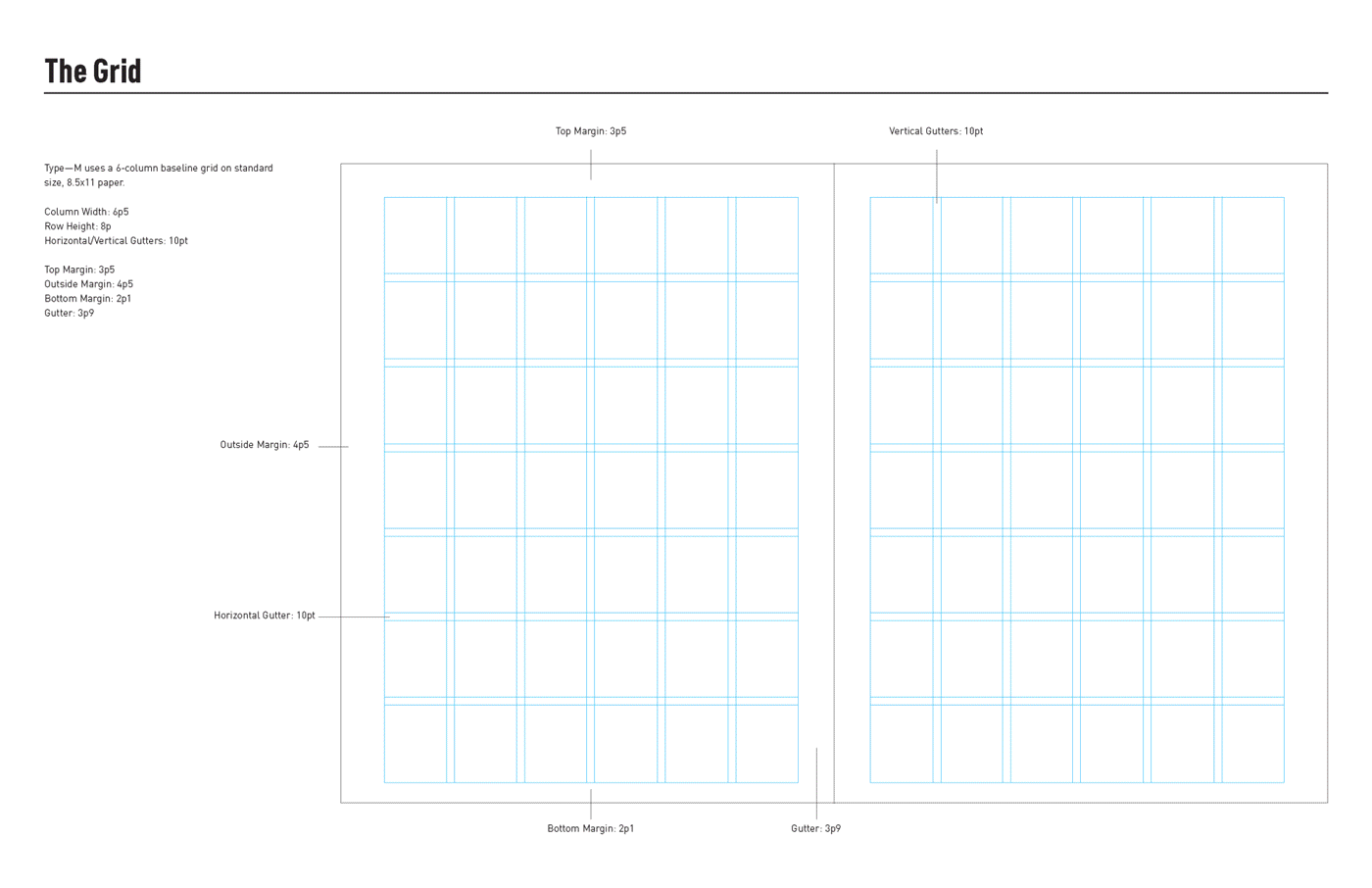
A magazine for print and web that focuses on type design and type designers.
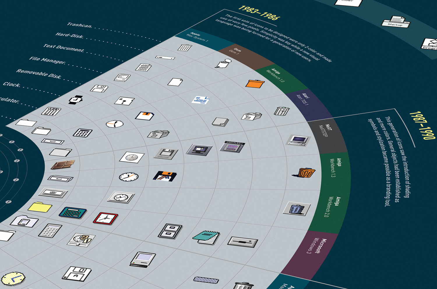
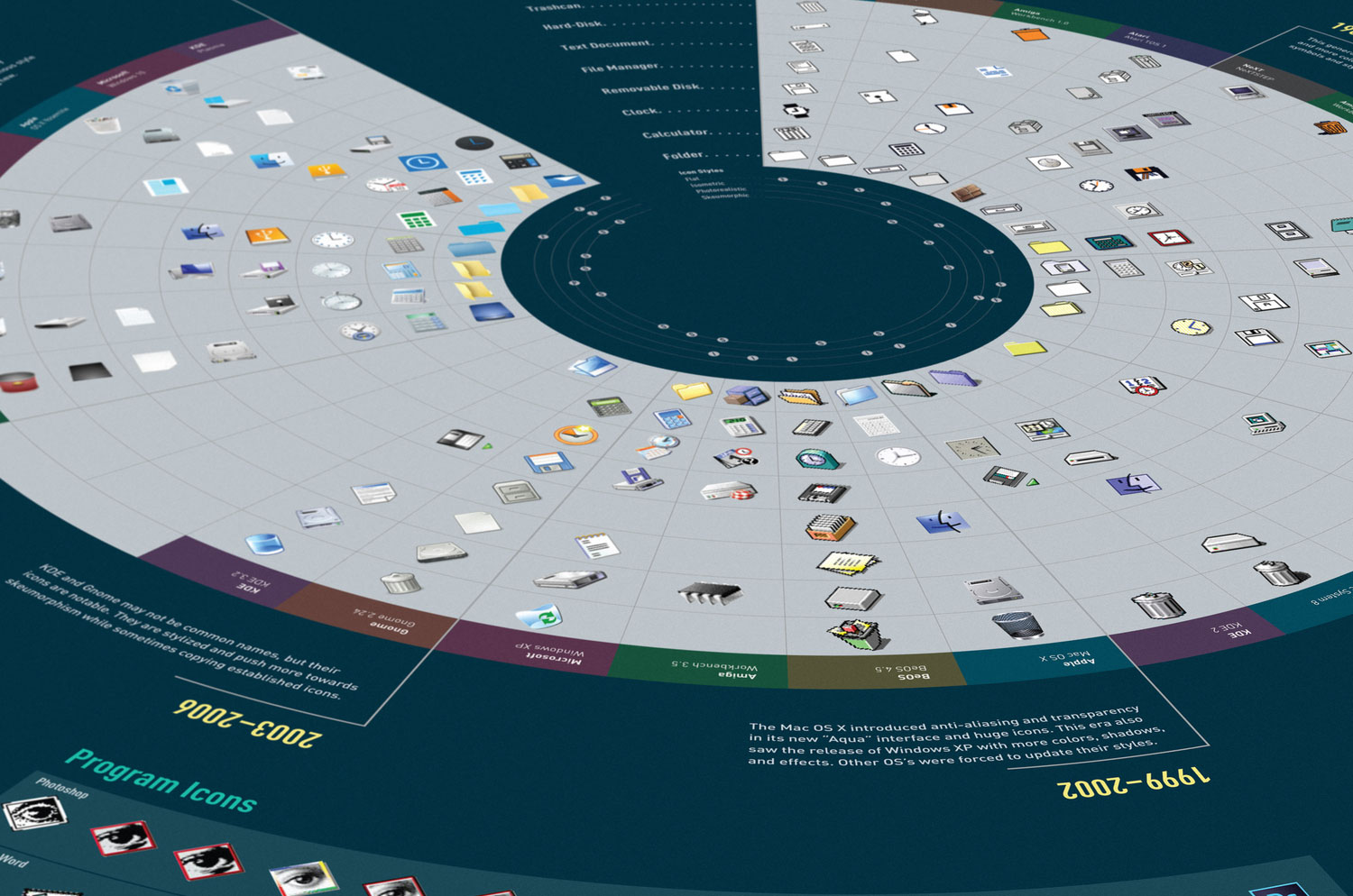
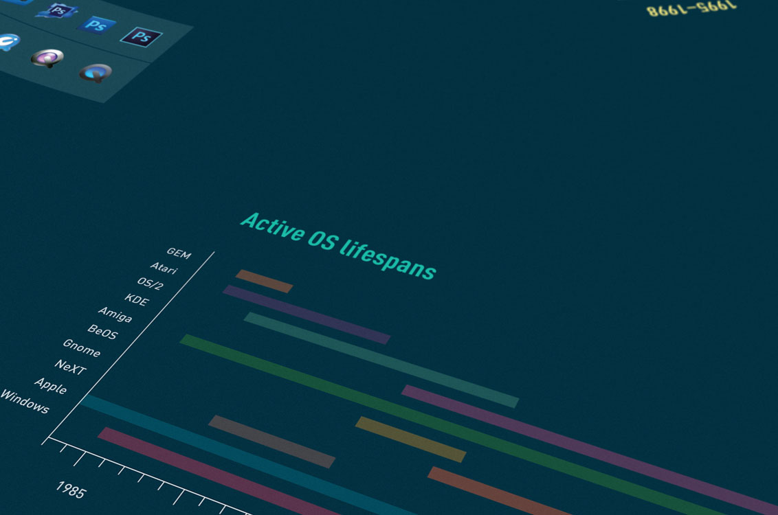
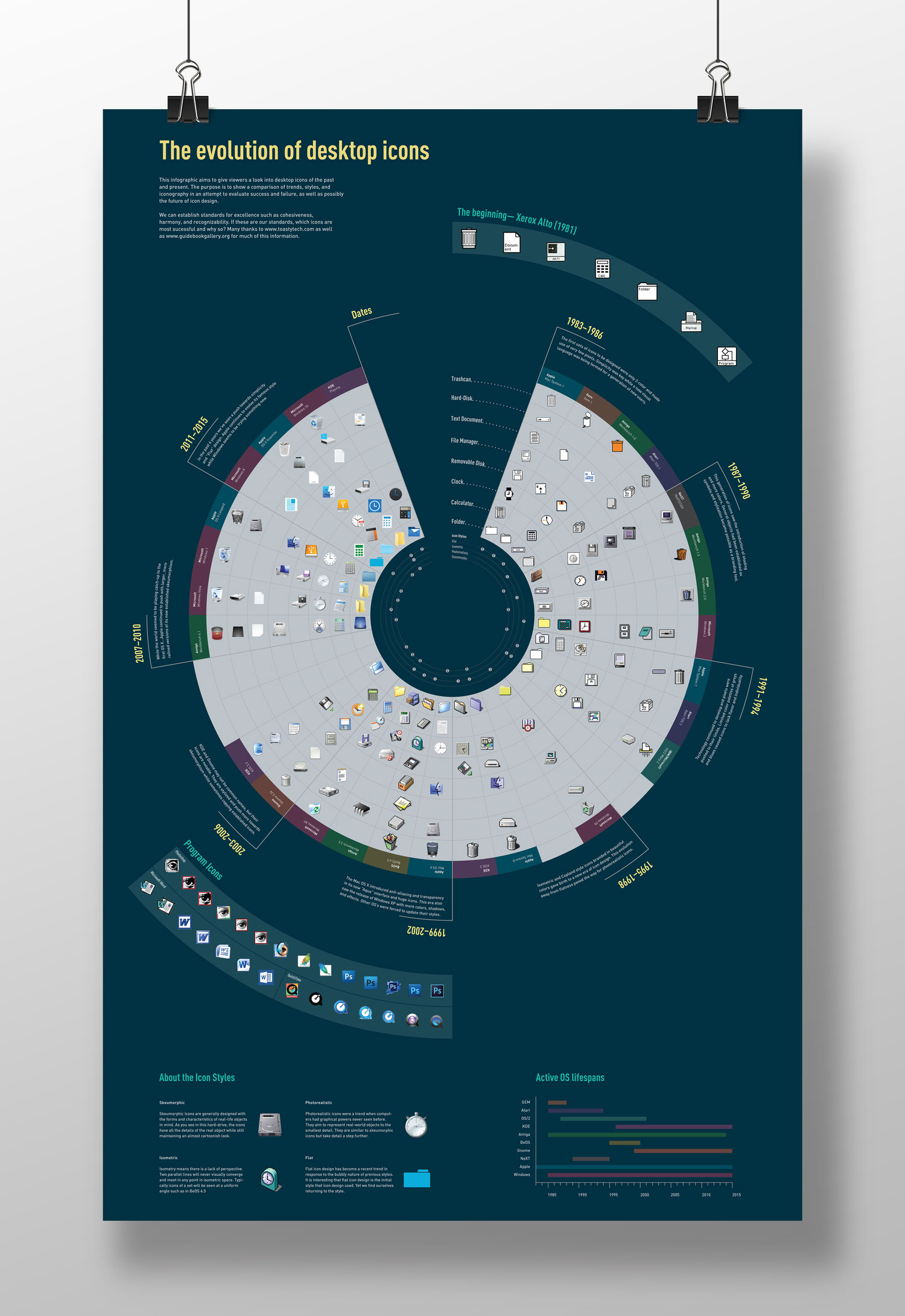
An infographic showcasing icon sets from select operating systems since 1981.

GDUSA Student to Watch 2017
President's Award
from The University of the Arts (highest student honor)
Armin Hofmann Award for Excellence
from The University of the Arts
Thesis Citation
from The University of the Arts for Water from Rocks
Adobe Design and Achievement Award
Semifinalist for Process and Type–M.
GDUSA Graphic Design Awards
for Process, Type–M, and Ego, Lie, Sin poster series.
Sagmeister & Walsh, New York, NY
Graphic Designer, July 2018–Present
Foreign Policy Design Group, Singapore
Design Intern, January 2018–July 2018
Lippincott, New York, NY
Design Intern, August 2017–December 2017
Ideas on Purpose, New York, NY
Design Intern, Summer 2015 & Summer 2016
Process Exhibition, UArts
Design Team
Joel Katz Design Associates, Philadelphia, PA
Design Intern, Spring 2016–Spring 2017
Group M, Philadelphia, PA
Design Intern, Fall 2015–Spring 2016
AIGA Student Group, UArts, Philadelphia, PA
Director of Communications, 2014–2015